CrosshairLineStyle.LabelBackgroundColor Property
Gets or sets the background color the label uses. This is a bindable property.
Namespace: DevExpress.Maui.Charts
Assembly: DevExpress.Maui.Charts.dll
NuGet Package: DevExpress.Maui.Charts
Declaration
public Color LabelBackgroundColor { get; set; }Property Value
| Type | Description |
|---|---|
| Color | The label’s background color. |
Example
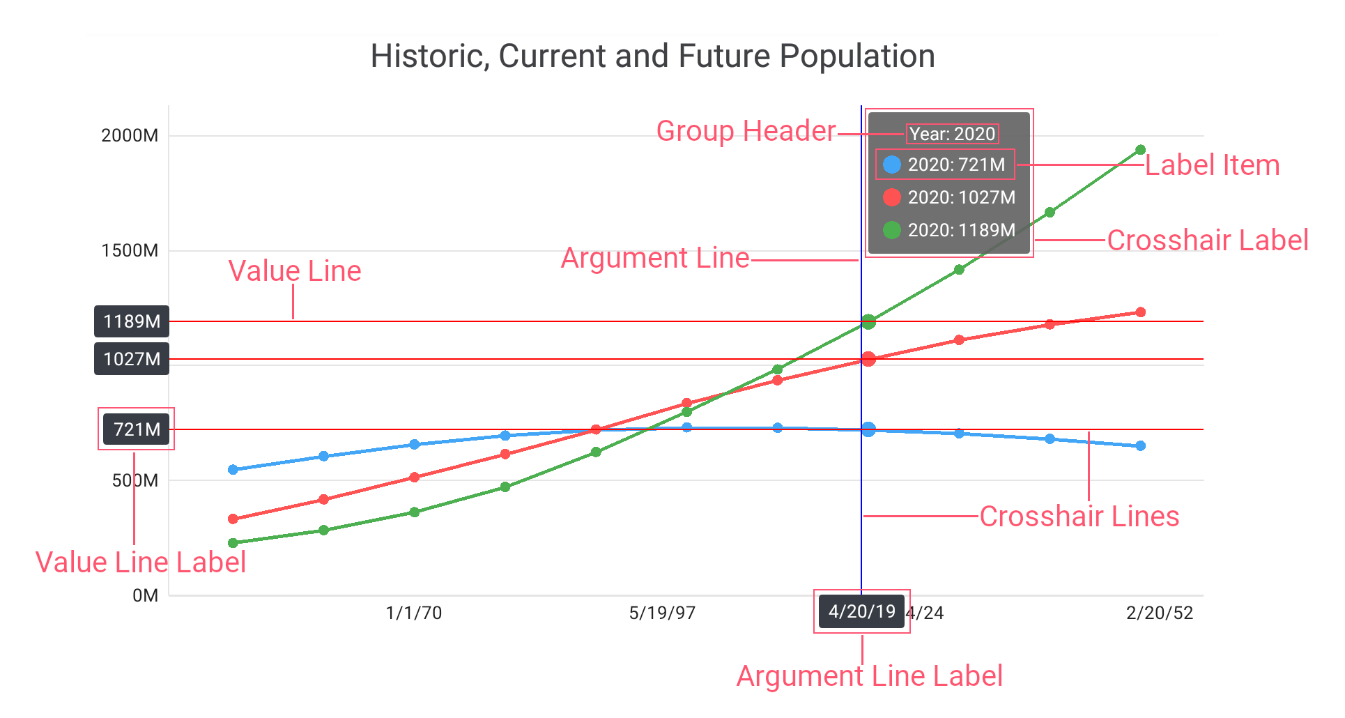
This example sets the ChartView hint behavior to crosshair, and how to specify the crosshair hint properties.
- Set the ChartView.Hint property to the Hint object, with the Enabled property set to True.
- Assign the CrosshairHintBehavior object to the Hint.Behavior property. Specify the GroupHeaderTextPattern and MaxSeriesCount properties to manage the crosshair cursor label content.
- Create a new HintStyle object and assign it to the Hint.Style property to customize the hint appearance.
Assign the CrosshairLineStyle class instance with specified
LabelBackgroundColor, Stroke, and TextStyle properties to the HintStyle.ArgumentLineStyle and HintStyle.ValueLineStyle properties to modify appearance of the hint lines and hint labels.
<dxc:ChartView.Hint>
    <dxc:Hint Enabled="True">
        <!--...-->
        <dxc:Hint.Behavior>
            <dxc:CrosshairHintBehavior
                    GroupHeaderTextPattern="{} Year: {A$YYYY}"
                    MaxSeriesCount="3" />
        </dxc:Hint.Behavior>
        <dxc:Hint.Style>
            <dxc:HintStyle>
                <dxc:HintStyle.ArgumentLineStyle>
                    <dxc:CrosshairLineStyle LabelBackgroundColor="#383c44"
                                            Stroke="Blue">
                        <dxc:CrosshairLineStyle.TextStyle>
                            <dxc:TextStyle Color="White"
                                           Size="30"/>
                        </dxc:CrosshairLineStyle.TextStyle>
                    </dxc:CrosshairLineStyle>
                </dxc:HintStyle.ArgumentLineStyle>
                <dxc:HintStyle.ValueLineStyle>
                    <dxc:CrosshairLineStyle LabelBackgroundColor="#383c44"
                                            Stroke="Red">
                        <dxc:CrosshairLineStyle.TextStyle>
                            <dxc:TextStyle Color="White"
                                           Size="30"/>
                        </dxc:CrosshairLineStyle.TextStyle>
                    </dxc:CrosshairLineStyle>
                </dxc:HintStyle.ValueLineStyle>
            </dxc:HintStyle>
        </dxc:Hint.Style>
    </dxc:Hint>
</dxc:ChartView.Hint>
See Also