ASPxButtonEdit Class
Represents an edit control with embedded buttons.
Namespace: DevExpress.Web
Assembly: DevExpress.Web.v25.2.dll
NuGet Package: DevExpress.Web
Declaration
Remarks
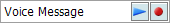
The ASPxButtonEdit class represents a text box editor which allows one or more buttons to be displayed within its client region. The following image demonstrates an ASPxButtonEdit with 2 buttons:
Create a ButtonEdit Control
Design Time
The ASPxButtonEdit control is available on the DX.25.2: Common Controls toolbox tab in the Microsoft Visual Studio IDE.
Drag the control onto a form and customize the control’s settings, or paste the control’s markup in the page’s source code.
<dx:ASPxButtonEdit ID="buttonEdit" runat="server"
                   NullText="Enter your name..." ClientInstanceName="ClientButtonEdit">
    <ClearButton DisplayMode="Always"></ClearButton>
</dx:ASPxButtonEdit>
Run Time
using DevExpress.Web;
...
protected void Page_Load(object sender, EventArgs e)
{
    ASPxButtonEdit buttonEdit = new ASPxButtonEdit();
    buttonEdit.ID = "buttonEdit";
    Page.Form.Controls.Add(buttonEdit);

    buttonEdit.ClientInstanceName = "ClientButtonEdit";
    buttonEdit.NullText = "Enter your name...";
    buttonEdit.ClearButton.DisplayMode = ClearButtonDisplayMode.Always;
}
Note
DevExpress controls require that you register special modules, handlers, and options in the Web.config file. You can change this file or switch to the Design tab in the Microsoft Visual Studio IDE to automatically update the Web.config file. Note that this information is automatically registered if you use the DevExpress Template Gallery to create a project.
The ASPxButtonEdit control maintains its buttons within a collection accessed via the ASPxButtonEditBase.Buttons property. An individual button is represented by an instance of the EditButton class. Each button can display text, or an image, or both. You can control the button’s visibility, availability to end-users and position within the editor’s text box. The common button appearance can be defined via the ASPxButtonEditBase.ButtonStyle property.
When an end-user clicks an editor button, the click can be processed either on the client, via the ASPxClientButtonEditBase.ButtonClick event, or on the server, by handling the ASPxButtonEditBase.ButtonClick event. The clicked button can be identified by its index in the event handlers.
The ASPxButtonEdit contains several properties that allow you to control its text editing behavior. You can specify the content text’s horizontal alignment via the ASPxButton.HorizontalAlign property. To mask user input into the editor’s text box, set the ASPxTextBoxBase.Password property to true. Using the ASPxTextBoxBase.MaxLength property, the user input can be limited to a specified number of characters.
The ASPxButtonEdit editor supports masked input. The editor’s mask settings can be accessed via the ASPxButtonEdit.MaskSettings property. A mask expression can be specified via the MaskSettings.Mask property of the editor.
Note
The client-side equivalent of this editor control is represented by the ASPxClientButtonEdit object. The editor’s client-side API is enabled if the ASPxEditBase.EnableClientSideAPI property is set to true, or the ASPxEditBase.ClientInstanceName property is defined, or any client event is handled. Available client events can be accessed via the ASPxButtonEdit.ClientSideEvents property.
<dx:ASPxButtonEdit ID="ASPxButtonEdit2" runat="server">
    <ClientSideEvents ButtonClick="OnButtonClick" />
    <Buttons>
        <dx:EditButton Text="AA">
        </dx:EditButton>
        <dx:EditButton Text="BB">
        </dx:EditButton>
    </Buttons>
</dx:ASPxButtonEdit>