Filter Panel
- 6 minutes to read
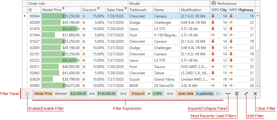
The Filter Panel is displayed at the bottom of the GridControl. This panel displays an existing filter expression (active or inactive) with a set of buttons to enable/disable, edit, or clear the filter.
| API | Description |
|---|---|
| DataViewBase.ShowFilterPanelMode | Specifies whether to display the filter panel within a View. |
Enable/Disable Filter
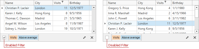
Use this check box to enable/disable the current filter at runtime.
| API | Description |
|---|---|
| DataControlBase.IsFilterEnabled | Specifies whether to enable/disable the current filter. |
Filter Expression
If you apply filter conditions to individual columns, the GridControl uses logical AND to combine conditions into a single filter expression.

The Filter Panel highlights individual field names, field values, and date-time functions to increase filter expression readability.
| API | Description |
|---|---|
| DataControlBase.FilterString | Gets or sets the filter expression applied to GridControl data. |
| DataControlBase.FilterCriteria | Gets or sets the filter criteria applied to GridControl data. |
| DataControlBase.FixedFilter | Specifies the filter criteria that is always applied to GridControl data and cannot be modified by the user. |
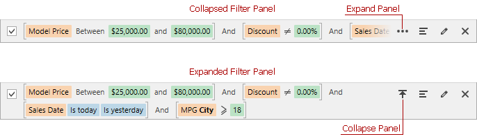
Expand/Collapse Panel
Click the Expand Panel button to display the entire filter expression if it does not fit the Filter Panel.
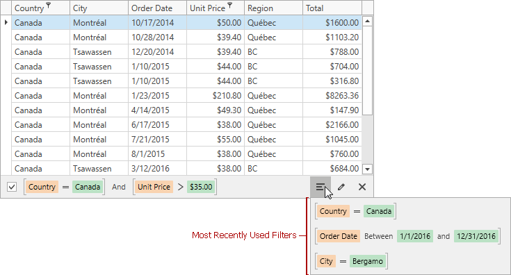
Most Recently Used Filters
Click the button displayed in the image below to access the most recently applied filter expressions.
| API | Description |
|---|---|
| DataControlBase.AllowMRUFilterList | Specifies whether to display the drop-down MRU filter list and the Most Recently Used button. |
| DataControlBase.MRUFilterListCount | Specifies the maximum number of the most recently used filters stored by the View. |
| DataControlBase.MRUFilterList | Returns a collection of the most recently used filters. |
| DataControlBase.AddMRUFilter | Adds the specified filter to the collection of the most recently used filters. |
| DataControlBase.RemoveMRUFilter | Removes the specified filter from the collection of the most recently used filters. |
| DataControlBase.ClearMRUFilter | Clears the collection of the most recently used filters. |
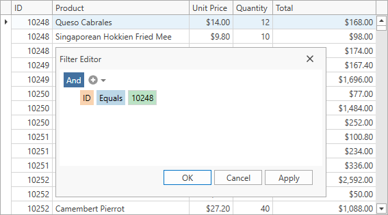
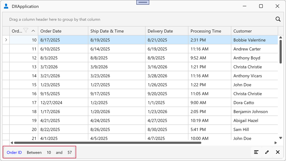
Edit Filter
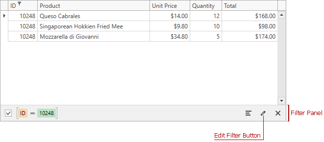
The button demonstrated in the image above invokes the Filter Editor:
Note
The Filter Panel does not display the Edit Filter button if the GridControl is bound to a virtual source.
| API | Description |
|---|---|
| DataViewBase.AllowFilterEditor | Specifies whether to allow users to invoke the Filter Editor from the column header’s context menu and Filter Panel. |
| DataViewBase.ShowEditFilterButton | Returns whether the Edit Filter button is displayed in the Filter Panel. |
| DataViewBase.ShowFilterEditor(ColumnBase) | Invokes the Filter Editor. |
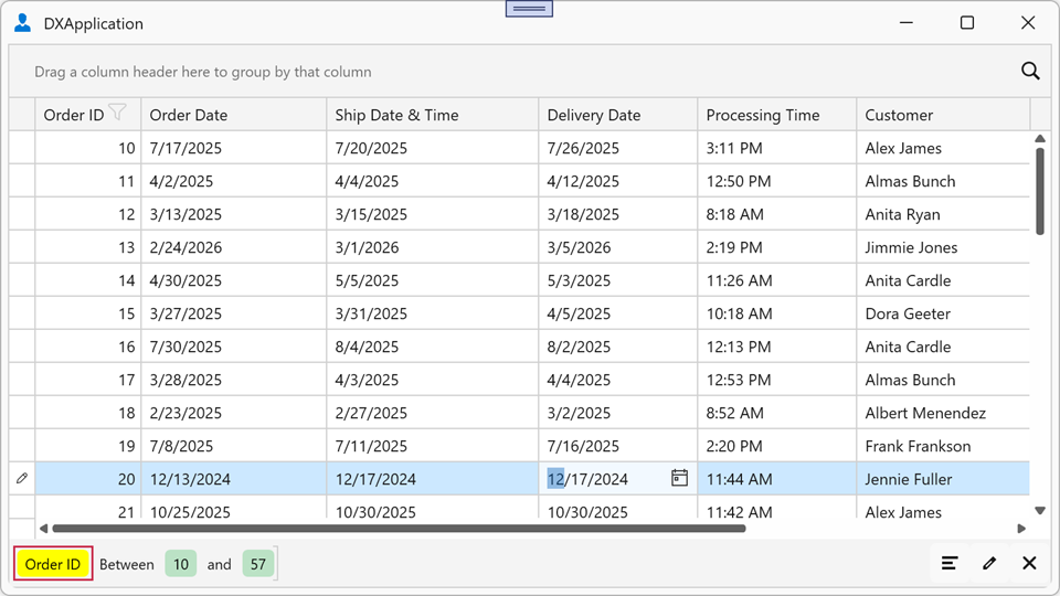
Clear Filter
The Clear Filter button at the end of the Filter Panel removes all filter conditions.
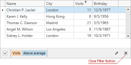
Users can also remove individual conditions as demonstrated in the image below:

| API | Description |
|---|---|
| DataViewCommandsBase.ClearFilter | Clears the filter. |
| FilteringPanelControl.ClearingFilterCommand | Gets or sets a command executed when a user clicks the Clear Filter button within the Filter Panel. |
| FilterPanelClearingFilterEventArgs.Handled | Gets or sets whether the built-in clear filter action is canceled. |
Example: Intercept Clear Filter Button Clicks
Bind a command to the FilteringPanelControl.ClearingFilterCommand property to intercept the filter clear action in a ViewModel. Assign the command to the new Filter Panel through the View’s GridViewBase.FilteringPanelStyle property. Set the FilterPanelClearingFilterEventArgs.Handled property to true to cancel the built-in clear action. If the Handled property is false, the built-in clear action runs after the command.
<dx:ThemedWindow x:Class="FilterPanelExample.MainWindow"
                 xmlns="http://schemas.microsoft.com/winfx/2006/xaml/presentation"
                 xmlns:x="http://schemas.microsoft.com/winfx/2006/xaml"
                 xmlns:dx="http://schemas.devexpress.com/winfx/2008/xaml/core"
                 xmlns:dxg="http://schemas.devexpress.com/winfx/2008/xaml/grid"
                 xmlns:dxfui="http://schemas.devexpress.com/winfx/2008/xaml/core/filteringui">
    <dxg:GridControl ItemsSource="{Binding Orders}">
        <dxg:GridControl.View>
            <dxg:TableView ShowFilterPanelMode="ShowAlways">
                <dxg:TableView.FilteringPanelStyle>
                    <Style TargetType="dxfui:FilteringPanelControl">
                        <Setter Property="ClearingFilterCommand"
                                Value="{Binding DataContext.ClearingFilterCommandHandler,
                                        RelativeSource={RelativeSource AncestorType=Window}}"/>
                    </Style>
                </dxg:TableView.FilteringPanelStyle>
            </dxg:TableView>
        </dxg:GridControl.View>
    </dxg:GridControl>
</dx:ThemedWindow>
Filter Panel Element Clicks
Bind a command to the FilteringPanelControl.ElementClickCommand property to handle clicks on individual Filter Panel elements in a ViewModel. Assign the command through the View’s GridViewBase.FilteringPanelStyle property. The command parameter is a FilterPanelElementClickEventArgs object that identifies the clicked element:
- ColumnName
- Gets the field name associated with the clicked Filter Panel element.
- ElementType
- Gets the type of the clicked Filter Panel element.
- Value
- Gets the value or operator associated with the clicked Filter Panel element.
- ClickCount
- Gets the number of clicks on a Filter Panel element.
Example: Handle Filter Panel Element Clicks
The following example handles clicks on field name and value elements to display a message:
<dx:ThemedWindow x:Class="FilterPanelExample.MainWindow"
                 xmlns="http://schemas.microsoft.com/winfx/2006/xaml/presentation"
                 xmlns:x="http://schemas.microsoft.com/winfx/2006/xaml"
                 xmlns:dx="http://schemas.devexpress.com/winfx/2008/xaml/core"
                 xmlns:dxg="http://schemas.devexpress.com/winfx/2008/xaml/grid"
                 xmlns:dxfui="http://schemas.devexpress.com/winfx/2008/xaml/core/filteringui">
    <dxg:GridControl ItemsSource="{Binding Orders}" AutoGenerateColumns="AddNew">
        <dxg:GridControl.View>
            <dxg:TableView ShowFilterPanel="True">
                <dxg:TableView.FilteringPanelStyle>
                    <Style TargetType="dxfui:FilteringPanelControl">
                        <Setter Property="ElementClickCommand"
                                Value="{Binding DataContext.ElementClickCommandHandler,
                                        RelativeSource={RelativeSource AncestorType=Window}}"/>
                    </Style>
                </dxg:TableView.FilteringPanelStyle>
            </dxg:TableView>
        </dxg:GridControl.View>
    </dxg:GridControl>
</dx:ThemedWindow>
Customize Appearance
Assign a style to the View’s GridViewBase.FilteringPanelStyle property to customize the color of individual Filter Panel elements.
Color Mode
Use the FilteringPanelControl.ColorMode property to switch between two color modes:
Default— The Filter Panel applies active theme brushes to all elements. You can override these brushes with background and foreground properties for individual elements.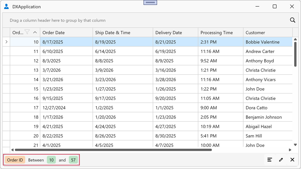
Plain— The Filter Panel applies the transparent background to all elements and ignores background-specific properties. You can specify foreground brushes for individual elements.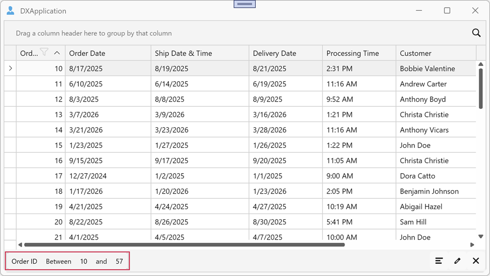
Example: Specify Color Mode
The following example applies the transparent background to all Filter Panel elements and paints field names blue:
<dx:ThemedWindow x:Class="FilterPanelExample.MainWindow"
                 xmlns="http://schemas.microsoft.com/winfx/2006/xaml/presentation"
                 xmlns:x="http://schemas.microsoft.com/winfx/2006/xaml"
                 xmlns:dx="http://schemas.devexpress.com/winfx/2008/xaml/core"
                 xmlns:dxg="http://schemas.devexpress.com/winfx/2008/xaml/grid"
                 xmlns:dxfui="http://schemas.devexpress.com/winfx/2008/xaml/core/filteringui">
    <dxg:GridControl ItemsSource="{Binding Orders}">
        <dxg:GridControl.View>
            <dxg:TableView ShowFilterPanelMode="ShowAlways">
                <dxg:TableView.FilteringPanelStyle>
                    <Style TargetType="dxfui:FilteringPanelControl">
                        <Setter Property="ColorMode" Value="Plain"/>
                        <Setter Property="PropertyForeground" Value="Blue"/>
                    </Style>
                </dxg:TableView.FilteringPanelStyle>
            </dxg:TableView>
        </dxg:GridControl.View>
    </dxg:GridControl>
</dx:ThemedWindow>
Element Colors
Use the following properties to specify background and foreground brushes for individual Filter Panel element types:
| API | Description |
|---|---|
| PropertyBackground / PropertyForeground | Background and foreground brushes for field names. |
| ValueBackground / ValueForeground | Background and foreground brushes for filter values. |
| OperatorBackground / OperatorForeground | Background and foreground brushes for comparison operators (for example, =, >, <). |
| LogicalOperatorBackground / LogicalOperatorForeground | Background and foreground brushes for logical operators (AND/OR). |
Note
When the FilteringPanelControl.ColorMode property is set to Plain, background brushes have no effect. Foreground brushes apply in both color modes.
Example: Specify Filter Panel Element Colors
The following example sets a yellow background for field names:
<dx:ThemedWindow x:Class="FilterPanelExample.MainWindow"
                 xmlns="http://schemas.microsoft.com/winfx/2006/xaml/presentation"
                 xmlns:x="http://schemas.microsoft.com/winfx/2006/xaml"
                 xmlns:dx="http://schemas.devexpress.com/winfx/2008/xaml/core"
                 xmlns:dxg="http://schemas.devexpress.com/winfx/2008/xaml/grid"
                 xmlns:dxfui="http://schemas.devexpress.com/winfx/2008/xaml/core/filteringui">
    <dxg:GridControl ItemsSource="{Binding Orders}">
        <dxg:GridControl.View>
            <dxg:TableView ShowFilterPanelMode="ShowAlways">
                <dxg:TableView.FilteringPanelStyle>
                    <Style TargetType="dxfui:FilteringPanelControl">
                        <Setter Property="ColorMode" Value="Default"/>
                        <Setter Property="PropertyBackground" Value="Yellow"/>
                    </Style>
                </dxg:TableView.FilteringPanelStyle>
            </dxg:TableView>
        </dxg:GridControl.View>
    </dxg:GridControl>
</dx:ThemedWindow>
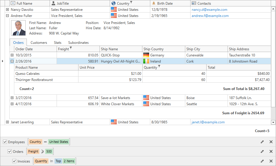
Master-Detail Filter Panel
If the GridControl displays detail views, the Filter Panel indents expressions so they visually correspond to individual detail views.
Legacy and New Filter Panels
New Filter Panel
Legacy Filter Panel
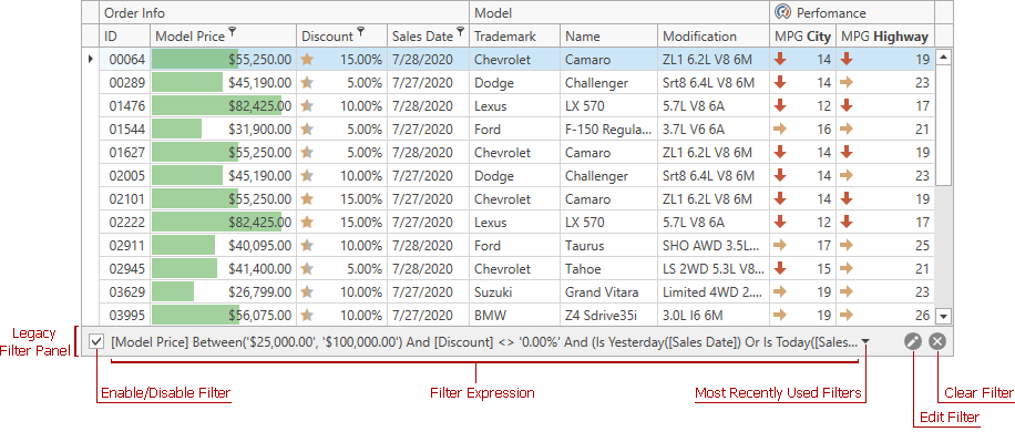
To use the legacy Filter Panel:
- For a specific
GridControl, set the DataViewBase.UseLegacyFilterPanel property totrue. - For all controls (
GridControl,TreeListControl, andPivotGridControl) in the project, set the CompatibilitySettings.UseLegacyFilterPanel property totrue.