Group Panel
- 2 minutes to read
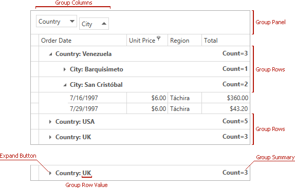
The Group Panel displays group column headers. Right-click the Group Panel to invoke the group panel context menu that contains commands related to data grouping.
Visibility
Set the GridViewBase.ShowGroupPanel property to true to display the Group Panel. Users can drag a column header to the panel to group data by that column.
<dxg:GridControl ItemsSource="{Binding Items}">
    <dxg:GridControl.View>
        <dxg:TableView ShowGroupPanel="True"/>
    </dxg:GridControl.View>
</dxg:GridControl>
Custom Content
Use GridViewBase.GroupPanelLeftContentTemplate and GridViewBase.GroupPanelRightContentTemplate properties to display custom content (for example, a label, icon, or button) in the left and right parts of the Group Panel.
Example: Custom Content in the Left Part of the Group Panel
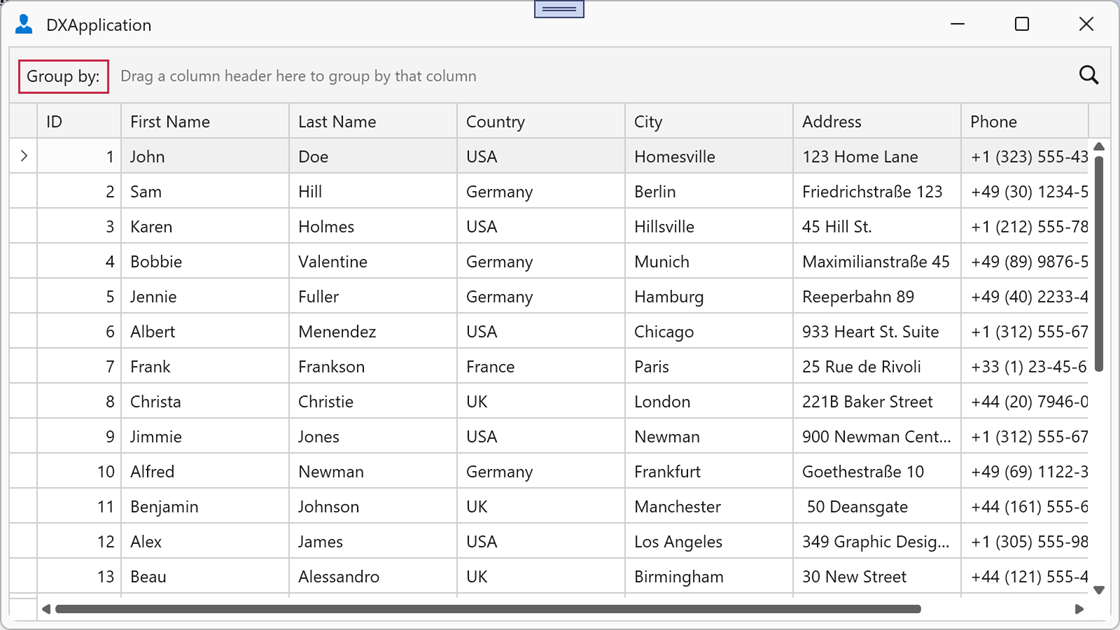
The following example adds the “Group by:” label to the left part of the Group Panel:
<Window.Resources>
    <DataTemplate x:Key="GroupPanelLeftTemplate">
        <TextBlock Text="Group by:" VerticalAlignment="Center" Margin="4,0,4,0"/>
    </DataTemplate>
</Window.Resources>

<dxg:GridControl ItemsSource="{Binding Items}">
    <dxg:GridControl.View>
        <dxg:TableView ShowGroupPanel="True"
                       GroupPanelLeftContentTemplate="{StaticResource GroupPanelLeftTemplate}"/>
    </dxg:GridControl.View>
</dxg:GridControl>
Example: Custom Content in the Right Part of the Group Panel
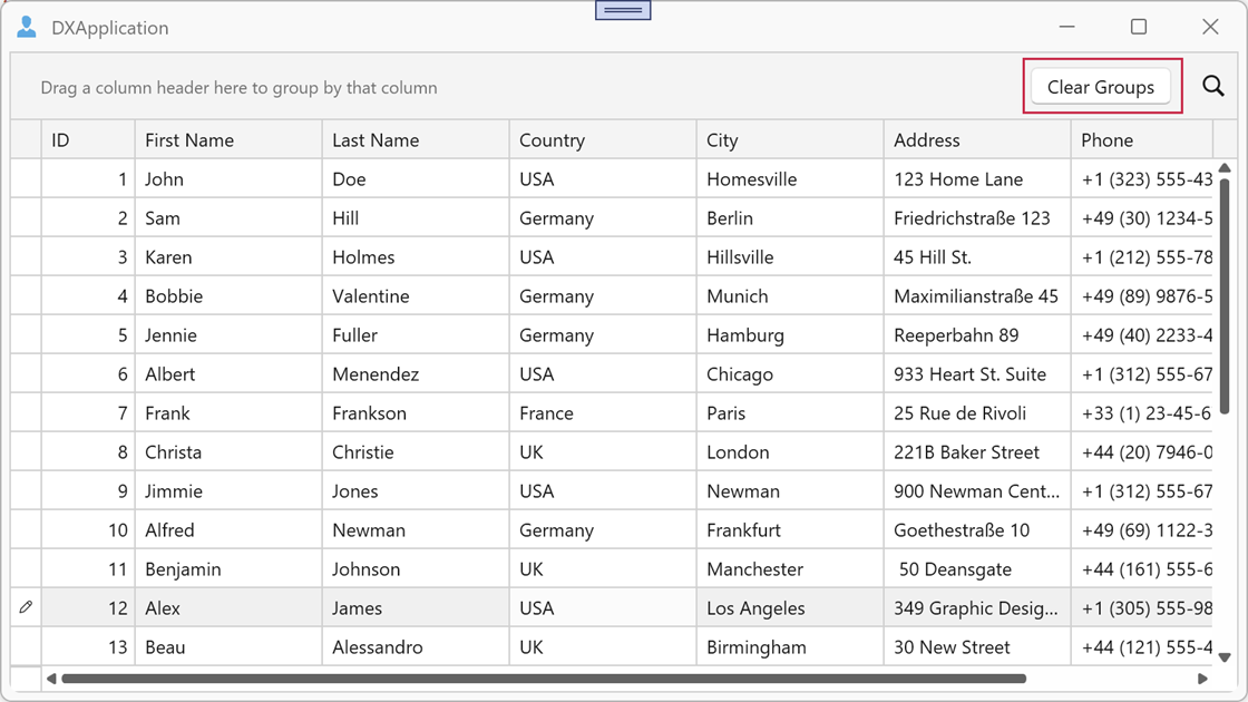
The following example adds the Clear Groups button to the right part of the Group Panel:
<Window.Resources>
    <DataTemplate x:Key="GroupPanelRightTemplate">
        <Button Content="Clear Groups"
                Command="dxg:GridCommands.ClearGrouping"
                CommandTarget="{Binding Path=View, ElementName=grid}"
                VerticalAlignment="Center" Margin="4,0,4,0"/>
    </DataTemplate>
</Window.Resources>

<dxg:GridControl x:Name="grid" ItemsSource="{Binding Items}">
    <dxg:GridControl.View>
        <dxg:TableView ShowGroupPanel="True"
                       GroupPanelRightContentTemplate="{StaticResource GroupPanelRightTemplate}"/>
    </dxg:GridControl.View>
</dxg:GridControl>
Note
Both templates support master-detail scenarios. You can specify separate templates for each View in the hierarchy.
Hint Text Alignment
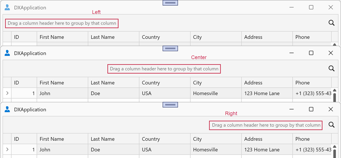
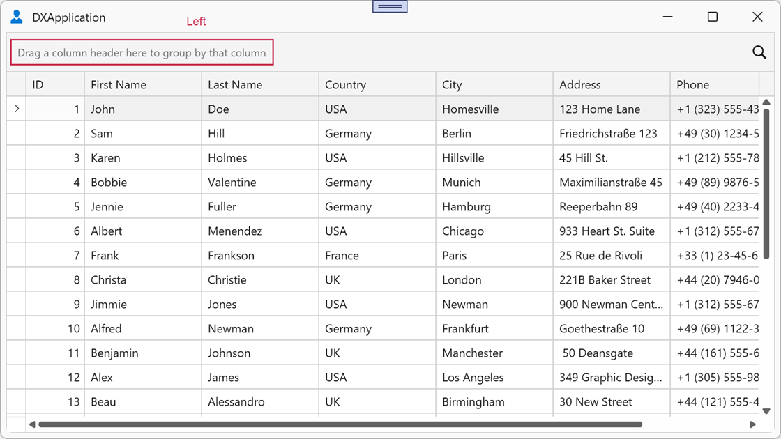
The GridViewBase.GroupPanelDragTextHorizontalAlignment property controls the horizontal alignment of the Group Panel hint text (Drag a column header here to group by that column). When the property is null (default), the current theme aligns the text based on the Search Panel position:
Left— when the GridViewBase.SearchPanelPosition property isDefault.Center— when the Search Panel overlaps the Group Panel.
Example: Align the Hint to the Left
The following example aligns the hint to the left:
<dxg:GridControl ItemsSource="{Binding Items}">
    <dxg:GridControl.View>
        <dxg:TableView ShowGroupPanel="True"
                       GroupPanelDragTextHorizontalAlignment="Left"/>
    </dxg:GridControl.View>
</dxg:GridControl>
Column Header Layout
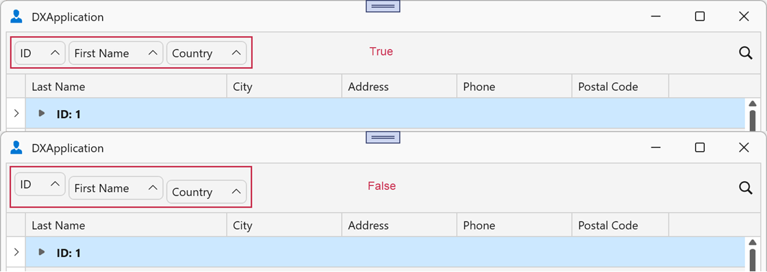
Set the GridViewBase.ShowGroupPanelColumnsAsSingleRow property to true to display all grouped column headers on the same level (without vertical offset). In master-detail scenarios, you can specify this property for master and detail Views.
<dxg:GridControl ItemsSource="{Binding Items}">
    <dxg:GridControl.View>
        <dxg:TableView ShowGroupPanel="True"
                       ShowGroupPanelColumnsAsSingleRow="True"/>
    </dxg:GridControl.View>
</dxg:GridControl>
Background
Use the TableView.TopPanelBackground / TreeListView.TopPanelBackground property to specify the background brush for the top panel area that contains the Group Panel and Search Panel. If the property is null (default), the View applies the current theme’s background brush.

<dxg:GridControl>
    <dxg:GridControl.View>
        <dxg:TableView ShowSearchPanelMode="Always"
                       TopPanelBackground="IndianRed"/>
    </dxg:GridControl.View>
</dxg:GridControl>