TcxCustomEditProperties.Buttons Property
Provides access to the collection of editor buttons.
Declaration
property Buttons: TcxEditButtons read; write;Property Value
| Type | Description |
|---|---|
| TcxEditButtons | An editor button collection. |
Remarks
Use the Buttons property to manage buttons displayed within the editor client area.

Button Management
You can call the Buttons.Add function to create additional buttons. All existing editor buttons are accessible through the Buttons.Items property.
Refer to the TcxEditButtons class description for detailed information on all button management options.
Button Settings and Functionality
To execute custom code in response to a click on an editor button, you can handle the OnButtonClick event. Alternatively, you can associate an editor button with an action object (a TBasicAction descendant instance).
Refer to the TcxEditButton class description for detailed information on all available button settings.
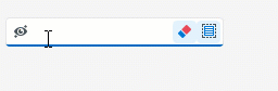
Code Example: Create Editor Buttons with Custom Functionality
The code example below demonstrates OnButtonClick and OnCreate event handlers.
The application form’s OnCreate event handler creates two additional embedded buttons in a TcxButtonEdit control and configures the appearance and behavior of all embedded buttons. The OnButtonClick event handler associates all created buttons with the editor’s functionality.
Note
This example uses a TcxImageList component with three SVG icons as a source of glyphs for the created buttons.
procedure TMyForm.cxButtonEdit1PropertiesButtonClick(Sender: TObject;
  AButtonIndex: Integer);
var
  AEditor: TcxButtonEdit;
begin
  AEditor := Sender as TcxButtonEdit;
  if AButtonIndex = 0 then  // The first button clears the editor
    AEditor.Clear
  else if AButtonIndex = 1 then  // The second button selects content
    AEditor.SelectAll
  else if AButtonIndex = 2 then  // The third button hides or reveals content
  begin
    if AEditor.Properties.EchoMode = eemNormal then
      AEditor.Properties.EchoMode := eemPassword
    else
      AEditor.Properties.EchoMode := eemNormal;
  end;
end;

procedure TMyForm.FormCreate(Sender: TObject);
var
  AProperties: TcxButtonEditProperties;
  I: Integer;
begin
  cxButtonEdit1.ShowHint := True;  // Enables hints for the editor
  AProperties := cxButtonEdit1.Properties;
  AProperties.BeginUpdate;  // Initiates the following batch change
  try
    AProperties.Images := cxImageList1;  // Assigns the source of button glyphs
    // Create two additional buttons
    AProperties.Buttons.Add;
    AProperties.Buttons.Add;
    // Specify common button settings
    for I := 0 to AProperties.Buttons.Count - 1 do
    begin
      AProperties.Buttons.Items[I].Kind := bkGlyph;  // Changes the button content type to "glyph"
      AProperties.Buttons.Items[I].ImageIndex := I;  // Specifies image indexes in the source list
      AProperties.Buttons.Items[I].HotTrackMode := TcxEditButtonHotTrackMode.Editor;
    end;
    // Specify unique button settings
    AProperties.Buttons.Items[0].Hint := 'Clear';
    AProperties.Buttons.Items[1].Hint := 'Select All';
    AProperties.Buttons.Items[2].Hint := 'Hide/Reveal';
    AProperties.Buttons.Items[2].LeftAlignment := True;
    AProperties.Buttons.Items[2].Transparent := True;
  finally
    AProperties.EndUpdate;  // Calls EndUpdate regardless of the batch operation's success
  end;
end;
Limitations
The following editors cannot display embedded buttons:
- TcxCheckBox
- An unbound check box editor.
- TcxDBCheckBox
- A data-aware check box editor.
- TcxLabel
- Represents the label control.
- TcxDBLabel
- Represents data-aware version of the TcxLabel.
- TdxFormattedLabel
- An unbound formatted label control.
- TdxDBFormattedLabel
- A data-aware formatted label control.
Refer to individual TcxCustomEdit class descendant descriptions for details.