Popup Control Elements
- 2 minutes to read
This topic describes the ASPxPopupControl elements and lists the main members that affect their appearance and functionality.
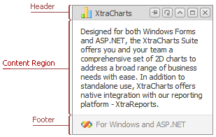
Header
The window Header can display an image, text, and buttons. Users can drag the window by its Header if the ASPxPopupControl.AllowDragging property is set to true.

Characteristics | Default Popup Window Members | Popup Window Members |
|---|---|---|
Visibility | ||
Appearance | ||
Navigation Location | ||
Image | ||
Text | ||
Template |
PopupWindow.HeaderContentTemplate |
Header Buttons

Buttons | Visibility | Image | Style | Description |
|---|---|---|---|---|
| Allows you to pin the window | |||
| Allows you to refresh the window | |||
| Allows you to collapse the window | |||
| Allows you to maximize the window | |||
| Allows you to close the window |
 Pin Button
 Refresh Button
 Collapse Button
 Maximize Button
 Close Button
Content Region
The Content Region is the main window element that can display text, web controls, HTML elements, or external content.

Characteristics | Default Popup Window Members | Popup Window Members |
|---|---|---|
Appearance | ||
Content Text | ||
Content Elements | ||
External Content | ||
Template |
Footer
The window Footer can display an image, text, and a size grip.

Characteristics | Default Popup Window Members | Popup Window Members |
|---|---|---|
Visibility | ||
Appearance | ||
Navigation Location | ||
Image | ||
Text | ||
Size Grip Visibility | ||
Size Grip Image | ||
Template |
PopupWindow.FooterContentTemplate |
Loading Panel
The Loading Panel is displayed over the popup window’s content while it waits for a callback response.

| Characteristics | Members |
|---|---|
| Visibility | SettingsLoadingPanel.Enabled |
| Text | SettingsLoadingPanel.Text |
| Image | ASPxPopupControl.LoadingPanelImage |
| Image Visibility | SettingsLoadingPanel.ShowImage |
| Image Position | SettingsLoadingPanel.ImagePosition |
| Delay | SettingsLoadingPanel.Delay |
| Style | ASPxPopupControl.LoadingPanelStyle |