Filter and Search
- 12 minutes to read
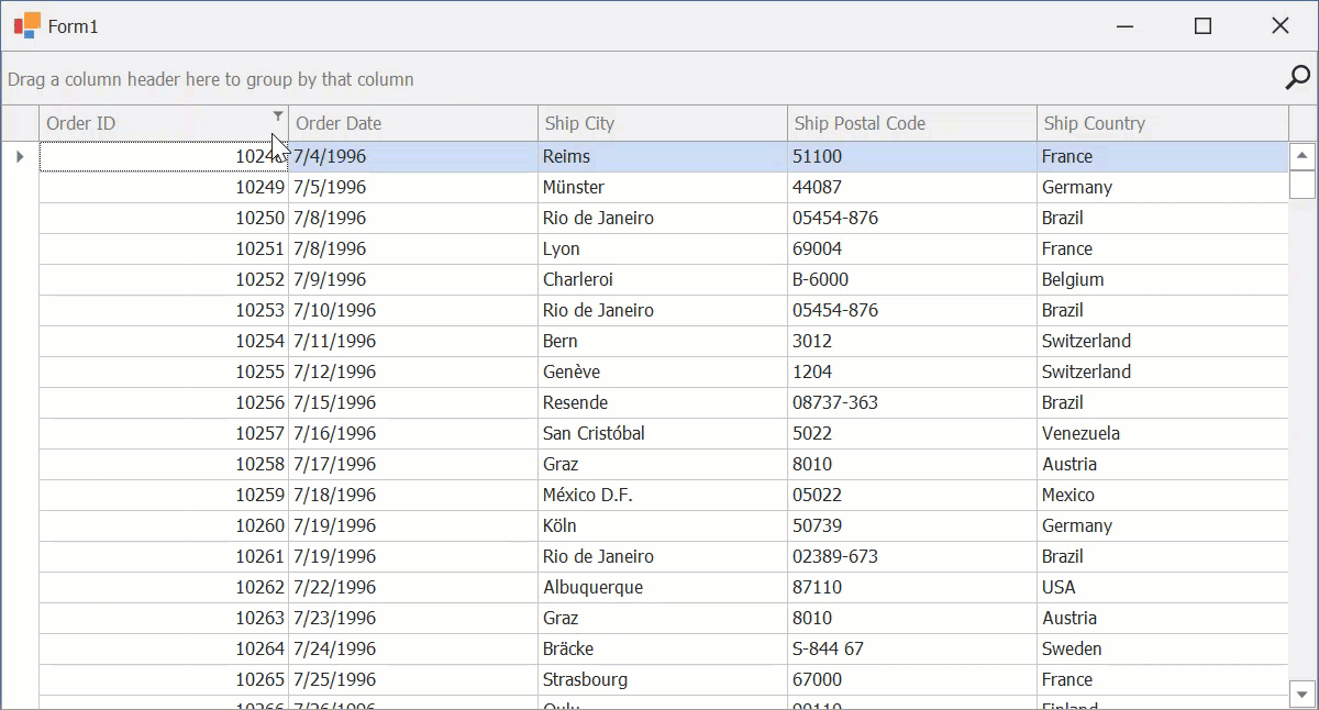
When a filter is applied, the View displays only records that match the filter criteria. You can filter data by one or multiple columns. When filtering by multiple columns, the grid combines the filters using the AND logical operator.
Most DevExpress WinForms data-aware controls (for example, Data Grid, Tree List, Vertical Grid, etc.) have a filter UI and API similar to those described in this help topic.
Tip
GridControl, GridLookUpEdit, and SearchLookUpEdit support AI-powered Semantic Search. Unlike standard keyword-based search, semantic search leverages Natural Language Processing (NLP) to analyze search queries beyond exact keyword matching. See the following help topic for additional information: Semantic Search.
Apply a Filter
Use the following properties to apply a filter:
The ColumnView.ActiveFilterString property specifies filter criteria as a string. The following code snippet applies a filter to two “OrderDate” and “ShipCity” columns:
The ColumnView.ActiveFilterCriteria property specifies filter criteria as a CriteriaOperator object:
The GridColumn.FilterInfo property specifies a filter condition for a column:
The GridView.SetAutoFilterValue method applies an Auto Filter Row condition:
using DevExpress.XtraGrid.Columns; gridView1.SetAutoFilterValue(colShipCity, "Aachen", AutoFilterCondition.Equals);Use the GridView.GetAutoFilterValue method to obtain the Auto Filter Row condition.
Clear a Filter
Use the following API to clear the filter:
The ClearColumnsFilter method clears all filter conditions applied to columns.
Tip
Set the ColumnView.ActiveFilterString property to an empty string to clear all filter conditions applied to columns.
- The GridColumn.ClearFilter method clears the column’s filter.
Filter and Search Options
Excel-style Filter Popup Menus
Users can click the filter icon within a column header to invoke a filter drop-down menu for a column. The drop-down menu contains the following tabs:
- Values
- Users can select from cell values displayed in the Data Grid or enter specific values.
- Filters
Contains a wide range of filtering options.
Note
Available filters depend on the data type of the grid column.
Note
The grid interprets user-entered values based on Find Panel syntax rules.
Refer to the following help topic for more information: Classic Menus.
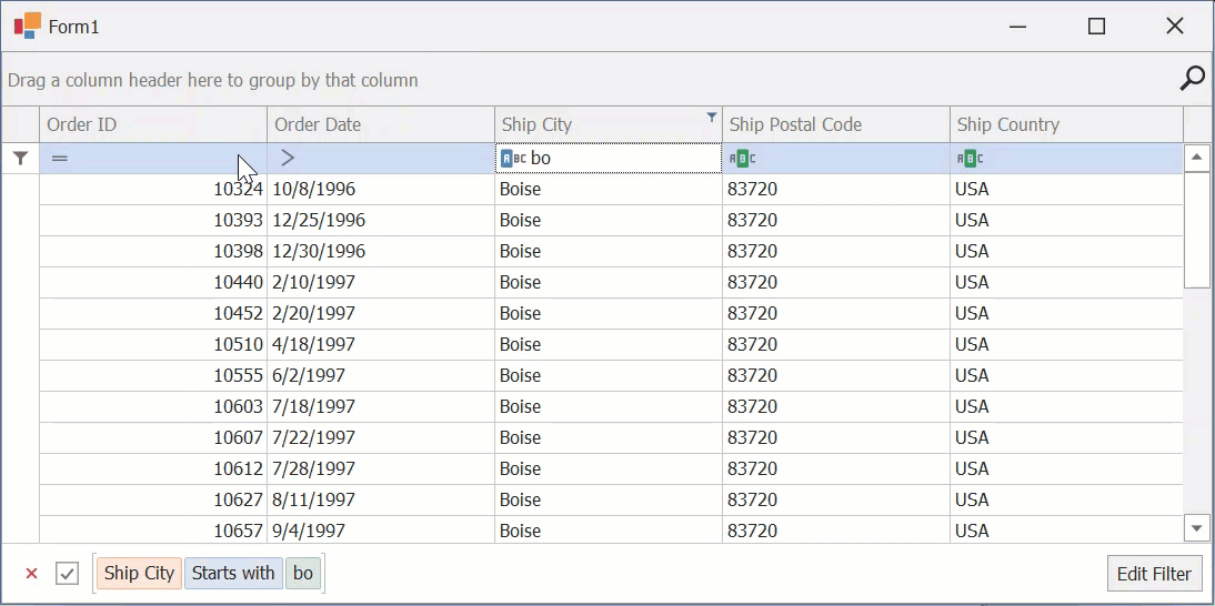
Automatic Filter Row
The Auto Filter Row is the topmost row in the grid. It allows users to create advanced filters by entering filter values (including ‘*’ and ‘%’ wildcards) and select filter operators (for example, NotLike, Equals, Between, etc.).
Enable the OptionsView.ShowAutoFilterRow property to display the Auto Filter Row.
Note
If an Auto Filter Row cell uses a RepositoryItemRichTextEdit editor, users can select only the “Like” filter condition for this cell. Other conditions (“Starts with”, “Equals”, etc.) are not available for Rich Text Formatted (RTF) values.
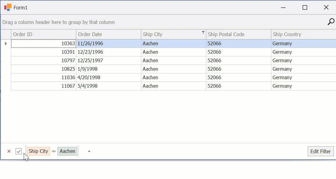
Filter Panel
When a user applies a filter, the View displays a Filter Panel. The panel’s UI includes:
- “Clear Filter” Button
- Clears the filter and closes the Filter Panel.
- “Toggle Filter” Checkbox
- Temporarily disables (removes) the current filter.
- Current Filter
- Displays the current filter.
- “Recent Filters” Button
- Opens a drop-down menu with recent filters.
- “Edit Filter” Button
- Opens the advanced Filter Editor, which allows users to modify the filter.
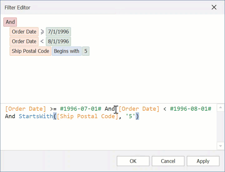
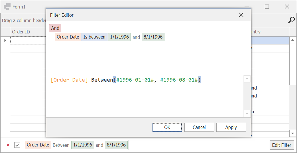
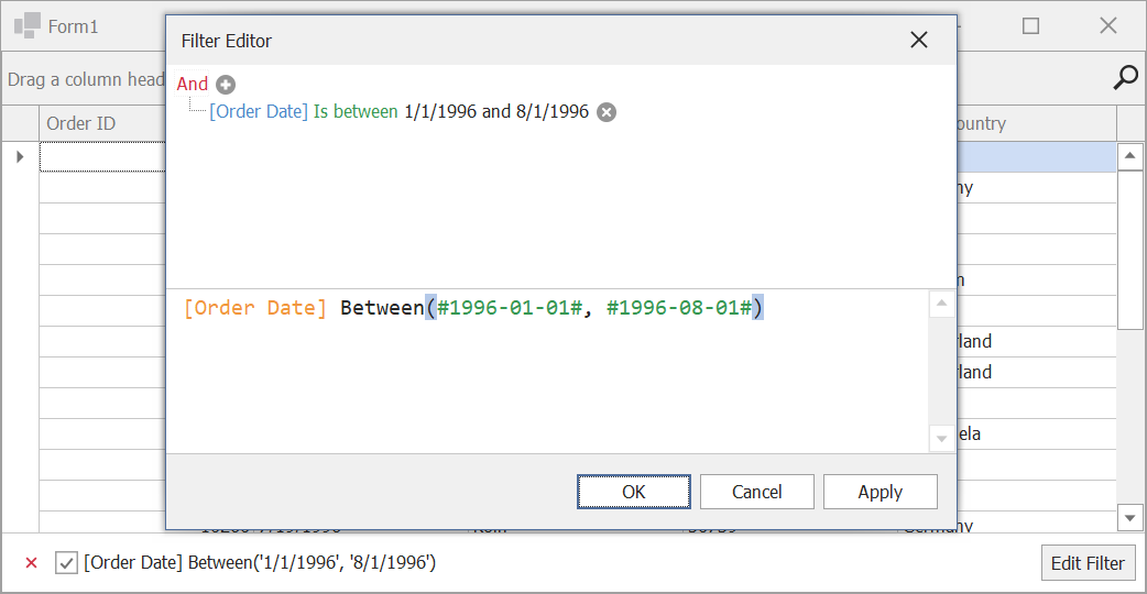
Advanced Filter Editor
The Filter Editor allows users to create complex filter criteria combined from multiple expressions. The Filter Editor supports syntax highlighting and autocomplete to facilitate user input.
Do one of the following to open the Filter Editor:
- Click Edit Filter in the Filter Panel.
- Right-click a column header and select Filter Editor.
Conditional Formatting Filters
You can filter data based on applied Conditional Formatting rules.
Users can apply these filters from:
- Excel-style Filter Menu
- Column Header Menu
- Filter Editor

Refer to the following help topic for more information: Conditional Formatting Filters.
Incremental Search
Users can focus a grid column and start typing. The Data Grid highlights matching records. To move to other matching records, users can press Ctrl+Up and Ctrl+Down hotkeys.
Enable the OptionsBehavior.AllowIncrementalSearch option to enable incremental search.
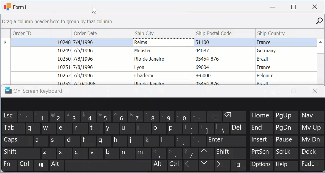
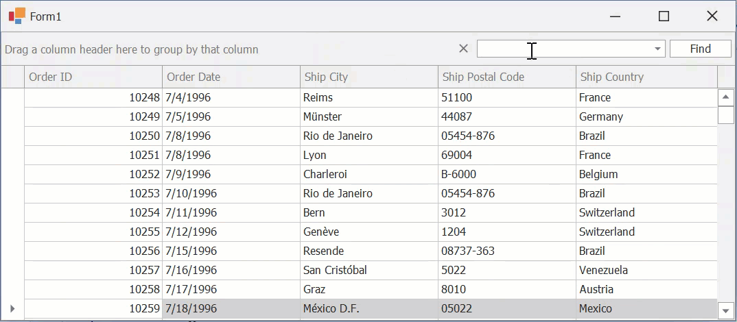
Find Panel
The Find Panel allows users to apply a temporary filter across all Data Grid columns. The grid highlights matching values. The Find Panel also gives access to previous search values.
To invoke the Find Panel, press Ctrl+F. You can configure the Find Panel so that it is always visible. Refer to the following help topic for additional information: Find Panel Options.
Note
The Find Panel does not highlight cells with HTML text.
Search in Column Headers
Use the GridOptionsFilter.InHeaderSearchMode property to enable built-in search boxes within column headers and use them to filter column data or to search in columns, depending on the mode you choose.
- TextFilter Mode
Users can type text in search boxes to filter against columns.
- TextSearch Mode
Users can type text in search boxes to search for column data. The grid highlights cell text that matches the search string.
Focus the required column and use the following shortcuts to navigate between search results:
- Ctrl+Down or F3
- Navigates to the next search result.
- Ctrl+Up or Shift+F3
- Navigates to the previous search result.
Note
The Find Panel and In-Header Search are mutually exclusive options. These features are not intended to be used together.
Search Syntax
The following list demonstrates sample search expressions supported in column header search boxes:
Spa— Finds records whose column values contain this string (in non-numeric columns).10— Finds records whose column values are equal to “10” (in numeric columns).=Spainor=22— Finds records whose column values are equal to the specified value.<>40— Finds records whose column values are not equal to the specified value.Other supported comparison operators include:
<,>,<=,>=, and!=(equivalent to<>).=USA,Spain,Germanyor=USA;Spain;Germany— Finds records whose column values are equal to any of these listed values.[10:20]or[10..20]— Finds records whose column values belong to the specified inclusive range.
Text search is case-insensitive.
Configure Filtering and Search
Note
This section lists the main built-in settings. The following help topic describes advanced filter/search scenarios: Advanced Filtering, Custom Filtering, Search.
Related Tutorials
- Tutorial: Filtering and Locating Rows API
- Tutorial: Incremental Search
- Tutorial: Search/Find Panel
- Tutorial: Column Filter Dropdowns
- Tutorial: Data Filtering Basics and Filter Panel Settings
- Tutorial: Excel-Style Custom Filter Dialog
- Tutorial: Filter Editor
- Tutorial: Filter Row
Grid/Column Settings
The following API allows you to enable, disable, or otherwise configure filtering at the level of a Grid/column.
API | Description |
|---|---|
Enables or disables the filter feature for the entire Data Grid. | |
Gets or sets whether the filter button in Grid Views (field filter button in Layout Views) is displayed within the column header. | |
Gets or sets whether the column’s values can be filtered using the Auto Filter Row. | |
Provides access to settings that affect filter menus for all columns. See ColumnViewOptionsFilter class members for the list of available settings. | |
Provides access to filter settings of a specific column. See OptionsColumnFilter class members for a list of available settings. | |
Allows you to toggle the current filter on or off. |
When a column’s filter changes, the ColumnView.ColumnFilterChanged event occurs. This event also fires when the Find Panel finishes the search.
Configure Drop-Down Menus
The following help topics describe different aspects of drop-down menu customization:
- Configure Filter Drop-Down Menus
- Customize Filter Drop-Down Menus
- Customize Masks and Formatting of Filter Editors
Configure the Auto Filter Row
Use the following API to specify Auto Filter Row settings:
API | Description |
|---|---|
Manages the visibility of the Auto Filter Row. | |
Specifies whether the auto filter row’s condition selector is visible. If this selector is disabled, entered values will be compared using the following operators: | |
Specifies the filter criteria operator for this column (“Equals”, “Like”, “Greater”, etc.). | |
If this setting is enabled, the Data Grid filters its records immediately after a user modifies the filter condition. Otherwise, the filter is not applied until a user presses the Enter key or moves focus to another cell. | |
Call this method from code to invoke the Automatic Filter Row popup menu for a specific column. | |
Fires when any popup menu is about to be shown. Allows you to customize the set of operators in an Auto Filter Row cell’s drop-down menu. |
Note
Cell editors displayed in the Automatic Filter Row ignore their masks and allow users to enter any characters.
The following code snippet keeps the numeric mask active for the Auto Filter Row:
private void GridView1_ShownEditor(object sender, System.EventArgs e) {
    GridView view = sender as GridView;
    TextEdit edit = view.ActiveEditor as TextEdit;
    if (edit != null && view.IsFilterRow(view.FocusedRowHandle))
        edit.Properties.Mask.MaskType = DevExpress.XtraEditors.Mask.MaskType.Numeric;
}
Configure the Filter Panel
Use the following API to specify Filter Panel settings:
API | Description |
|---|---|
Manages filter panel visibility. | |
Allows you to hide the button that invokes the list with recently applied filters. | |
Controls the Edit Filter button’s visibility. |
Configure Incremental Search
Use the following API to handle search operations:
API | Description |
|---|---|
Enables or disables incremental search. | |
Returns the searched text during incremental search. | |
Triggers incremental search. | |
Cancels incremental search. |
Configure the Filter Editor
The following help topics describe different aspects of Filter Editor customization:
Configure the Filter Criteria Display Style
The following properties get or set the display style of filter criteria in the Find Panel and built-in Filter Editor at different levels:
Property | Level |
|---|---|
The entire application. | |
A single View. |
Available display styles include:
- Visual
Renders filter criteria in an easy-to-read format and uses skin-based colored highlights to differentiate between column names, functions, and values. In the Filter Panel, the ‘x’ button is displayed when you hover over a condition. This button allows users to remove individual conditions from the filter.
- Text
Renders filter criteria in a text-based format.
Configure the Find Panel
Use the following API to specify Find Panel settings:
API | Description |
|---|---|
Manages the availability of the Find Panel. | |
Gets or sets whether records that do not match the query are hidden. | |
If text entered into the Find Panel contains whitespace, the Panel splits this string into separate logical blocks. The ParserKind setting specifies how these blocks are combined into a search query. | |
Gets or sets the condition according to which the Data Grid searches for the string entered into the Find Panel. | |
Gets or sets whether a user must press Enter or click the “Find” button to start a search, or it starts automatically after a certain delay (the ColumnViewOptionsFind.FindDelay property). | |
Gets or sets whether to search data in expanded detail views. | |
Gets settings that allow you to display custom items within the Find Panel. |
Refer to the following topic for more information: Find Panel.
Configure Search in Column Headers
Use the following API to handle search operations:
API | Description |
|---|---|
Allows you to disable search boxes in individual column headers. | |
Clears search text (contents of column header search boxes) for all columns. | |
Hides the currently active column header search box. | |
Activates a built-in header search box for a specific column. | |
Gets or sets the text of the column’s built-in header search box. This property is supported in Grid Views and Banded Grid Views. | |
Gets or sets a grayed out hint displayed in an empty header search box when the search box is activated. | |
Gets or sets whether to display search text (GridColumn.SearchText) in column header tooltips. |
Refer to the following topic for more information: GridView.OptionsFilter.InHeaderSearchMode.
AI-powered Semantic Search
Semantic search enables users to locate relevant data quickly and accurately within large datasets. Unlike standard keyword-based search, semantic search leverages Natural Language Processing (NLP) to analyze search queries beyond exact keyword matching.
Read the following help topic to learn more: AI-powered Semantic Search.
Examples
- How to: Apply a Filter to a Column
- How to: Apply a Filter to a View
- How to: Specify a Filter for a View Without Binding It to Any Particular Column
- How to: Display a Custom String in the Filter Panel when a View’s Data is not Filtered
- How to: Create and Register Custom Functions
- How to: Dynamically Control Record Visibility in XtraGrid
- How to: Get Data Rows in a Filtered Grid
- How to: Change the Color of Highlighted Search Results
- How to: Customize the Layout of the Find Panel
- How to: Perform Custom Filtering When the (Custom) Item is Selected in the Filter Dropdown
- How to: Filter a LookUp(ComboBox) Column Based on Another Column Value
- How to: Customize the Checked Filter Dropdown List
- How to: Make the Auto Filter Row Insensitive to Accents
- How to: Locate a Data Row by Display Text
- How to: Highlight Cell Text that Matches the Filter (Auto Filter Row)
- How to: Customize Filter Criteria before It is Applied
- How to: Rename Grid Filters and Serialize Custom Names
- What Can Cause Properties, Methods, and Events of a Detail View to Fail?
Cheat Sheets and Best Practices
DevExpress data-aware UI controls support a similar filter UI and API. See the following quick-reference guides for detailed information:
Filter DevExpress Data-Aware Controls