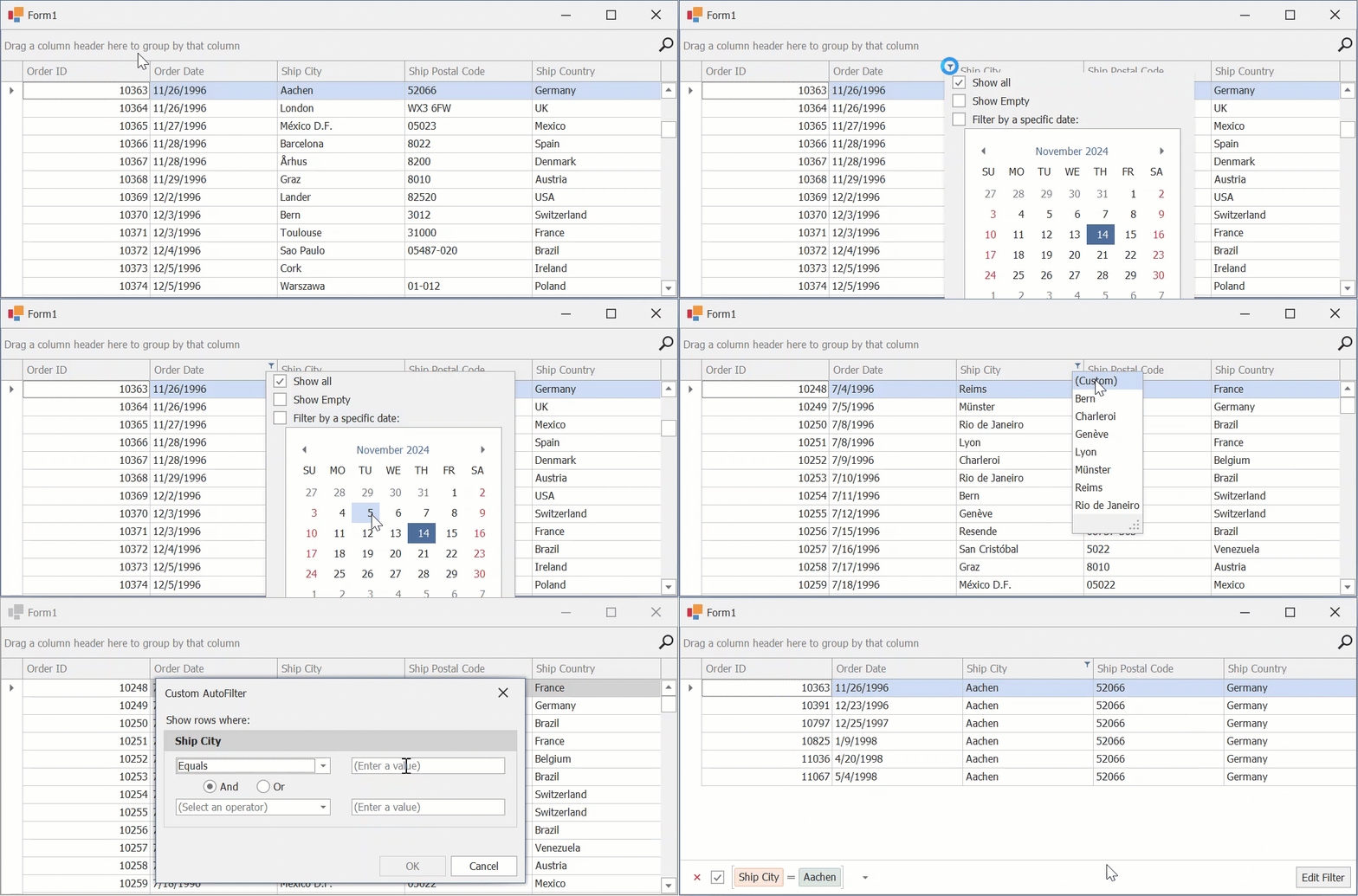
Column's Filter Dropdown
- 3 minutes to read
Filter dropdowns allow users to apply filter criteria to columns in the GridView and its descendants, and to card fields in the CardView and LayoutView.

Excel-style Menus
The default filter menu type in v17.1 and higher.
Contains the following tabs:
- Values
- Users can select from cell values displayed in the Data Grid or enter specific values.
- Filters
- Gives a wider pool of filter options. For example, in a date column, the user can select only records that correspond to the previous week.
Selection options depend on the type of data in the grid column.

Classic Menus
Displays regular drop-down lists or checked lists for all data types except for DateTime columns. The display mode of DateTime values depends on the OptionsColumnFilter.FilterPopupMode property value.

Customize Menus
Common Settings
The following settings get or set the display mode of drop-down menus at different levels:
Property | Level |
|---|---|
The entire application. | |
A specific View. | |
A specific column. |
The following API members apply to both Excel-style and Classic menus:
API | Description |
|---|---|
Gets or sets the maximum number of records that are scanned to populate column filter dropdowns with unique filter values. | |
ColumnViewOptionsFilter.ShowAllTableValuesInCheckedFilterPopup | Gets or sets whether checked filter drop-down lists display unique values from all data source records or only from records that meet the current filter criteria. |
Displays a filter drop-down menu for the specified column. |
Excel-style-related Settings
The following table lists the main settings of Excel-style drop-down menus:
API | Description |
|---|---|
If your DevExpress installation version is older than v17.1, switch this setting to | |
Gets or sets whether filter conditions immediately apply to data, or only when the filter dropdown is closed. | |
Handle this event to customize Excel-style filters. |
See the following help topics for more information and examples:
Classic-style Drop-Down Menu Settings
The following table lists the main settings of classic drop-down menus:
API | Description |
|---|---|
An alternative property that allows you to enable classic filter drop-down menus. To enable classic filter menus, set this property to | |
Gets or sets the maximum number of items that regular drop-down menus can display simultaneously. | |
If this property is enabled, regular drop-down lists remember values most recently selected by users. These values are shown before the default Custom item. | |
Gets or sets whether the (Blanks) and (Non Blanks) items are available within filter drop-down menus. |
Use the following API to configure checked lists in classic drop-down menus (except for calendar menus):
API | Description |
|---|---|
Set the property to | |
This event allows you to modify items within the checked list filter menu, including the standard Select All item. |
Use the following API to configure calendar drop-down menus:
API | Description |
|---|---|
Set this property to | |
If this setting is enabled, filters are applied right after users toggle calendar-based menu check boxes. | |
OptionsColumnFilter.ImmediateUpdatePopupDateFilterOnDateChange | If this setting is enabled, a filter is applied right after a user selects a date (or a date range) within a calendar-based menu. |
Gets or sets whether drop-down menus display the Show Empty filter item. Users can check this item to view records that have no values in the corresponding DateTime column. |
See the following help topic for more information and examples: Customize Filter Drop-down Menus.