ColumnViewOptionsView.FilterCriteriaDisplayStyle Property
Gets or sets the display style of filter conditions in the Filter Panel and built-in Filter Editor.
Namespace: DevExpress.XtraGrid.Views.Base
Assembly: DevExpress.XtraGrid.v26.1.dll
Declaration
[DefaultValue(FilterCriteriaDisplayStyle.Default)]
[XtraSerializableProperty]
public FilterCriteriaDisplayStyle FilterCriteriaDisplayStyle { get; set; }Property Value
| Type | Default | Description |
|---|---|---|
| FilterCriteriaDisplayStyle | Default | The display style of filter conditions in the Filter Panel and built-in Filter Editor. When the FilterCriteriaDisplayStyle property is set to Default, the actual display style is specified by the static WindowsFormsSettings.FilterCriteriaDisplayStyle property. |
Available values:
| Name | Description |
|---|---|
| Default | When a control’s FilterCriteriaDisplayStyle property is set to Default, the actual display style is specified by the WindowsFormsSettings.FilterCriteriaDisplayStyle property. For the Report Designer and Dashboard Designer, the default display style is Visual. For other controls, the default display style is Visual starting from v21.1; in older versions, the default display style is Text. |
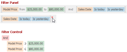
| Visual | Renders filter criteria in an easy-to-read format and uses skin-based colored highlights to differentiate between column names, functions, and values. In the Filter Panel, the ‘x’ button is displayed when you hover over a condition. This button allows users to remove individual conditions from the filter.
|
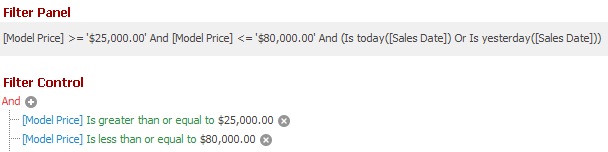
| Text | Renders filter criteria in a text-based format.
|
Property Paths
You can access this nested property as listed below:
| Object Type | Path to FilterCriteriaDisplayStyle |
|---|---|
| ColumnView |
|
Remarks
Use the static WindowsFormsSettings.FilterCriteriaDisplayStyle property to specify the default display style of filter criteria for controls in your application (Data Grid, Tree List, Vertical Grid, Pivot Grid and Filter Editors). Individual grid and tree list controls override this setting if you set their FilterCriteriaDisplayStyle property to any value except Default.
The following list demonstrates the available display styles of filter criteria in controls.
Visual -
Renders filter criteria in an easy-to-read format and uses skin-based colored highlights to differentiate between column names, functions, and values. In the Filter Panel, the ‘x’ button is displayed when you hover over a condition. This button allows users to remove individual conditions from the filter.
Text -
Renders filter criteria in a text-based format.
Note
You can bind a standalone Filter Control to a data-aware control (Grid, Tree List, etc.) with the SourceControl property (FilterControl.SourceControl, FilterEditorControl.SourceControl). When you change the data-aware control’s FilterCriteriaDisplayStyle property at runtime, the standalone Filter Control does not automatically update its appearance to match the new display style. To forcibly update the Filter Control’s appearance, call the Filter Control’s LayoutChanged method.
Related GitHub Examples
The following code snippets (auto-collected from DevExpress Examples) contain references to the FilterCriteriaDisplayStyle property.
Note
The algorithm used to collect these code examples remains a work in progress. Accordingly, the links and snippets below may produce inaccurate results. If you encounter an issue with code examples below, please use the feedback form on this page to report the issue.