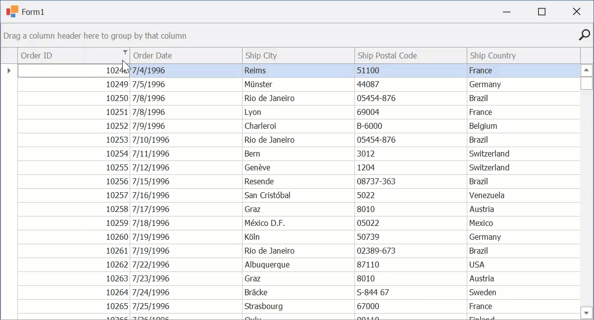
Filter Button
Filter buttons are displayed within column headers. Click the filter button to open the filter dropdown and specify a filter condition.
Settings
Style | Use the GridOptionsView.HeaderFilterButtonShowMode property to specify the display mode: smart tag or standard. |
Appearance | Use ColumnFilterButton and ColumnFilterButtonActive to customize appearance settings of filter buttons. Note These appearance settings are not in effect if filter buttons are rendered as smart tags. |
Custom Draw Event | Handle the GridView.CustomDrawColumnHeader event to manually draw column headers and their UI elements. |
Icon Settings | To specify a custom filter button icon, create a custom Skin in the WinForms Skin Editor. The skin element that corresponds to the filter button is Smart Filter (located under Grid → Column Headers → Filtering). |
Availability | Use the View’s OptionsCustomization.AllowFilter or a column’s OptionsColumnFilter.AllowFilter property to control the availability of filter buttons for the entire View or for individual columns, respectively. |