Popup and Context Menus
- 6 minutes to read
This topic shows how to customize a Data Grid’s built-in popup menus, override the default menu item actions, and use events to create custom popup menus.
Note
This topic does not cover in-place editors’ menu items.
Built-In Context Menus
The Data Grid’s Grid Views and Banded Grid Views have the following built-in context menus:
Column Header Menu (right-click a column header)
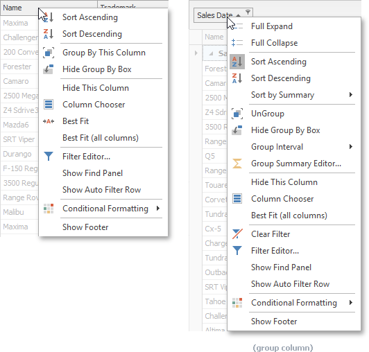
Menu Item Visibility controlled by Menu Availability GridOptionsMenu.EnableColumnMenu Show/Hide Auto Filter Row command GridOptionsMenu.ShowAutoFilterRowItem Group Interval sub-menu (available for date-time columns) GridOptionsMenu.ShowDateTimeGroupIntervalItems Sort by Summary sub-menu (available for grouping columns) GridOptionsMenu.ShowGroupSortSummaryItems Conditional Formatting sub-menu (hidden by default) GridOptionsMenu.ShowConditionalFormattingItem Show/Hide Footer command (hidden by default) GridOptionsMenu.ShowFooterItem Group Summary Editor action (hidden by default; available for grouping columns) GridOptionsMenu.ShowGroupSummaryEditorItem Split/Remove Split command (available when Data Grid is hosted inside a GridSplitContainer) GridOptionsMenu.ShowSplitItem Group Panel Menu (right-click the Group Panel)
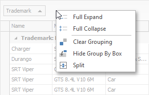
Menu Item Visibility controlled by Menu Availability GridOptionsMenu.EnableGroupPanelMenu ‘Split’/‘Remove Split’ command (available when Data Grid is hosted inside a GridSplitContainer) GridOptionsMenu.ShowSplitItem Group Row Menu (right-click a Group Row)
Set the GridOptionsMenu.EnableGroupRowMenu property to
trueto invoke this menu when a user right-clicks a group row.Summary Menu (right-click the total summary footer and group summary footers)
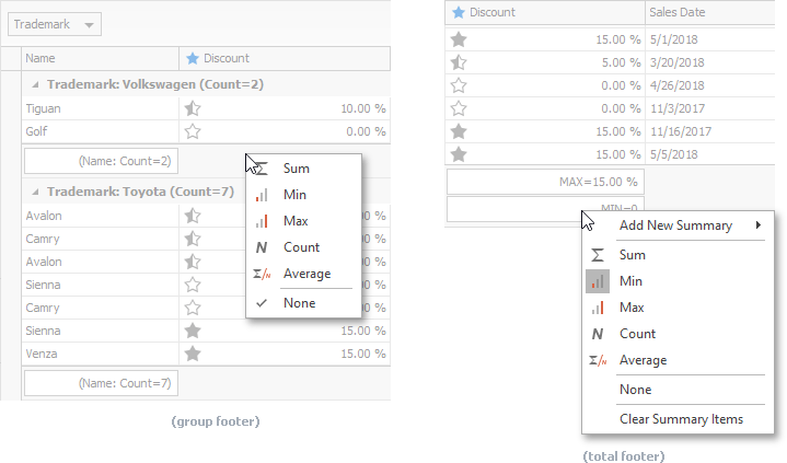
Menu Item Visibility controlled by Menu Availability GridOptionsMenu.EnableFooterMenu ‘Add New Summary’ sub-menu (hidden by default; not supported for group summary footers) GridOptionsMenu.ShowAddNewSummaryItem Auto-Filter Row Menu (click a condition selector in the Auto-Filter Row)
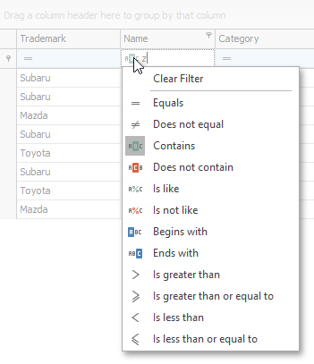
Menu Item Visibility controlled by Menu Availability GridOptionsFilter.AllowAutoFilterConditionChange Row Menu (right-click a data row)
This menu is initially empty. Handle the GridView.PopupMenuShowing event to display a menu when a user right-clicks rows.
View properties can affect the availability of items in these menus. For example, when you disable the GridOptionsCustomization.AllowSort option, the View deactivates the Sort Ascending and Sort Descending items in the Column Header Menu.
Not all menu items can be hidden through View properties. To control menu item visibility, use the GridView.PopupMenuShowing event as demonstrated in the following topic: Modify Built-In Context Menus.
Custom Context Menus
You can create a custom context menu (PopupMenu) and invoke this menu when a user right-clicks a grid element. This technique has the following common concepts:
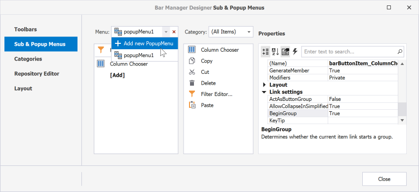
Use the BarManager designer to create a popup menu and populate it with items as demonstrated in the following help topic: Popup Menus.
The GridView.PopupMenuShowing event allows you to invoke a custom context menu or modify built-in menus.
The e.HitInfo property returns information about the control area right-clicked by a user (a GridHitInfo object for the Data Grid).
You can invoke your context menu instead of a built-in menu or for a custom area:
void gridView1_PopupMenuShowing(object sender, PopupMenuShowingEventArgs e) { // Invoke a custom menu instead of the built-in column header context menu: if (e.MenuType == GridMenuType.Column) e.ShowCustomMenu(ColumnPopupMenu); // Invoke a custom menu when a user right-clicks the filter panel: if (e.HitInfo.InFilterPanel) e.ShowCustomMenu(FilterPanelPopupMenu); }We recommend that you assign the e.HitInfo property to the PopupMenuBase.Tag property to pass information about a clicked element to your menu.
void gridView1_PopupMenuShowing(object sender, PopupMenuShowingEventArgs e) {
    // ...
    MyMenu.Tag = e.HitInfo;
    e.ShowCustomMenu(MyMenu);
}

GridHitInfo GetHitInfo(BarItemLink link) {
    PopupMenu menu = link.LinkedObject as PopupMenu;
    return menu.Tag as GridHitInfo;
}
void barButtonItem_ItemClick(object sender, ItemClickEventArgs e) {
    GridHitInfo info = GetHitInfo(e.Link);
    info.View.ShowFilterEditor(info.Column);
}
Show a Custom Popup Menu for Grid Elements
The following code sample invokes a custom context menu when a user right-clicks a column header:
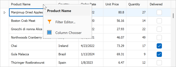
Add a BarManager to the form and create a custom PopupMenu.
Handle the GridView.PopupMenuShowing event and call the e.ShowCustomMenu method to display your custom menu instead of the default header menu.
void gridView1_PopupMenuShowing(object sender, PopupMenuShowingEventArgs e) {
    if (e.MenuType == GridMenuType.Column) {
        popupMenu_Column.Tag = e.HitInfo;
        popupMenu_Column.MenuCaption = $"{e.HitInfo.Column}";

        e.ShowCustomMenu(popupMenu_Column);
    }
}

GridHitInfo GetHitInfo(BarItemLink link) {
    PopupMenu menu = link.LinkedObject as PopupMenu;
    return menu.Tag as GridHitInfo;
}
void barButtonItem_Filter_ItemClick(object sender, ItemClickEventArgs e) {
    GridHitInfo info = GetHitInfo(e.Link);
    info.View.ShowFilterEditor(info.Column);
}

void barButtonItem_ColumnChooser_ItemClick(object sender, ItemClickEventArgs e) {
    GridHitInfo info = GetHitInfo(e.Link);
    info.View.ShowCustomization();
}
Add a Context Menu for Grid Empty Space
The GridView.PopupMenuShowing event allows you to invoke a context menu when a user right-clicks an area that does not contain any grid elements:
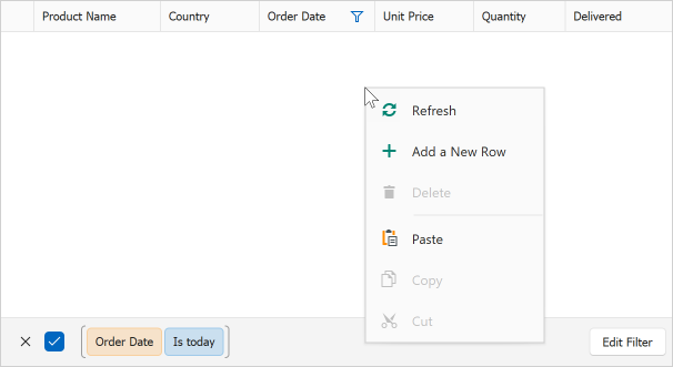
The e.MenuType property returns User when a user right-clicks an empty space, Filter Panel, Group Row, or Header Panel Button. Create a condition applied to empty area only and use the e.ShowCustomMenu method to invoke your context menu:
void gridView1_PopupMenuShowing(object sender, PopupMenuShowingEventArgs e) {
    if (e.MenuType == GridMenuType.User && !e.HitInfo.InFilterPanel
        && !e.HitInfo.InGroupRow && e.HitInfo.HitTest != GridHitTest.ColumnButton) {
        popupMenu_Empty.Tag = e.HitInfo;
        e.ShowCustomMenu(popupMenu_Empty);
    }
}
Modify Built-In Popup Menus
You can add, modify, and remove items displayed in default context menus. Use this technique only if custom context menus do not suit your requirements. Refer to the following help topic for more information: Modify Built-In Context Menus.
Menu Appearance and Behavior
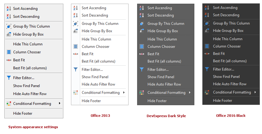
The Data Grid paints its menus according to system settings, without taking into account the current skin.
To apply a skin to the Data Grid’s menus, place a BarManager or RibbonControl component onto the form. This component is automatically bound to the Data Grid’s EditorContainer.MenuManager property. The RibbonControl/BarManager now manages the display and behavior of the grid’s menus, and applies the selected paint scheme (skin) to them.
The following image shows a column header menu painted using different themes.
You can use the Project Settings Page or the DefaultLookAndFeel component to customize the default paint scheme for all controls, including the data grid’s popup menus.
Cheat Sheets and Best Practices
Read the following quick-reference guide for general information and examples: