TreeViewControl.SelectionRectangleStyle Property
Gets or sets a style for the selection rectangle. This is a dependency property.
Namespace: DevExpress.Xpf.Grid
Assembly: DevExpress.Xpf.Grid.v26.1.dll
Declaration
Property Value
| Type | Description |
|---|---|
| Style | A custom Style for the selection rectangle. |
Remarks
Use the ShowSelectionRectangle property to display the selection rectangle when users select multiple nodes.
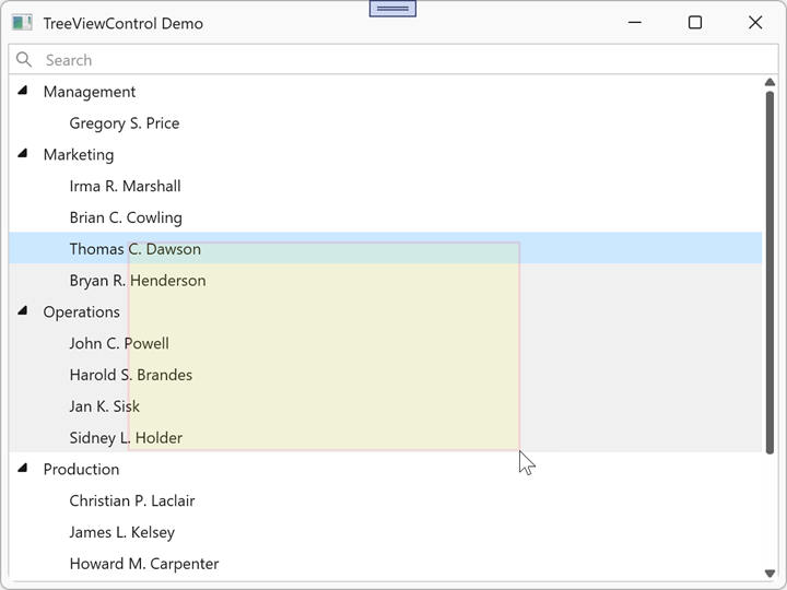
Example: Customize Selection Rectangle Appearance
The following example customizes the selection rectangle’s appearance:
<dx:ThemedWindow x:Class="TreeViewControlApp.MainWindow"
                 xmlns="http://schemas.microsoft.com/winfx/2006/xaml/presentation"
                 xmlns:x="http://schemas.microsoft.com/winfx/2006/xaml"
                 xmlns:dx="http://schemas.devexpress.com/winfx/2008/xaml/core"
                 xmlns:dxg="http://schemas.devexpress.com/winfx/2008/xaml/grid"
                 Title="TreeViewControl Demo" Height="450" Width="600">
    <dxg:TreeViewControl x:Name="tree"
                         ChildNodesPath="Employees"
                         TreeViewFieldName="Name"
                         ShowSelectionRectangle="True">
        <dxg:TreeViewControl.SelectionRectangleStyle>
            <Style TargetType="Border">
                <Setter Property="Opacity" Value="0.1" />
                <Setter Property="Background" Value="Yellow" />
                <Setter Property="BorderBrush" Value="Red" />
                <Setter Property="BorderThickness" Value="2" />
            </Style>
        </dxg:TreeViewControl.SelectionRectangleStyle>
    </dxg:TreeViewControl>
</dx:ThemedWindow>
See Also