TreeViewControl.FocusedRowBorderTemplate Property
Gets or sets the template that displays the focused node border. This is a dependency property.
Namespace: DevExpress.Xpf.Grid
Assembly: DevExpress.Xpf.Grid.v26.1.dll
Declaration
Property Value
| Type | Description |
|---|---|
| ControlTemplate | A ControlTemplate that displays the focused node border. |
Remarks
The FocusedRowBorderTemplate is applied only when the ShowFocusedRectangle property is set to true and the AllowEditing property is set to false.
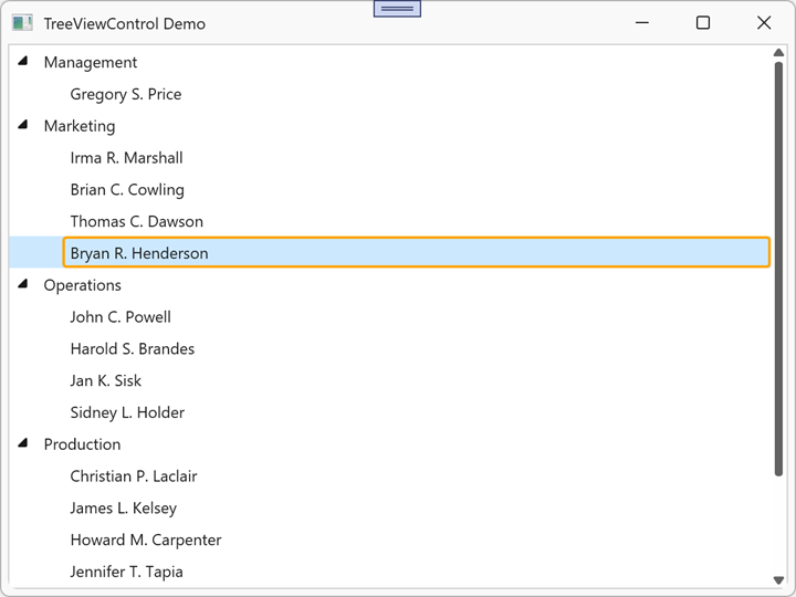
Example: Apply a Custom Border to the Focused Node
The following example displays an Orange border when a node is focused:
<dx:ThemedWindow x:Class="TreeViewControlApp.MainWindow"
                 xmlns="http://schemas.microsoft.com/winfx/2006/xaml/presentation"
                 xmlns:x="http://schemas.microsoft.com/winfx/2006/xaml"
                 xmlns:dx="http://schemas.devexpress.com/winfx/2008/xaml/core"
                 xmlns:dxg="http://schemas.devexpress.com/winfx/2008/xaml/grid"
                 Title="TreeViewControl Demo" Height="450" Width="600">
        <dxg:TreeViewControl x:Name="tree"
                             ChildNodesPath="Employees"
                             TreeViewFieldName="Name"
                             ShowFocusedRectangle="True"
                             AllowEditing="False">
            <dxg:TreeViewControl.FocusedRowBorderTemplate>
                <ControlTemplate>
                    <Border CornerRadius="5" BorderThickness="2" BorderBrush="Orange"/>
                </ControlTemplate>
            </dxg:TreeViewControl.FocusedRowBorderTemplate>
        </dxg:TreeViewControl>
</dx:ThemedWindow>
Refer to the following help topic for additional information: Appearance Customization.
See Also