Automatic Filter Row
- 5 minutes to read
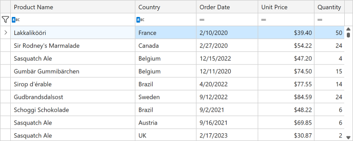
The Automatic Filter Row displays filter cells for each column. In each cell, users can type a filter value and, optionally, select a condition (such as “does not equal”, “greater than”, “contains”, and others).
Display the Automatic Filter Row
Set the TableView.ShowAutoFilterRow property to true to display the Automatic Filter Row:
The TableView.AutoFilterRowPosition property allows you to specify where to display the Automatic Filter Row. Set this property to Header to embed the Automatic Filter Row into the Column Header Panel. In this case, the GridControl adds “magnifying glass” icons ( ) to column headers. These icons become visible when a user hovers the mouse pointer over a header. Once a user clicks on such an icon, the entire column header becomes the Automatic Filter Row cell:

Users can press the Tab key to move focus to the next column header and edit that column’s filter. The Shift+Tab combination moves focus to the previous column.
Set the ColumnBase.AllowAutoFilter property to false to disable the Automatic Filter Row cell for a column.
Specify the Filter Mode
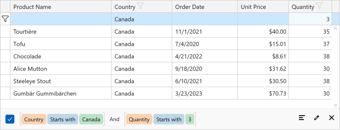
The Automatic Filter Row‘s default filter criteria is BeginsWith (Equals for Boolean columns). These criteria can vary based on the ShowCriteriaInAutoFilterRow property value. Refer to the following section for more information: Display the Filter Criteria Selector.
You can use the ColumnBase.AutoFilterCriteria property to specify the column’s filter criteria:
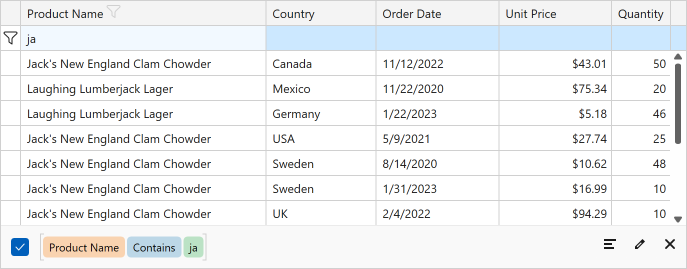
<dxg:GridColumn FieldName="ProductName" AutoFilterCriteria="Contains"/>
Set the ColumnBase.ColumnFilterMode property to DisplayText to allow users to filter data if you apply a custom format that displays data:
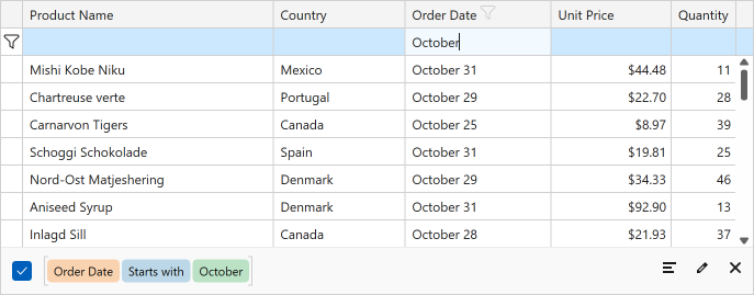
<dxg:GridColumn FieldName="OrderDate" ColumnFilterMode="DisplayText">
    <dxg:GridColumn.EditSettings>
        <dxe:DateEditSettings MaskType="DateTime"
                              Mask="m"
                              MaskUseAsDisplayFormat="True"/>
    </dxg:GridColumn.EditSettings>
</dxg:GridColumn>
Modify Automatic Filter Row Behavior
- Apply Filter
- The GridControl updates its filter when a user modifies a cell value in the Automatic Filter Row. Set the ColumnBase.ImmediateUpdateAutoFilter property to
falseto update the GridControl‘s filter only after a user presses theEnterkey or focuses another cell. - Filter Delay
- Use the DataViewBase.FilterRowDelay property to specify the time in milliseconds between the Automatic Filter Row modification and the GridControl filter update.
- Filter DateTime Values
- The GridControl ignores time parts when a user filters data by DateTime values. Set the ColumnBase.RoundDateTimeForColumnFilter property to
falseto take time parts into account. - Clear Button
- If a user enters a value into an Automatic Filter Row cell, the clear button appears. This button clears the cell value. Use the TableView.AutoFilterRowClearButtonMode and TreeListView.AutoFilterRowClearButtonMode properties to control this button’s availability.
Work with the Auto Filter Row in Code
You can use the ColumnBase.AutoFilterValue property to obtain or specify a cell value in the Automatic Filter Row.
The DataControlBase.AutoFilterRowHandle field returns the Automatic Filter Row‘s handle. Row handles allow you to identify grid rows. Refer to the following help topic for more information: Obtain Row Handles.
Use ShowEditor(Boolean) and HideEditor() methods to activate/deactivate the Automatic Filter Row‘s focused editor:
grid.CurrentColumn = grid.Columns[nameof(Product.Quantity)];
view.FocusedRowHandle = DataControlBase.AutoFilterRowHandle;
view.ShowEditor(true);
Customize Automatic Filter Row Appearance
The following table lists appearance settings for the Automatic Filter Row:
| Property | Description |
|---|---|
| ColumnBase.AutoFilterRowDisplayTemplate | Gets or sets a template that displays a column’s value within the Automatic Filter Row. This is a dependency property. |
| ColumnBase.AutoFilterRowEditTemplate | Gets or sets the BaseEdit.EditTemplate for an Automatic Filter Row cell editor. This is a dependency property. |
| ColumnBase.AutoFilterRowCellStyle | Gets or sets the style applied to the Automatic Filter Row‘s cell. This is a dependency property. |
| TableView.AutoFilterRowCellStyle / TreeListView.AutoFilterRowCellStyle | Gets or sets the style applied to the Automatic Filter Row‘s cells. This is a dependency property. |
The following code sample highlights an Automatic Filter Row cell if that cell is not empty:
<dxg:GridControl.View>
    <dxg:TableView ShowAutoFilterRow="True"
                   ShowCriteriaInAutoFilterRow="True">
        <dxg:TableView.AutoFilterRowCellStyle>
            <Style TargetType="dxg:FilterCellContentPresenter">
                <Style.Triggers>
                    <DataTrigger Binding="{Binding Column.AutoFilterValue, Converter={dxmvvm:ObjectToBooleanConverter}}"
                                 Value="True">
                        <Setter Property="Background" Value="LightYellow"/>
                    </DataTrigger>
                </Style.Triggers>
            </Style>
        </dxg:TableView.AutoFilterRowCellStyle>
    </dxg:TableView>
</dxg:GridControl.View>
An Automatic Filter Row cell displays an editor specified in the column’s EditSettings property. If you set this property to CheckEditSettings, the Automatic Filter Row ignores ColumnFilterMode and AutoFilterCriteria properties and sets the column’s filter criterion to Equals.
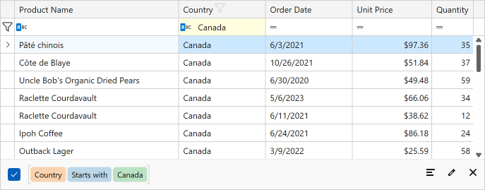
Display the Filter Criteria Selector
The Filter Criteria Selector allows users to specify the column’s filter criterion. This selector is invoked when a user clicks the Filter Criteria Button:
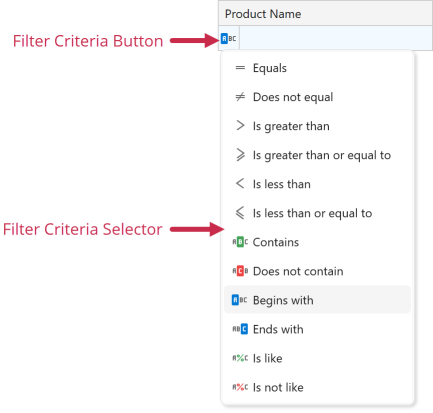
Set the TableView.ShowCriteriaInAutoFilterRow property to true to display Filter Criteria Buttons in Automatic Filter Row cells. The ColumnBase.ShowCriteriaInAutoFilterRow property allows you to specify button visibility for each column.
The GridControl changes the Automatic Filter Row‘s default filter criteria when you display the Filter Criteria Button:
- BeginsWith
- Applies to
stringcolumns and columns with the ColumnBase.ColumnFilterMode property set toDisplayText. - Equals
- Applies to other column types (
int,double,DateTime,bool, and so on).
Adjust Criteria Selector Filters
The Filter Criteria Selector displays filter criteria based on the column’s type. You can use properties from the following help topic to change the filter list: Allowed Filters.
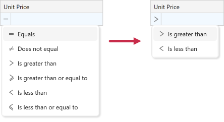
<dxg:GridColumn FieldName="UnitPrice"
                AllowedBinaryFilters="Greater, Less"
                AutoFilterCriteria="Greater"/>
If you hide a column’s default filter criteria, the GridControl disables the corresponding cell in the Automatic Filter Row. To avoid this, set the ColumnBase.AutoFilterCriteria property to any of the allowed filter criteria.