Master-Detail Data Representation
- 3 minutes to read
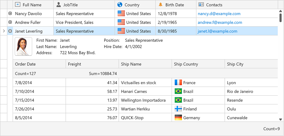
The GridControl supports master-detail data presentation. In this mode, the GridControl displays a set of detail (child) records for each master (parent) row.

You can display detail data in any visual form:
- Table
- Detail data are displayed within a nested grid.
- Custom
- Detail data are displayed within a custom data template.
- Tabbed
- Detail data are organized in tabbed layout. Each tab can display a nested grid or custom content.
Detail Rendering Specifics
The detail descriptor content is used as a factory to create details. This means the standard layout customization properties do not work for details.
Tip
You can use the master view’s DataViewBase.FocusedView property to get the focused detail view. This property returns the master view if it is focused.
Use the focused detail view’s DataViewBase.DataControl property to get a focused detail GridControl instance.
Changing the column order and size in any detail grid affects all the detail grids simultaneously.
Note that detail grids are integrated into the master grid’s Group Panel, Filter Panel, and other UI Elements. You can identify details in those elements by their captions (DataViewBase.DetailHeaderContent property values converted to strings).
Scrolling
Detail grids are built in the master grid visual tree. This means the master and detail grids share vertical and horizontal scrollbars.
Limitations
Refer to the Master-Detail Mode Limitations topic to learn about the master-detail mode’s architectural limitations.
Expand and Collapse Master Rows
Use the GridControl.ExpandMasterRow and GridControl.CollapseMasterRow methods to expand and collapse master rows. You can collapse and expand master rows using a single GridControl.SetMasterRowExpanded method.
To get a specific row’s state, use the GridControl.IsMasterRowExpanded method.
Use the GridControl.MasterRowCollapsing and GridControl.MasterRowExpanding events to prevent master rows from collapsing or expanding.
The GridControl.MasterRowExpanded and GridControl.MasterRowCollapsed events allow you to perform additional processing after a master row was expanded or collapsed.
Expand Button Visibility
The TableView.ShowDetailButtons property allows you to hide all expand buttons. You can use the TableView.IsDetailButtonVisibleBinding property to selectively display or hide detail expand buttons.
Expand and Collapse Shortcuts
Users can press the Ctrl++ or Ctrl+- shortcut to expand or collapse the focused master row.
Obtain Details
Use the GridControl.GetDetail to obtain a detail data control identified by the master row and its Detail Descriptor. This method returns null if no DataControlDetailDescriptor objects are used as details on this level or if corresponding details are collapsed.
You can obtain detail controls and descriptors using the following methods:
- GridControl.GetVisibleDetail - Returns the currently visible detail data control identified by its master row.
- GridControl.GetVisibleDetailDescriptor - Returns the Detail Descriptor corresponding to the currently expanded detail of the specified master row.
Appearance Customization
Margins
The GridControl supports custom margins for the details. You can define detail margins using the DetailDescriptorBase.Margin property.
Use the ExpandDetailButtonWidth property to adjust the width of the column with the expand button. The ExpandDetailButtonWidth property affects the detail margin.
Examples
- How to: Create a Master-Detail Grid
- How to: Create a Master-Detail Grid in Code
- How to: Bind Master and Detail Focused Rows to View Model Properties
- How to: Define the Selected Detail Row in the View Model
- How to: Display Detail Content in Tabs
- How to: Display Chart Control in Grid Details
- How to: Display Custom Content in Grid Details
- How to: Display Different Details Based on Master Row Data
- How to: Expand and Collapse Master Rows
- How to: Specify Detail Buttons Visibility