Windows and Utility Controls
- 2 minutes to read
This document lists various types of DevExpress windows, which are the main visual elements of any WPF application. Components that provide various ornamental elements (e.g., splash screens or loading indicators) are also described here.
ThemedWindow
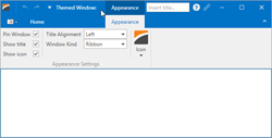
A WPF standard Window descendant that fully supports DevExpress WPF Themes, so the window’s look and feel is consistent with other DevExpress controls. Supports all functionality supplied by the Window class.
The ThemedWindow supports integration with the RibbonControl and the DXTabControl.
Tip
Topic: ThemedWindow
Utilities and Helpers
Splash Screens
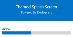
DevExpress Splash Screens allow you to display a splash screen to inform users of the state of your application during the initial load. When you add a splash screen to your project, a XAML file containing the default splash screen is generated. You can fully customize this XAML file to create a custom splash screen according to your requirements.
Although splash screens can be opened and closed automatically on window loading, you can also manually invoke or hide these screens as required.
Tip
Topic: Splash Screen Manager
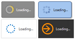
Loading Decorator
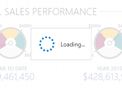
The LoadingDecorator is a convenient tool for displaying slow-loading content. Technically, this is a content container that wraps any content and displays a loading indicator while this content is loading. It features built-in animation effects, rich loading indicator customization capabilities, and four owner lock modes that lock the parent window while the content is loading.
Tip
Topic: Loading Decorator
Wait Indicator
A simple panel that is typically shown to indicate the application is currently busy. This panel contains a text string and an animated image that depends on the currently applied theme. You can define your own data templates to customize the Wait Indicator’s appearance and layout.
Tip
Topic: Wait Indicator
Badges
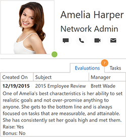
The Badge control allows you to display badges over any control or UI element. You can specify badge position, content, and appearance.
Tip
Topic: Badges
Taskbar Services
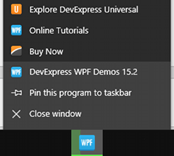
The TaskbarButtonService and ApplicationJumpListService services allow you to customize the application icon displayed in the Windows taskbar. Using these services you can:
- Dynamically fill the taskbar icon with custom colors to indicate the current application state (busy, paused, error, etc.).
- Add overlay icons to the taskbar icon.
- Customize the application preview shown when users hover over a taskbar icon.
- Modify jump lists, invoked by right-clicking a taskbar icon.
Tip
Topic: TaskbarButtonService
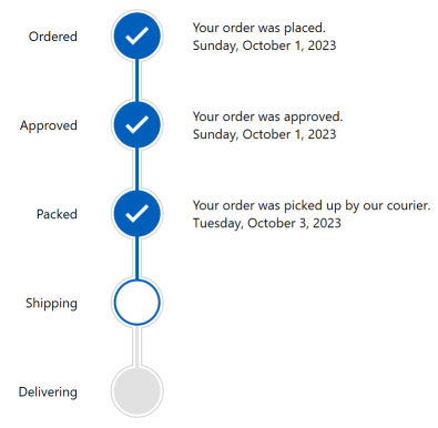
Step Progress Bar
The StepProgressBar control allows you to visualize event chains.