Windows Modern UI
- 3 minutes to read

DevExpress Windows Modern UI controls are a comprehensive set of UI elements for creating Windows Store-styled applications. These UI elements include various types of containers, navigation elements, notifications and dialogs. All UI elements are touch-ready and fully compatible with the latest DevExpress WPF Themes.
This section contains documents that enumerate available controls and articles that explain how to band these elements together to create a solid Windows Modern-inspired WPF application.
Content Containers
The first step in creating any application is building its initial layout. Content containers listed below allow you to design your application windows similar to Windows Store application templates, provided by Microsoft. Afterwards, populate containers with the required content and apply a modern theme (e.g., one of Office 2016 themes) to instantly get a stunning Windows Modern-inspired application.
-
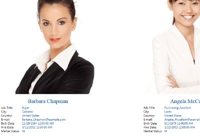
Presents items as individual pages with page headers displayed at the top. End-users can browse only one page at a time.
-
Presents items as a horizontally scrollable list. Displays an embedded navigation button when navigated to.
-
Presents items as a vertically scrollable list.

Navigation
This section contains articles related to navigating through application screens.
-
Contains a step-by-step walkthrough that demonstrates how to implement application navigation, pass specific data between application screens, access navigation history, etc.
-
A non-visual container that encapsulates your root application screen. This container is a navigation entry point from which end-users can travel to child application modules.
-
A replacement for the default UserControl that implements the INavigationAware interface. Implementing this interface is required if you need to pass parameters between separate application modules.
-
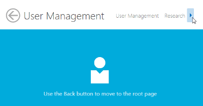
A navigation bar, typically docked to the top edge of the window. Automatically displays a ‘Back’ button when end-users navigate to an application screen that contains this bar. Can also host custom navigation buttons.
-
Bars that are typically docked to the top or bottom edge of the window and invoked when end-users right click the application area. These bars contain various custom commands and options.
-
A frame with two views. One view displays the Hamburger Menu that displays the navigation interface. The other view displays pages to which an end-user navigates using the interface.

Minor UI Elements
This section contains secondary UI elements (messages, notifications, panels, etc.) that are required to give your application a finished look.
-
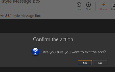
A modern version of default message boxes.
-
A replacement for default dialogs designed to fit the Windows Modern UI.
-
Floating panels with a beak that points to an object related to this panel. Flyouts can be used to create pop-up menus for various elements (e.g., buttons within an AppBar Control).
-
A service for displaying notifications that pop on screen and are then dismissed after a certain delay.
-
A LayoutControl descendant that displays tiles, which support grouping and content animations.
