Cell Validation
- 4 minutes to read
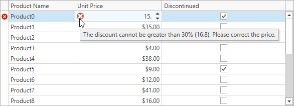
The GridControl allows you to validate cell values. The image below shows a GridControl with an invalid cell value:

Note
When you use a custom CellTemplate, input validation is supported only if the template contains a BaseEdit class descendant declared as demonstrated in the following topic: Custom In-Place Cell Editors.
Initialize a Validation Command
The GridControl contains the following API members that allow you to validate cell values:
| API | Description |
|---|---|
| GridViewBase.ValidateCellCommand / TreeListView.ValidateCellCommand | Gets or sets a command that allows you to validate the focused cell’s data. |
| GridViewBase.ValidateCell / TreeListView.ValidateCell | Allows you to validate the focused cell’s data. |
| GridColumn.Validate / TreeListColumn.Validate | Allows you to validate the focused cell’s data in the current column. |
The GridControl does not raise these events / execute commands when you change cell values in code. To allow the control to validate these changes, set the DataViewBase.AllowLeaveInvalidEditor property to true.
The code sample (MVVM style) below uses the GridViewBase.ValidateCellCommand property to validate cell values:
<dxg:GridControl ItemsSource="{Binding ProductList}">
    <dxg:GridControl.Columns>
        <dxg:GridColumn FieldName="ProductName"/>
        <dxg:GridColumn FieldName="UnitPrice"/>
        <dxg:GridColumn FieldName="Discontinued"/>
    </dxg:GridControl.Columns>
    <dxg:GridControl.View>
        <dxg:TableView ValidateCellCommand="{Binding ValidateCellCommand}"/>
    </dxg:GridControl.View>
</dxg:GridControl>
using DevExpress.Mvvm;
using DevExpress.Mvvm.DataAnnotations;
using DevExpress.Mvvm.Xpf;
// ...
public class MainViewModel : ViewModelBase {
    // ...
    [Command]
    public void ValidateCell(RowCellValidationArgs args) { }
}
Validate a New Value
Use the following RowCellValidationArgs properties to get cell values:
To indicate that the new value is invalid, set the Result property to an error description.
In the following code sample, users cannot reduce the product’s price by more than 30% if the product is on discount:
[Command]
public void ValidateCell(RowCellValidationArgs args) {
    if(args.FieldName != nameof(Product.UnitPrice) || !((Product)args.Item).Discontinued)
        return;
    var cellValue = (double)args.OldValue;
    var discount = 100 - Convert.ToDouble(args.NewValue) / cellValue * 100;
    if(discount > 0 && discount <= 30)
        return;
    args.Result = "Please correct the price.";
}
Indicate Errors
The GridControl displays an error icon within the cell if an edited cell’s value is invalid. Hover the mouse pointer over the error icon to display a tooltip with an error description:

The GridControl does not allow users to close an editor that did not pass validation. Set the DataViewBase.AllowLeaveInvalidEditor property to true to disable this behavior.
Use the Result property to define the error’s icon and description. This property accepts objects of the ValidationErrorInfo type that allows you to specify an error type and content.
If you assign an error description string to the Result property, it casts this string to a ValidationErrorInfo object with the default error icon.
The code sample below demonstrates how to show an error tooltip based on the entered value:
[Command]
public void ValidateCell(RowCellValidationArgs args) {
    if(args.FieldName != nameof(Product.UnitPrice) || !((Product)args.Item).Discontinued)
        return;
    var cellValue = (double)args.OldValue;
    var discount = 100 - Convert.ToDouble(args.NewValue) / cellValue * 100;
    if(discount > 0 && discount <= 30)
        return;

    var error = discount < 0
        ? $"The price cannot be greater than {cellValue}"
        : $"The discount cannot be greater than 30% ({cellValue * 0.7}). Please correct the price.";
    args.Result = new ValidationErrorInfo(error, ValidationErrorType.Critical);
}