Assign Editors to Cells
- 5 minutes to read
The GridControl assigns editors to column cells based on the column’s data type. Refer to the Smart Columns Generation topic for a complete list of supported data types and corresponding data editors.
The DataViewBase.EditorButtonShowMode property specifies how to display editor buttons in cells.
You can also use the following techniques to assign editors to column cells:
Control How Editor Buttons Are Displayed
Use the EditorButtonShowMode property to specify how editor buttons appear in cells:
- The DataViewBase.EditorButtonShowMode property defines the button display mode for all columns in a view.
- The ColumnBase.EditorButtonShowMode property overrides this setting for an individual column.
Use a DevExpress Editor
The EditSettings property allows you to choose a DevExpress Data Editor for a column.
Implement a Custom Control
Use the CellTemplate property to implement a custom cell editor for a column. You can specify any DevExpress WPF Control or Standard WPF Control.
The CellTemplate is intended for complex customization that you cannot achieve with EditSettings alone. If you want to specify and configure a DXEditor, we recommend that you use EditSettings instead. Refer to the Address Possible Issues if You Use Cell Templates section for more information.
Assign Editors Separately for Display and Edit Modes
You can use templates to define custom cell editors separately for display and edit modes.
The ColumnBase.CellEditTemplate is only used when a cell is in edit mode. Therefore, it has less impact on performance compared to a CellTemplate that is used in both edit and display modes and applies to all cells within a column.
Use the ColumnBase.CellDisplayTemplate to use a different (or differently configured) editor for cells in display mode.
| Template | Description |
|---|---|
| ColumnBase.CellDisplayTemplate / DataViewBase.CellDisplayTemplate | Defines a template that displays column values. |
| ColumnBase.CellEditTemplate / DataViewBase.CellEditTemplate | Defines a template that is used to edit cell values. |
Use a Separate Editor for Automatic Filter Row
The EditSettings property affects the Automatic Filter Row. Specify the CellTemplate to assign a different editor for data cells:
 <dxg:GridColumn FieldName="Date">
    <!-- Automatic Filter Row uses TextEdit -->
    <dxg:GridColumn.EditSettings>
        <dxe:TextEditSettings/>
    </dxg:GridColumn.EditSettings>
    <!-- Data cells use DateEdit -->
    <dxg:GridColumn.CellTemplate>
        <DataTemplate>
            <dxe:DateEdit x:Name="PART_Editor"/>
        </DataTemplate>
    </dxg:GridColumn.CellTemplate>
</dxg:GridColumn>
Assign Different Editors to the Same Column
Use the CellTemplateSelector property to change a cell template based on a condition:
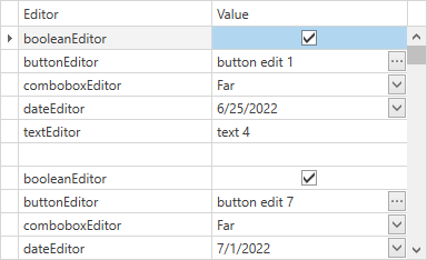
To implement this task, do the following:
Implement custom DataTemplates. Editors declared in these templates should follow our recommendations from this help topic: ColumnBase.CellTemplate:
<Window.Resources>
    <DataTemplate x:Key="booleanEditor">
        <dxe:CheckEdit Name="PART_Editor"/>
    </DataTemplate>
    <DataTemplate x:Key="buttonEditor">
        <dxe:ButtonEdit Name="PART_Editor"/>
    </DataTemplate>
    <DataTemplate x:Key="comboboxEditor">
        <dxe:ComboBoxEdit Name="PART_Editor">
            <dxe:ComboBoxEdit.ItemsSource>
                <collections:ArrayList>
                    <dx:Alignment>Near</dx:Alignment>
                    <dx:Alignment>Center</dx:Alignment>
                    <dx:Alignment>Far</dx:Alignment>
                </collections:ArrayList>
            </dxe:ComboBoxEdit.ItemsSource>
        </dxe:ComboBoxEdit>
    </DataTemplate>
    <DataTemplate x:Key="dateEditor">
        <dxe:DateEdit Name="PART_Editor"/>
    </DataTemplate>
    <DataTemplate x:Key="textEditor">
        <dxe:TextEdit Name="PART_Editor"/>
    </DataTemplate>
</Window.Resources>

<dxg:GridControl Name="grid">
    <dxg:GridControl.Columns>
        <dxg:GridColumn FieldName="Editor"/>
        <dxg:GridColumn FieldName="Value">
            <dxg:GridColumn.CellTemplateSelector>
                <local:EditorTemplateSelector/>
            </dxg:GridColumn.CellTemplateSelector>
        </dxg:GridColumn>
    </dxg:GridControl.Columns>
    <dxg:GridControl.View>
        <dxg:TableView Name="view" AutoWidth="True" EditorButtonShowMode="ShowAlways"/>
    </dxg:GridControl.View>
</dxg:GridControl>
Create a custom DataTemplateSelector descendant. This descendant should return templates according to your scenario requirements.
Note
Each GridControl cell contains an object of the EditGridCellData data type in its DataContext. This object’s RowData.Row property contains your data item. You can use this property if your logic should take property values from data items into account:
public class EditorTemplateSelector : DataTemplateSelector {
    public override DataTemplate SelectTemplate(object item, DependencyObject container) {
        EditGridCellData data = (EditGridCellData)item;
        var dataItem = data.RowData.Row as TestData;
        return string.IsNullOrEmpty(dataItem.Editor) ? null : (DataTemplate)((FrameworkElement)container).FindResource(dataItem.Editor);
    }
}
Address Possible Issues if You Use Cell Templates
The CellDisplayTemplate and CellEditTemplate override the CellTemplate for the same column.
The CellTemplate does not affect data processing (sorting, grouping, filtering, summary calculation) and export.
When you use the CellTemplate, specify the EditSettings value to configure the format settings, data processing (sorting, grouping, filtering, summary calculation), and export. The editor itself specified in the EditSettings property is ignored.
Performance depends on the current cell editor. The difference is not noticeable when you use lightweight controls (for example, TextBlock). When you use heavier controls, the EditSettings property allows you to gain maximum performance. For example, ComboBoxEditSettings, LookUpEditSettings, and so on.
Process User Actions
You can specify how to process user actions related to editor activation. Refer to the following help topic for more information: Customize Editor Activation and Validation.
Adjust Data Presentation in Cells
- Format Cell Values
- Use techniques described in the following help topic: Format Cell Values.
- Align Cell Content
- Define the ColumnBase.EditSettings or ColumnBase.CellTemplate property and specify the
HorizontalContentAlignmentproperty in a BaseEditSettings / BaseEdit descendant. - Modify Cell Appearance
- Apply format conditions or use the DataViewBase.CellStyle property to customize cells.
- Merge Duplicated Cell Values
- You can merge neighboring cells if they display matching values.
Change How Data Cells Look in Printed and Exported Documents
The EditSettings property affects the cell appearance when you print the GridControl data or export it in WYSIWYG mode.
Use the PrintCellStyle property to customize cell appearance when you print or export the grid.
Comparative Table
Property | Supports Printing / Exporting | Supports Standard WPF Controls | Supports Template Selector | Works in Edit Mode | |
|---|---|---|---|---|---|
|
|
|
|
| |
|
|
|
|
| |
|
|
|
|
| |
|
|
|
|
|

