Row Validation
- 4 minutes to read
The GridControl supports row validation. Use row validation when data within data row columns are dependent on values in other columns.
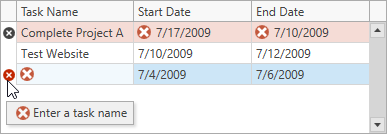
The following image demonstrates a GridControl with invalid rows:
Initialize a Validation Command
Use the following API to validate data rows:
API | Description |
|---|---|
Specifies a command that validates row values. | |
Allows you to validate row values. |
The grid raises these events or executes commands when saving changes to a data source.
Tip
The grid saves changes in the focused row when a user moves focus to another row or when the CommitEditing method is called.
The following code snippet creates a GridViewBase.ValidateRowCommand to validate rows. The validation command ensures that the Task.StartDate is not greater than the Task.EndDate, and that the Task.TaskName is not empty.
- args.Item – Specifies a data item that corresponds to the processed data row.
- args.Result – Specifies the error description.
<dxg:GridControl ItemsSource="{Binding TaskList}" AutoGenerateColumns="AddNew">
    <dxg:GridControl.View>
        <dxg:TableView AutoWidth="True"
                       ValidateRowCommand="{Binding ValidateRowCommand}"/>
    </dxg:GridControl.View>
</dxg:GridControl>
using DevExpress.Mvvm;
using DevExpress.Mvvm.DataAnnotations;
using DevExpress.Mvvm.Xpf;

public class MainViewModel : ViewModelBase {
    // ...
    [Command]
    public void ValidateRow(RowValidationArgs args) {
        args.Result = GetValidationErrorInfo((Task)args.Item);
    }
    static ValidationErrorInfo GetValidationErrorInfo(Task task) {
        if(task.StartDate > task.EndDate)
            return new ValidationErrorInfo("The start date must be before the end date.");
        if(string.IsNullOrEmpty(task.TaskName))
            return new ValidationErrorInfo("The task name cannot be empty.");
        return null;
    }
}
Indicate Errors
Error Tooltip
The GridControl displays a tooltip with a message and icon when the user hovers the mouse pointer over an invalid row:
The following code snippet specifies a message and an error icon:
[Command]
public void ValidateRow(RowValidationArgs args) {
    // ...
    args.Result = new ValidationErrorInfo("Task name cannot be empty.", ValidationErrorType.Critical);
}
Note
You can set the args.Result property to a string. This casts the string to a ValidationErrorInfo object with the specified ErrorContent property and default error icon.
Error Window
The GridControl displays an error window after a user enters an invalid value.
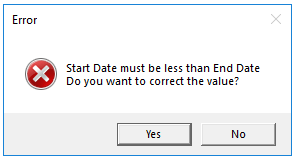
The error window allows users to do the following:
- Click Yes: Focuses the edited row and allows the user to correct invalid values.
- Click No: Discards changes. The rollback occurs only if data source objects implement the System.ComponentModel.IEditableObject interface.
Row Indicator
The Row Indicator Panel displays an error icon next to each row that contains a validation error. To highlight these rows, set the TableView.RowIndicatorValidationErrorBackground / TreeListView.RowIndicatorValidationErrorBackground property to a custom background brush. The panel is visible only when the TableView.ShowIndicator / TreeListView.ShowIndicator property is set to true.
Customize Error Behavior
Create a command and bind it to the GridViewBase.InvalidRowExceptionCommand property to customize validation errors. The grid executes this command after the ValidateRowCommand detects errors.
Use the following properties to customize error content and behavior:
| Property | Description |
|---|---|
| ExceptionMode | Specifies how the grid reacts to an invalid value. Options include: display a message box (the default setting), throw an exception, display an error icon, or ignore the error. |
| ErrorText | Specifies additional text displayed before the “Do you want to correct the value?” prompt in the error window. |
| WindowCaption | Specifies the error window’s caption. |
The following code snippet creates an InvalidRowCommand that disables the error window:
<dxg:GridControl ItemsSource="{Binding TaskList}">
    <dxg:GridControl.View>
        <dxg:TableView ValidateRowCommand="{Binding ValidateRowCommand}"
                       InvalidRowExceptionCommand="{Binding InvalidRowCommand}"/>
    </dxg:GridControl.View>
</dxg:GridControl>
[Command]
public void InvalidRow(InvalidRowExceptionArgs args) {
    args.ExceptionMode = ExceptionMode.NoAction;
}