Comparison: Standard WPF DataGrid and DevExpress WPF GridControl
- 7 minutes to read
This article describes the main differences between Standard WPF DataGrid and DevExpress WPF GridControl. Use it to migrate from the Standard WPF DataGrid to the DevExpress WPF GridControl.
Display Data
- Standard WPF DataGrid
- Displays data in tabular format. To configure data presentation, customize the control and column objects.
- DevExpress WPF GridControl
Uses three types of views to display data. To configure data presentation, customize the View and column objects:
Bind to Data
Standard WPF DataGrid and DevExpress WPF GridControl use the same property to bind to data - ItemsSource.
Columns
- Standard WPF DataGrid
- Columns use the Binding or SelectedItemBinding property to bind to data. A DataGridTemplateColumn defines data binding inside a cell template.
- DevExpress WPF GridControl
Columns use the FieldName and Binding properties to bind to data.
The Binding property uses the standard binding mechanism. The FieldName uses PropertyDescriptor objects and has better performance than the Binding property. Refer to the following topic for more information on trade-offs between performance and flexibility: Binding Columns to Data Source Fields.
You cannot use the FieldName property to bind a column to a collection property. To display such a property in a GridControl cell, use any of the following techniques:
- Change the field type from a collection to Object in your application’s Model.
- Use the Binding property.
GridControl uses the FieldName property to identify columns. When you use the Binding property, the FieldName property is set automatically. Refer to the following topic for more information: Binding Columns to Data Source Fields - How the GridControl Identifies Columns.
Unbound Columns
- Standard WPF DataGrid
- Add a DataGridTemplateColumn to the column collection. To display data in this column, override its CellTemplate property and specify a data field.
- DevExpress WPF GridControl
- Specify a ColumnBase.UnboundExpression that calculates values based on the existing data fields. You can also handle the GridControl.CustomUnboundColumnData / TreeListView.CustomUnboundColumnData events to store an unbound column’s values. Refer to the following topic for more information: Unbound Columns.
Sort, Group, and Filter Data
The Standard WPF DataGrid does not handle data operations on its own. Instead, it delegates them to the bound ICollectionView.
The DevExpress WPF GridControl can perform data operations on its own. To sort, group, and filter data, you do not need to bind it to an ICollectionView descendant. Refer to the following topics for more information:
Runtime Capabilities
The Standard WPF DataGrid does not support sort, group, and filter operations at runtime.
The DevExpress WPF GridControl allows users to perform these operations in several ways.
Sort
Do one of the following to sort data against a column:
- Click a column’s header.
- Invoke a column’s context menu and click Sort Ascending, Sort Descending, or Clear Sorting.
To clear the sort order, do one of the following:
- Press the
CTRLkey and click the column’s header. - Select Clear Sorting from the column’s header context menu.
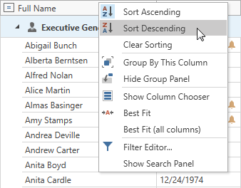
GridControl supports sorting by several columns simultaneously.
Topic: GridControl - Sort Data.
Group
Do one of the following to group View data:
- Drag a column header from the Column Header Panel to the Group Panel.
- Invoke a column’s context menu and click Group By This Column.
To ungroup a View, do one of the following:
- Drag a column header from the Group Panel to the Column Header Panel.
- Invoke a column’s context menu and click Ungroup.
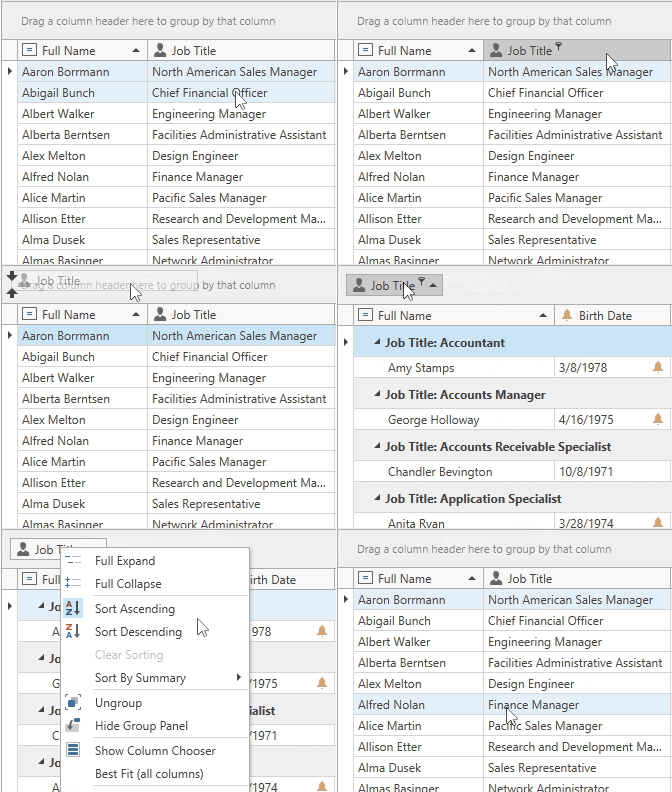
You can also change the sort order of columns.
Topic: GridControl - Grouping.
Filter
Use one of the following options to filter View data:
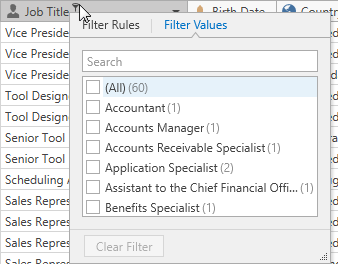
Drop-down Filter. Users can click a filter icon in a column’s header to show this menu.
Automatic Filter Row. A special row displayed above all other rows.
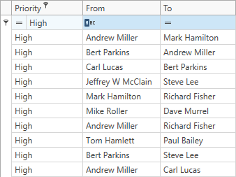
Filter Editor. Users can use the Filter Editor form to build filter criteria and create complex filter conditions.
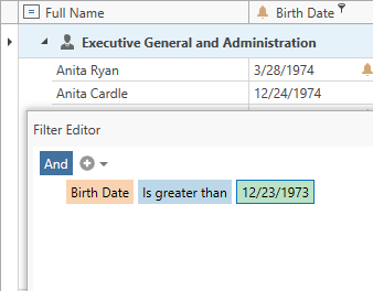
You can clear or disable a filter at runtime. Refer to the following topics for more information:
Customize Sorting, Grouping, Filtering
You can implement a custom sort, group, and filter logic:
Custom Sorting
To implement custom sorting, set the GridColumn.SortMode property to “Custom” and handle the GridControl.CustomColumnSort event.
Learn more: GridControl - Sorting Modes and Custom Sorting.
Custom Grouping
Set the GridColumn.SortMode property to “Custom” and handle the GridControl.CustomColumnGroup event to implement custom grouping.
Learn more: GridControl - Group Modes and Custom Grouping.
Custom Filtering
To customize the filter logic, do one of the following:
Handle the GridControl.CustomRowFilter event and implement custom logic here.
Learn more: GridControl - Filter Modes and Custom Filtering.
Handle the GridControl.SubstituteFilter/TreeListView.SubstituteFilter events. These events allow you to replace a filter with your filter criteria. You can also implement custom criteria operators to replace the default ones. Refer to the following articles for details:
How to: Implement a Custom Criteria Language Function Operator
- How to traverse through and modify the CriteriaOperator instances
Search Capabilities
The GridControl‘s built-in Search Panel can highlight search results in the View and optionally filter rows.
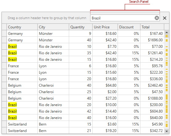
Topic: GridControl - Search.
Define Cell Editors
- Standard WPF DataGrid
Uses the following typed columns to embed editors into cells:
You can also use a DataGridTemplateColumn. This column allows you to override the cell template and specify the required editor.
- DevExpress WPF GridControl
Uses GridColumn objects. Each column automatically creates an editor based on the data field type. Refer to the following topic for a complete list of supported data types and corresponding data editors: Smart Columns Generation.
Refer to the following topic for details on how to customize column editors: Assign Editors to Cells.
Format Text
- Standard WPF DataGrid
- Does not have a built-in API to format text or numeric fields. You need to use the standard WPF binding to display formatted values.
- DevExpress WPF GridControl
Allows you to specify the formatting API at the following levels:
- GridControl / GridColumn settings
- Column editor’s settings
- Column editor’s template
Learn more: Format Cell Values.
Colorize Cells and Rows
- Standard WPF DataGrid
- Includes styles and templates that allow you to colorize cells and rows.
- DevExpress WPF GridControl
- Supports a Conditional Formatting mechanism in addition to row/cell styles and templates.
Input Validation
Validation on Exceptions
- Standard WPF DataGrid
- Requires that you enable validation at the column level with the Binding.ValidatesOnExceptions property.
- DevExpress WPF GridControl
- Validates input on exceptions automatically.
Validation with IDataErrorInfo and INotifyDataErrorInfo
- Standard WPF DataGrid
- Requires that you enable validation at the column binding level with the Binding.ValidatesOnDataErrors or Binding.ValidatesOnNotifyDataErrors property.
- DevExpress WPF GridControl
- Automatically displays errors when the IDataErrorInfo or INotifyDataErrorInfo interface is implemented.
Validation Rules
- Standard WPF DataGrid
- Supports Validation Rules out of the box.
- DevExpress WPF GridControl
- The GridControl does not work with Validation Rules directly. Handle the ValidateCell event and use Validation Rules to implement validation logic.
Other Techniques
The DevExpress WPF GridControl supports the following techniques that are not supported in the Standard WPF DataGrid. You can validate input and specify different error types and icons at the following application levels:
Model - IDXDataErrorInfo
Implement the IDXDataErrorInfo interface to validate input at the Model level and specify different error types and icons.
Model - Data Annotation Attributes
Use attributes to validate input at the Model level. Refer to the following article for more information: Input Validation - Attribute-Based Validation.
View/ViewModel - Event-Based Validation:
Use the following events to validate input at the View/ViewModel level and specify different error types and icons:
Refer to the following articles for more information on Validation Events: