DxDropDown.FooterCssClass Property
Specifies the CSS class applied to the footer.
Namespace: DevExpress.Blazor
Assembly: DevExpress.Blazor.v22.1.dll
NuGet Package: DevExpress.Blazor
Declaration
[Parameter]
public string FooterCssClass { get; set; }
Property Value
| Type | Description |
|---|---|
| String | A CSS class name. |
Remarks
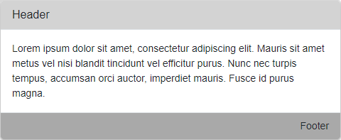
Assign the CSS class name to the FooterCssClass property to customize the footer’s appearance. Use the FooterText property to specify text displayed in the header.
<style>
    .header-style {
        background-color: lightgray;
    }
    .footer-style {
        background-color: darkgray;
    }
</style>

<DxButton Id="showDDbtton" Click="() => IsOpen = true">Show a drop-down window</DxButton>
<DxDropDown HeaderVisible="true"
    HeaderCssClass="header-style"
    HeaderText="Header"
    FooterVisible="true"
    FooterCssClass="footer-style"
    FooterText="Footer"
    Width="max(25vw, 300px)"
    BodyText="Lorem ipsum dolor sit amet, consectetur adipiscing elit. Mauris sit amet metus vel
        nisi blandit tincidunt vel efficitur purus. Nunc nec turpis tempus, accumsan orci auctor,
        imperdiet mauris. Fusce id purus magna."
    @bind-IsOpen="@IsOpen"
    PositionTarget="#showDDbtton"
    PositionMode="DropDownPositionMode.Bottom">
</DxDropDown>

@code {
    bool IsOpen { get; set; } = false;
}
When you use the FooterTextTemplate or FooterTemplate, specified appearance settings take priority over appearance settings defined in the assigned CSS class.
For more information on how to apply CSS classes to DevExpress Blazor components, refer to the following help topic: CSS Classes.
See Also