DxTreeView Class
A TreeView component.
Namespace: DevExpress.Blazor
Assembly: DevExpress.Blazor.v22.1.dll
NuGet Package: DevExpress.Blazor
Declaration
public class DxTreeView :
    DxNavigationControlComponent<TreeViewJSInteropProxy, ITreeViewModel>,
    ITreeViewJSInteropProxyServer,
    IJSCallback
Remarks
The DevExpress TreeView component for Blazor (<DxTreeView>) displays hierarchical data structures within a tree-like UI. The component implements navigation within a web application.
Add a TreeView to a Project
Follow the steps below to add the TreeView component to an application:
- Use a DevExpress Project Template to create a new Blazor Server or Blazor WebAssembly application. If you use a Microsoft project template or already have a Blazor project, configure your project to incorporate DevExpress Blazor components.
- Add the
<DxTreeView>…</DxTreeView>markup to a.razorfile. - Configure the component: add nodes or bind the TreeView to data, handle expand/collapse events, enable node selection, and so on (see the sections below).
Nodes / Unbound Mode
The <DxTreeView> component supports bound and unbound modes. In unbound mode, the user should populate a node hierarchy. Root nodes are stored within the TreeView’s Nodes collection. Each node has its own collection of child nodes that you can access from its Nodes property.
A DxTreeViewNode class instance defines a node in code, and the Name property specifies its unique name. Use the Text property to specify the node’s text, the IconCssClass property to specify a CSS class for the node’s icon, and the NavigateUrl property to specify the URL to navigate to when the node is clicked.
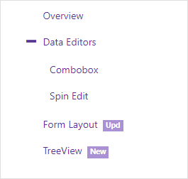
<DxTreeView>
  <Nodes>
    <DxTreeViewNode Name="Overview" Text="Overview" NavigateUrl="https://demos.devexpress.com/blazor/" />
    <DxTreeViewNode Name="Editors" Text="Data Editors" Expanded="true">
      <Nodes>
        <DxTreeViewNode Text="Combobox" NavigateUrl="https://demos.devexpress.com/blazor/ComboBox" />
        <DxTreeViewNode Text="Spin Edit" NavigateUrl="https://demos.devexpress.com/blazor/SpinEdit" />
      </Nodes>
    </DxTreeViewNode>
    <DxTreeViewNode Name="FormLayout" Text="Form Layout" NavigateUrl="https://demos.devexpress.com/blazor/FormLayout" BadgeText="Upd" />
    <DxTreeViewNode Name="TreeView" Text="TreeView" NavigateUrl="https://demos.devexpress.com/blazor/TreeView" BadgeText="New"  />
    <DxTreeViewNode Name="Tabs" Text="Tabs" NavigateUrl="https://demos.devexpress.com/blazor/Tabs" Visible="false" BadgeText="New" />
  </Nodes>
</DxTreeView>
Data Binding
The TreeView component supports binding to data. In bound mode, items from the data source automatically populate TreeView nodes.
Follow the steps below to bind TreeView to data:
Use the Data property to specify a data source. You can use different data types:
- Flat data - a collection of items that are available at one level.
- Hierarchical data - a collection of nested nodes.
Add the DataMappings tag to the component’s markup.
Create the DxTreeViewDataMapping instance and map node properties (HasChildren, IconCssClass, and so on) to data source fields. Mappings are used to link the TreeView data model to the data source.
Flat data - the Key and ParentKey properties are required. If the TreeView’s structure consists of only one level, you can omit these properties.
Hierarchical data - the Children property is required.
You can also create multiple
DxTreeViewDataMappinginstances to specify different mappings for different node levels. Use the Level property to specify the node level for which data mappings are applied.
Flat Data
The code below binds the TreeView to the collection of flat data items. It specifies mappings for the Text, Key, and ParentKey properties.
@if(Data == null) {
    <p><em>Loading...</em></p>
}
else {
    <div class="cw-320">
        <DxTreeView Data="@Data">
            <DataMappings>
                <DxTreeViewDataMapping Text="Name"
                                       Key="Id"
                                       ParentKey="CategoryId" />
            </DataMappings>
        </DxTreeView>
    </div>
}

@code {
    List<FlatDataItem> Data { get; set; }

    protected override void OnInitialized() {
        IEnumerable<ProductFlat> products = ProductData.Products;
        IEnumerable<ProductCategory> productSubcategories = ProductData.Categories;

        Data = new List<FlatDataItem>(Enum.GetValues<ProductCategoryMain>().Select(i => new FlatDataItem() { Name = i.ToString(), Id = i }));
        Data.AddRange(products.Select(i => new FlatDataItem() { Name = i.ProductName, Id = i.Id, CategoryId = i.ProductCategoryId }));
        Data.AddRange(productSubcategories.Select(i => new FlatDataItem() { Name = i.Subcategory, Id = i.SubcategoryID, CategoryId = i.Category }));
    }
}
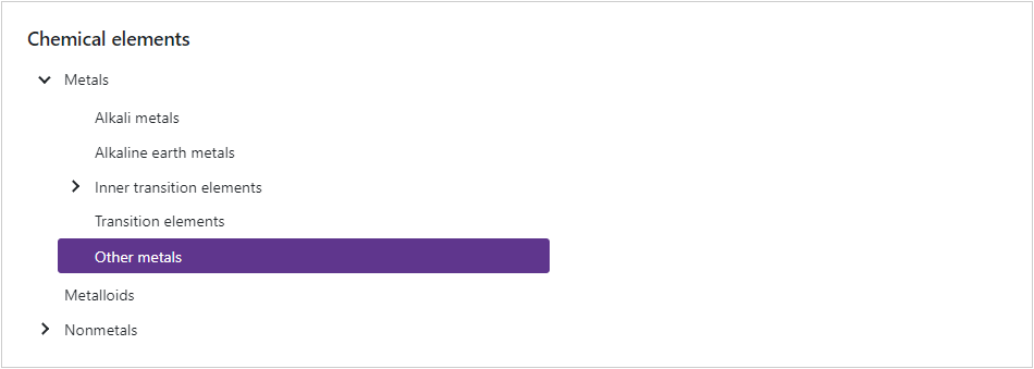
Hierarchical Data
The code below binds the TreeView to the collection of ChemicalElementGroup objects. Each object can have child objects. The code specifies the Children and Text mappings to adjust the TreeView data model to the specified data source.
<DxTreeView Data="@ChemicalElements.Groups">
    <DataMappings>
        <DxTreeViewDataMapping Children="Groups"
                               Text="Name"/>
    </DataMappings>
</DxTreeView>
Expand/Collapse Nodes
Users can click a node or its Expand/Collapse button to expand/collapse the node. When node selection is enabled, users should double-click nodes or click the Expand/Collapse buttons.
The table below lists related API members:
Member | Description |
|---|---|
Specifies user actions that expand or collapse a node. | |
Specifies whether expand buttons are visible. | |
Expands or collapses the specified node. | |
Returns whether the specified node is expanded. | |
Expands the nodes down to the specified node. | |
Expands all nodes in the DxTreeView. | |
Collapses all nodes in the DxTreeView. | |
Specify a CSS class for the expand button’s icon. | |
Specify a CSS class for the collapse button’s icon. |
The following events fire when a node’s state changes:
Member | Description |
|---|---|
Fires when a node is about to be expanded and allows you to cancel the action. | |
Fires when a node is about to be collapsed and allows you to cancel the action. | |
Fires after a node has been expanded. | |
Fires after a node has been collapsed. | |
Fires when a TreeView’s node expands or collapses. |
Filter Nodes
Enable the ShowFilterPanel option to activate the filter panel. If a user types in a search string, the component displays matching nodes, and optionally, their parent/child nodes. Note that if you activate the filter option with the enabled LoadChildNodesOnDemand option, the component loads all its nodes into memory.
<DxTreeView ShowFilterPanel="true">
    @* ... *@
</DxTreeView>
Use the FilterMode property to specify how the component displays the filter operation results. The following options are available:
- EntireBranch
- The component displays a node that meets the filter criteria and all its parent and child nodes, even if they do not meet the criteria.
- ParentBranch
- The component displays a node that meets the filter criteria and all its parent nodes, even if they do not meet the criteria.
- Nodes
- The component displays only nodes that meet the filter criteria. A node at the hierarchy’s highest level that meets the filter criteria becomes the root node. The node’s child nodes that meet the filter criteria move to the upper hierarchy levels.
The table below lists available API members:
Member | Description |
|---|---|
Specifies the minimum number of characters a user must type in the search box to apply the filter. | |
Allows you to implement custom filter logic. | |
Specifies the filter criteria used to filter the component’s nodes. |
Node Selection
Set the AllowSelectNodes property to true to enable node selection. Once a user clicks a node, it is highlighted and the SelectionChanged event is raised. The following example demonstrates how to handle this event to expand the selected node if it has children and collapse other nodes:
<DxTreeView @ref="@treeView" AllowSelectNodes="true" SelectionChanged="@SelectionChanged">
  ...
</DxTreeView>

@code  {
    DxTreeView treeView;

    protected void SelectionChanged(TreeViewNodeEventArgs e)  {
        treeView.CollapseAll();
        treeView.ExpandToNode((n) => n.Text == e.NodeInfo.Text);
        if (!e.NodeInfo.IsLeaf) {
          treeView.SetNodeExpanded((n) => n.Text == e.NodeInfo.Text, true);
        }
    }
}
The table below lists other related API:
Member | Description |
|---|---|
Returns information about the selected node. | |
Selects the specified node. | |
Clears node selection. |
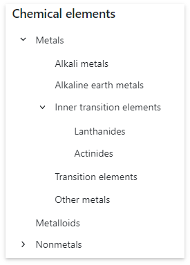
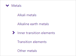
Disable User Interactions
Set the Enabled property to false to ignore user interactions.
<button type="button" @onclick="@(() => ToggleTreeViewEnabled())">Enable/Disable TreeView</button>

<DxTreeView Enabled="@TreeViewEnabled">
    <Nodes>
        <DxTreeViewNode Text="Metals">
            <Nodes>
                <DxTreeViewNode Text="Alkali metals" />
                <DxTreeViewNode Text="Inner transition elements">
                    <Nodes>
                        <DxTreeViewNode Text="Lanthanides" />
                        <DxTreeViewNode Text="Actinides" />
                    </Nodes>
                </DxTreeViewNode>
            </Nodes>
        </DxTreeViewNode>
    </Nodes>
</DxTreeView>

@code  {
    bool TreeViewEnabled { get; set; } = false;

    void ToggleTreeViewEnabled() { TreeViewEnabled = !TreeViewEnabled; }
}
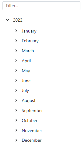
Load Child Nodes on Demand
When the LoadChildNodesOnDemand option is set to true, the component does not load child nodes until the parent node is expanded for the first time. This optimizes performance for complex hierarchical structures because the TreeView requests the data from the data source.
You can load child nodes on demand in either bound or unbound modes. In bound mode, the HasChildren property is required. The component uses this property to determine how to render nodes before they are expanded for the first time (for example, whether expand buttons must appear).
<DxTreeView @ref="@treeView"
            CssClass="cw-480"
            Data="@DataSource"
            LoadChildNodesOnDemand="true">
    <DataMappings>
        <DxTreeViewDataMapping HasChildren="@(nameof(DateTimeGroup.HasSubGroups))"
                               Children="@(nameof(DateTimeGroup.SubGroups))"
                               Text="@(nameof(DateTimeGroup.Title))"/>
    </DataMappings>
</DxTreeView>

@code {
    DxTreeView treeView;

    IEnumerable<DateTimeGroup> DataSource = new List<DateTimeGroup>() {
        new DateTimeGroup(new DateTime(DateTime.Now.Year, 1, 1), DateTimeGroupType.Year)
    };

    protected override void OnAfterRender(bool firstRender) {
        if(firstRender) {
            var todayDate = DateTime.Now;
            treeView.SetNodeExpanded(n => n.Text == todayDate.Year.ToString(), true);
        }
        base.OnAfterRender(firstRender);
    }
}
Note that you cannot operate with unloaded nodes in code (for instance, select an unloaded node, get node information, and so on).
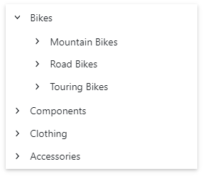
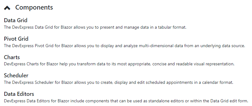
Templates
Use the following <DxTreeView> properties to specify a common node template and a text template for all nodes:
In unbound mode, you can create node templates on an individual basis. These templates have priority over common templates. Use the following <DxTreeViewNode> properties:
<DxTreeView @ref="@treeView"
            Data="@ComponentsData.ComponentSets" >
    <DataMappings>
            <DxTreeViewDataMapping Children="ComponentSets" />
    </DataMappings>
    <NodeTemplate>
        @if(!context.IsLeaf) {
                <h4 class="my-0 p-2 d-flex align-items-center">
                    @if(context.Expanded) {
                        <span class="oi oi-chevron-top"></span>
                    } else {
                        <span class="oi oi-chevron-bottom"></span>
                    }
                    <span class="ms-3 flex-grow-1">@dataItem.Title</span>
                </h4>
            } else {
                <div class="d-flex p-2">
                    <div class="flex-grow-1">
                        <h5 class="mt-0">@dataItem.Title</h5>
                        @dataItem.Description
                    </div>
                </div>
            }
    </NodeTemplate>
</DxTreeView>

@code {
    DxTreeView treeView;
    protected override Task OnAfterRenderAsync(bool firstRender) {
        if(firstRender)
            treeView.ExpandAll();
        return base.OnAfterRenderAsync(firstRender);
    }
}
Navigate URL for a Node
Use the NavigateUrl property to specify a URL where the client web browser navigates when a node is clicked. To specify where to display the URL (in the current window, new tab, and so on), use one of the properties below.
The DxTreeView.Target property specifies the common target attribute’s value for all nodes in the TreeView. To override the attribute value for a specific node, use the DxTreeViewNode.Target property.
The code below sets the common target attribute’s value for all nodes to _blank and overrides this value for the first node (sets it to _self).
<DxTreeView Target="_blank">
    <Nodes>
        <DxTreeViewNode Name="Overview"
                        Text="Overview"
                        NavigateUrl="https://demos.devexpress.com/blazor/"
                        Target="_self"/>
        <DxTreeViewNode Name="Editors" Text="Data Editors" Expanded="true">
            <Nodes>
                <DxTreeViewNode Text="Combobox" NavigateUrl="https://demos.devexpress.com/blazor/ComboBox" />
                <DxTreeViewNode Text="Spin Edit" NavigateUrl="https://demos.devexpress.com/blazor/SpinEdit" />
            </Nodes>
        </DxTreeViewNode>
    </Nodes>
</DxTreeView>
Troubleshooting
If a Blazor application throws unexpected exceptions, refer to the following help topic: Troubleshooting.