CSS Classes
- 4 minutes to read
This topic describes how to apply custom CSS classes to DevExpress Blazor components.
Note
You can also use themes to change your application’s appearance.
Add a CSS File to a Project
- Copy a CSS file with your styles to the wwwroot/css folder.
Add the CSS file link to the
headsection of the layout file:- Pages/_Layout.cshtml in Blazor Server apps.
- wwwroot/index.html in Blazor WebAssembly apps.
<head>
    ...
    <link href="css/my-styles.css" rel="stylesheet" />
</head>
Note
You can also define styles in the <style> section of a .razor file:
<style>
   .my-style {
       width: 400px;
       color: white;
       background-color: mediumpurple;
   }
</style>
Apply Styles to Components
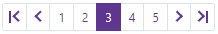
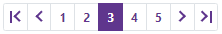
You can apply CSS styles to Blazor components and their elements. All objects inherited from DxComponentBase implement the CssClass property. The following code applies a CSS class to a Pager:
Default Style (font-weight: 400)
Custom Style (font-weight: 700)
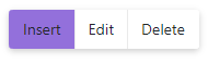
Other classes can also have a CssClass or *CssClass property, for example, DxChartLegend.CssClass, DxComboBox.InputCssClass. The code below applies a CSS class to a toolbar item (the DxToolbarItemBase.CssClass property).
<DxToolbar>
    <DxToolbarItem CssClass="my-toolbar-item" Text="Insert"></DxToolbarItem>
    <DxToolbarItem Text="Edit"></DxToolbarItem>
    <DxToolbarItem Text="Delete"></DxToolbarItem>
</DxToolbar>
Icon CSS Classes
Your CSS file can contain styles for icons used within components. To apply these styles, use the IconCssClass property. The code below assigns icons to Context Menu items.
<DxContextMenu>
    <Items>
        <DxContextMenuItem Text="Home" IconCssClass="icon icon-home"></DxContextMenuItem>
        <DxContextMenuItem Text="Contacts" IconCssClass="icon icon-phone"></DxContextMenuItem>
        <DxContextMenuItem Text="Calendar" IconCssClass="icon icon-calendar"></DxContextMenuItem>
    </Items>
</DxContextMenu>
Refer to Icons for more information.
Apply Styles to Inner HTML Elements
DevExpress Blazor components consist of standard HTML elements (div, table, input,td, etc.). You can apply CSS styles to these elements. Refer to the following articles for more information:
The code below hides horizontal lines in the Data Grid:
Default Style

Custom Style (horizontal lines are hidden)
CSS Isolation
The Blazor CSS isolation feature allows you to create component-specific styles and avoid styling conflicts between components and libraries.
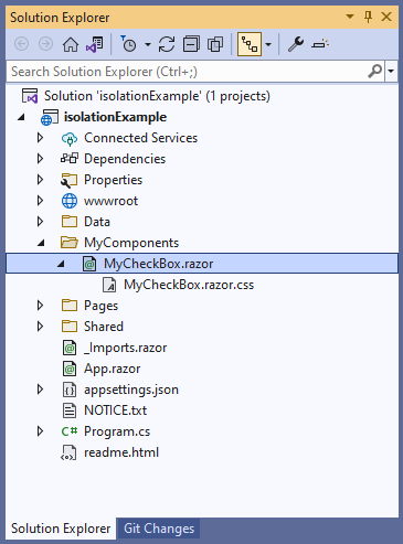
DevExpress components for Blazor support CSS isolation, except for the DxPopup, DxDropDown, and DxFlyout components as they are always rendered in the page root. To enable the isolation feature, create a folder for your custom components that use DevExpress components. In this folder, create the following items:
- A Razor component, for example, MyCheckBox.
- A .css file for isolated styles. The stylesheet should have the same name as the component.
In the MyCheckBox.razor markup, specify the DevExpress component. Blazor generates the b-{string} attribute at build time and uses it to target HTML markup elements in the current component, where {string} is a 10-character string. Blazor cannot generate attributes for custom components such as DevExpress Blazor. Wrap DevExpress components in a markup element, for example, <div> or <span> for them to be treated as HTML elements.
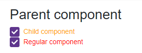
<h2>Parent component</h2>

<div>
    <DxCheckBox Checked="true"
                CssClass="my-checkbox">Child component</DxCheckBox>
</div>
In the MyCheckBox.razor.css file, specify component-specific styles. Use the ::deep combinator to apply styles.
::deep .my-checkbox {
    color: orange;
}
Add the MyCheckBox component to your application. You can add the DxCheckBox component with the same CSS class to make sure that MyCheckBox styles are isolated.
@using isolationExample.MyComponents

<style>
    .my-checkbox {
        color: red;
    }
</style>

<MyCheckBox />

<DxCheckBox Checked="true" CssClass="my-checkbox">Regular component</DxCheckBox>