DxListEditorColumn Class
A multi-column editor’s column.
Namespace: DevExpress.Blazor
Assembly: DevExpress.Blazor.v22.1.dll
NuGet Package: DevExpress.Blazor
Declaration
public class DxListEditorColumn :
    DxDataColumnBase<IDataColumnModel>,
    IDataColumnItemContentRenderer
Remarks
The following editors can display data across multiple columns:
To create columns, use DxListEditorColumn objects that include the following properties for column customization:
- FieldName - Specifies the data source field used to populate column items.
- Caption - Specifies the column’s header.
- Visible - Specifies the column’s visibility.
- VisibleIndex - Specifies the column’s display order.
- Width - Specifies the column’s width.
To format an editor value, use the EditFormat property. This property allows you to format values displayed in one-column and multi-column ComboBoxes/TagBoxes.
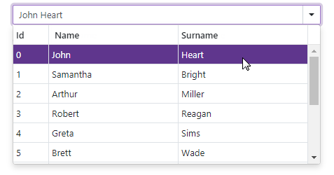
The code below adds three columns to ComboBox and applies the {1} {2} format to the component. This format specifies that the editor value includes values of the following columns: Name (VisibleIndex = 1) and Surname (VisibleIndex = 2).
<DxComboBox Data="@Staff.DataSource"
            @bind-Value="@SelectedPerson"
            EditFormat ="{1} {2}">
    <DxListEditorColumn FieldName="Id" Width="50px" />
    <DxListEditorColumn FieldName="FirstName" Caption="Name"/>
    <DxListEditorColumn FieldName="LastName" Caption="Surname"/>
</DxComboBox>

@code {
    Person SelectedPerson { get; set; } = Staff.DataSource[0];
}