DxStackLayout Class
A Stack Layout component.
Namespace: DevExpress.Blazor
Assembly: DevExpress.Blazor.v22.1.dll
NuGet Package: DevExpress.Blazor
Declaration
public class DxStackLayout :
    DxControlComponent<StackLayoutJSInteropProxy>,
    IStackLayoutJSInteropProxyServer,
    IJSCallback,
    IModelWrapper<IStackLayoutModel>
Remarks
<DxStackLayout> allows you to stack UI elements vertically or horizontally.
If your page requires a grid layout, use the DxGridLayout component.
Add a Stack Layout to a Project
Follow the steps below to add the Stack Layout component to an application:
- Use a DevExpress Project Template to create a new Blazor Server or Blazor WebAssembly application. If you use a Microsoft project template or already have a Blazor project, configure your project to incorporate DevExpress Blazor components.
- Add the
<DxStackLayout>…</DxStackLayout>markup to a.razorfile. - Add layout items.
Items
Follow the steps below to create layout items:
- Add
<Items>...</Items>into the component’s markup to define Items collection. Add DxStackLayoutItem objects to the collection. Use the Length property to specify the item length (auto, pixel, percentage, fr, etc.). You can also apply a CSS class to the whole item.
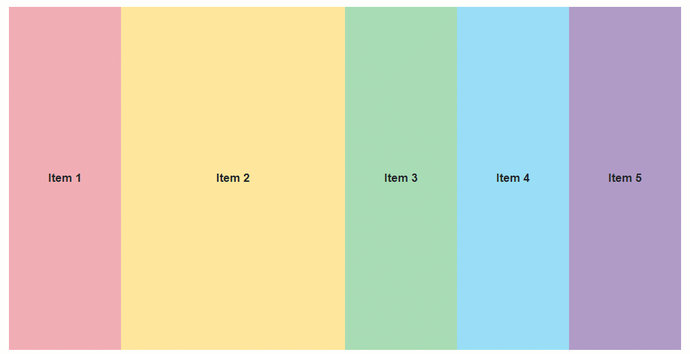
Stack layout items whose length is specified with the
frunit are arranged last because they occupy the remaining space (space is divided between these items in proportion to the prefix number).Use the Template property to specify item content.
<DxStackLayout>
    <Items>
        <DxStackLayoutItem>
            <Template>
                <div class="stacklayout-header stacklayout-item">
                    Item 1
                </div>
            </Template>
        </DxStackLayoutItem>
        <DxStackLayoutItem Length="2fr">
            <Template>
                <div class="stacklayout-content stacklayout-item">
                    Item 2
                </div>
            </Template>
        </DxStackLayoutItem>
        <DxStackLayoutItem>
            <Template>
                <div class="stacklayout-left-side-bar stacklayout-item">
                    Item 3
                </div>
            </Template>
        </DxStackLayoutItem>
        <DxStackLayoutItem>
            <Template>
                <div class="stacklayout-right-side-bar stacklayout-item">
                    Item 4
                </div>
            </Template>
        </DxStackLayoutItem>
        <DxStackLayoutItem>
            <Template>
                <div class="stacklayout-footer stacklayout-item">
                    Item 5
                </div>
            </Template>
        </DxStackLayoutItem>
    </Items>
</DxStackLayout>
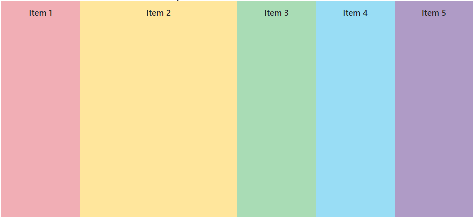
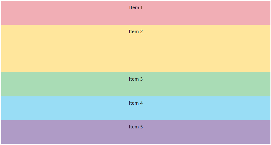
Orientation
The component’s default orientation is Horizontal (layout items are arranged in a row).
To arrange items in a column, set the Orientation property to Vertical.
<DxStackLayout Orientation="Orientation.Vertical">
    <Items>
        ...
    </Items>
</DxStackLayout>
Adaptivity
You can use the DxLayoutBreakpoint component to adapt a stack layout to different screen sizes.
The code below does the following:
- Creates an
IsSmallScreendata field. - Adds a
DxStackLayoutcomponent and uses theIsSmallScreenfield to manage the items’ orientation depending on a device screen size. - Adds a
DxLayoutBreakpointcomponent, binds it to theIsSmallScreenfield, and specifies the device size when the breakpoint should be activated.
<DxLayoutBreakpoint DeviceSize="DeviceSize.Medium | DeviceSize.Small | DeviceSize.XSmall" @bind-IsActive="IsSmallScreen"/>
<DxStackLayout style="height:500px" Orientation="IsSmallScreen ? Orientation.Vertical : Orientation.Horizontal">
<Items>
<DxStackLayoutItem>
<Template>
<div class="stacklayout-header stacklayout-item">
Item 1
</div>
</Template>
</DxStackLayoutItem>
<DxStackLayoutItem Length="2fr">
<Template>
<div class="stacklayout-content stacklayout-item">
Item 2
</div>
</Template>
</DxStackLayoutItem>
...
</Items>
</DxStackLayout>
@code {
bool IsSmallScreen;
}
Troubleshooting
If a Blazor application throws unexpected exceptions, refer to the following help topic: Troubleshooting.