DxMenu Class
A Menu component.
Namespace: DevExpress.Blazor
Assembly: DevExpress.Blazor.v22.1.dll
NuGet Package: DevExpress.Blazor
Declaration
public class DxMenu :
    DxNavigationControlComponent<MenuJSInteropProxy, IMenuModel>,
    IMenuJSInteropProxyServer,
    IJSCallback
Remarks
<DxMenu> adds a menu to your Blazor application.
Add Menu to a Project
To add a <DxMenu> component to an application, follow the steps below:
- Create an application. If you use Microsoft project templates, configure the application as described in this topic: Microsoft Templates (NuGet Packages).
- Add the
<DxMenu>…</DxMenu>markup to your application. - Configure the component: add items, change the orientation, specify display mode, and so on (see the sections below).
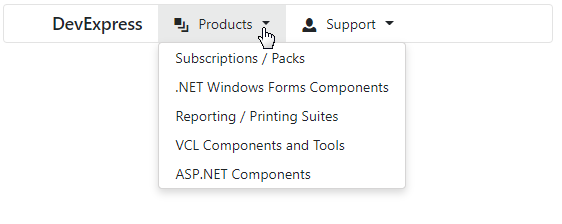
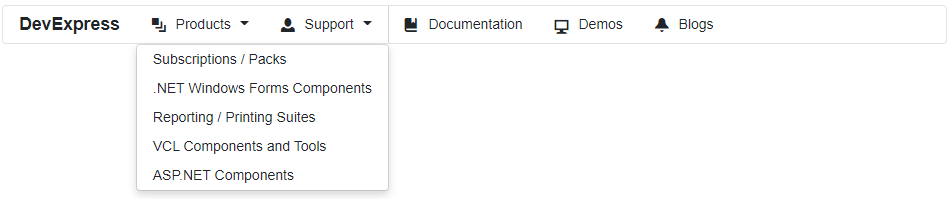
Items
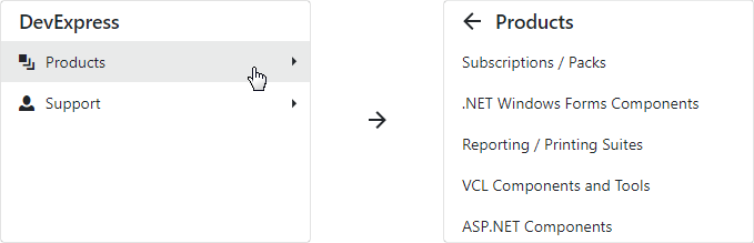
Specify menu items in the DxMenu.Items collection. Each item is a DxMenuItem class instance that can have a collection of child items (the DxMenuItem.Items property).
Use the ItemsPosition property to align items in the menu. To customize item content and appearance, use the Text, IconCssClass, CssClass properties. To add a separator before an item, use the BeginGroup property.
You can also use the Expanded property to show a drop-down window with child items. Note that a node is visible when all its parent nodes are visible.
<div class="card">
    <DxMenu Title="DevExpress"
            ItemsPosition="ItemPosition.Start">
        <Items>
            <DxMenuItem Text="Products" IconCssClass="oi oi-layers" Expanded="true">
                <Items>
                    <DxMenuItem Text="Subscriptions / Packs" />
                    <DxMenuItem Text=".NET Windows Forms Components" />
                    <DxMenuItem Text="Reporting / Printing Suites" />
                    <DxMenuItem Text="VCL Components and Tools" />
                    <DxMenuItem Text="ASP.NET Components" />
                </Items>
            </DxMenuItem>
            <DxMenuItem Text="Support" IconCssClass="oi oi-person">
                <Items>
                    <DxMenuItem Text="Knowledge Base" />
                    <DxMenuItem Text="Documentation" />
                    <DxMenuItem Text="Support Center" />
                    <DxMenuItem Text="Newsgroups" />
                    <DxMenuItem Text="Best Practices" />
                </Items>
            </DxMenuItem>
            <DxMenuItem Text="Documentation" IconCssClass="oi oi-book" BeginGroup="true" />
            <DxMenuItem Text="Demos" IconCssClass="oi oi-monitor" />
            <DxMenuItem Text="Blogs" IconCssClass="oi oi-bell" />
        </Items>
    </DxMenu>
</div>
Data Binding
The Menu component supports binding to data. In bound mode, items from the data source automatically populate menu items.
Follow the steps below to bind Menu to data:
Use the Data property to specify a data source. You can use different data types:
- Flat data - a collection of items that are available at one level.
- Hierarchical data - a collection of nested items.
Add the DataMappings tag to the component’s markup.
Create the DxMenuDataMapping instance and map item properties (BeginGroup, CssClass, and so on) to data source fields. Mappings are used to link the Menu data model to the data source.
Flat data - the Key and ParentKey properties are required. If the Menu’s structure consists of only one level, you can omit these properties.
Hierarchical data - the Children property is required.
You can also create multiple
DxMenuDataMappinginstances to specify different mappings for different item levels. Use the Level property to specify the item level for which data mappings are applied.
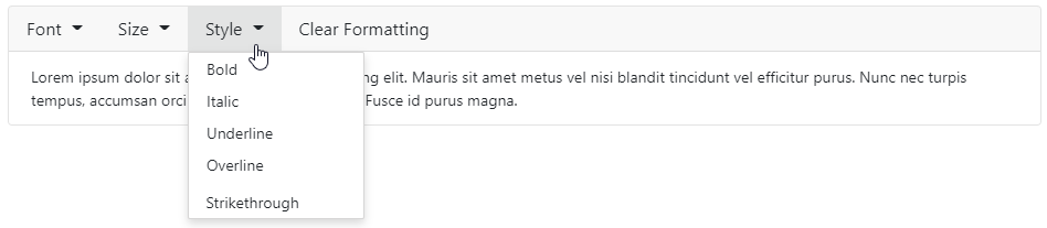
The code below loads menu items from the TextFormattingMenu class. Each menu item has child items. The code specifies the Children and Text mappings to adjust the menu data model to the specified data source.
<div class="card w-100">
    <div class="card-header p-0 fw-normal">
        <DxMenu ItemClick="@(e => ((TextFormattingMenuItem)e.ItemInfo.Data).Click())"
                Data="@MenuItems">
            <DataMappings>
                <DxMenuDataMapping Text="Text"
                                   Children="Children"
                                   BeginGroup="BeginGroup"
                                   CssClass="CssClass"
                                   Enabled="Enabled" />
            </DataMappings>
        </DxMenu>
    </div>
    <div class="card-body">
        <div style="@Formatting.GetStyleString()">
            <span class="dxbs-preventsel">Lorem ipsum dolor sit amet, consectetur adipiscing elit. Mauris sit amet metus vel nisi blandit tincidunt vel efficitur purus. Nunc nec turpis tempus, accumsan orci auctor, imperdiet mauris. Fusce id purus magna.</span>
        </div>
    </div>
</div>

@code {
    List<TextFormattingMenuItem> menuItems;
    List<TextFormattingMenuItem> MenuItems => menuItems = menuItems ?? TextFormattingMenu.MenuItems(Formatting);
    TextFormatting Formatting { get; } = new TextFormatting();
}
Orientation
The Menu’s default orientation is Horizontal (menu items are arranged in a row). Use the Orientation property to change the orientation.
<div>
    <DxMenu Title="DevExpress"
            Orientation="Orientation.Vertical"
            DisplayMode="MenuDisplayMode.Desktop">
        <Items>
            <DxMenuItem Text="Products" IconCssClass="oi oi-layers">
                <Items>
                    <DxMenuItem Text="Subscriptions / Packs" />
                    <DxMenuItem Text=".NET Windows Forms Components" />
                    <DxMenuItem Text="Reporting / Printing Suites" />
                    <DxMenuItem Text="VCL Components and Tools" />
                    <DxMenuItem Text="ASP.NET Components" />
                </Items>
            </DxMenuItem>
            <DxMenuItem Text="Support" IconCssClass="oi oi-person">
                <Items>
                    <DxMenuItem Text="Knowledge Base" />
                    <DxMenuItem Text="Documentation" />
                    <DxMenuItem Text="Support Center" />
                    <DxMenuItem Text="Newsgroups" />
                    <DxMenuItem Text="Best Practices" />
                </Items>
            </DxMenuItem>
        </Items>
    </DxMenu>
</div>
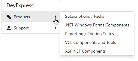
Display Modes
The Menu component supports different display modes (the DisplayMode property):
Auto- the menu is adapted to the device type.Desktop- the menu is shown as a panel with root items. The menu view also depends on the orientation. In the horizontal orientation, child items are available in drop-down menus. In the vertical orientation, submenus with child items are shown to the side of the menu container.Mobile- the menu has a compact view and depends on the orientation. In the horizontal orientation, it is a hamburger menu. In the vertical orientation, the menu looks like a desktop menu - a panel with root items, but submenus are shown in the main menu container and have the Back button.
The code below demonstrates how to specify display mode:
<div>
    <DxMenu Title="DevExpress"
            Orientation="Orientation.Vertical"
            DisplayMode="MenuDisplayMode.Mobile">
        <Items>
            <DxMenuItem Text="Products" IconCssClass="oi oi-layers">
                <Items>
                    <DxMenuItem Text="Subscriptions / Packs" />
                    <DxMenuItem Text=".NET Windows Forms Components" />
                    <DxMenuItem Text="Reporting / Printing Suites" />
                    <DxMenuItem Text="VCL Components and Tools" />
                    <DxMenuItem Text="ASP.NET Components" />
                </Items>
            </DxMenuItem>
            <DxMenuItem Text="Support" IconCssClass="oi oi-person">
                <Items>
                    <DxMenuItem Text="Knowledge Base" />
                    <DxMenuItem Text="Documentation" />
                    <DxMenuItem Text="Support Center" />
                    <DxMenuItem Text="Newsgroups" />
                    <DxMenuItem Text="Best Practices" />
                </Items>
            </DxMenuItem>
        </Items>
    </DxMenu>
</div>
Adaptivity
The Menu component supports adaptive mode when items are arranged horizontally. The following properties specify how the menu responds when the width of the browser window changes and there is not enough space to display all the items:
- CollapseItemToIconMode - Specifies whether the menu hides item text and displays icons instead. You can also use the AdaptivePriority property to specify the order in which menu items are hidden.
- CollapseItemsToHamburgerMenu - Specifies whether menu items are collapsed into a hamburger menu. You can use the HamburgerButtonPosition property to specify the hamburger button’s position.
<div class="card w-auto">
    <DxMenu Title="DevExpress"
            CollapseItemToIconMode="MenuCollapseItemToIconMode.Sequentially"
            CollapseItemsToHamburgerMenu="true">
        <Items>
            <DxMenuItem Text="Products" IconCssClass="oi oi-layers" />
            <DxMenuItem Text="Support" IconCssClass="oi oi-person" />
            <DxMenuItem Text="Documentation" IconCssClass="oi oi-book" />
            <DxMenuItem Text="Demos" IconCssClass="oi oi-monitor" />
            <DxMenuItem Text="Blogs" IconCssClass="oi oi-bell" />
            <DxMenuItem Text="Search" IconCssClass="oi oi-magnifying-glass" />
        </Items>
    </DxMenu>
</div>

You can also use the DisplayMode property in Auto mode to show the Menu as a panel or in a compact view depending on the device type.
Templates
The Menu component allows you to use templates to customize the layout and appearance of the menu title and menu items.
Title Template
Use the TitleTemplate property to specify the template for the menu title.
<div class="card w-50">
    <DxMenu Title="DevExpress Logo">
        <TitleTemplate>
            <img width="120" src="images/Logo-Monochrome.svg" alt="@context" />
        </TitleTemplate>
        <Items>
            <DxMenuItem Text="Products" IconCssClass="oi oi-layers" />
            <DxMenuItem Text="Support" IconCssClass="oi oi-person" />
            <DxMenuItem Text="Documentation" IconCssClass="oi oi-book" />
            <DxMenuItem Text="Demos" IconCssClass="oi oi-monitor" />
        </Items>
    </DxMenu>
</div>

Item Templates
You can specify a template for all items or for an individual item. Individual templates override common templates.
| What to Customize | Common Templates | Individual Templates |
|---|---|---|
| A whole item | DxMenu.ItemTemplate | DxMenuItem.Template |
| An item’s text | DxMenu.ItemTextTemplate | DxMenuItem.TextTemplate |
| An item’s submenu | DxMenu.SubMenuTemplate | DxMenuItem.SubMenuTemplate |
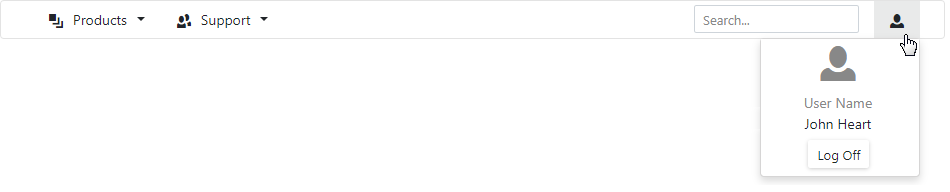
The following example demonstrates how to use templates to create the Search and User Profile menu items.
<div class="card">
    <DxMenu>
        <Items>
            <DxMenuItem Text="Products" IconCssClass="oi oi-layers">
                <Items>
                    <DxMenuItem Text="Subscriptions / Packs" />
                </Items>
            </DxMenuItem>
            <DxMenuItem Text="Support" IconCssClass="oi oi-people">
                <Items>
                    <DxMenuItem Text="Knowledge Base" />
                </Items>
            </DxMenuItem>
            <DxMenuItem CssClass="ml-auto">
                <Template>
                    <div class="container">
                        <input type="text" class="form-control form-control-sm center" placeholder="Search...">
                    </div>
                </Template>
            </DxMenuItem>
            <DxMenuItem Text="User Profile">
                <TextTemplate>
                    <div class="oi oi-person" />
                </TextTemplate>
                <SubMenuTemplate>
                    <div class="w-100">
                        <div class="flex-column align-items-center justify-content-center">
                            <div class="logo-container d-flex align-items-center justify-content-center mt-2">
                                <div class="oi oi-person text-muted h1" />
                            </div>
                            <div class="user-name-container bm-3 mb-2">
                                <div class="user-name-title text-muted text-center">User Name</div>
                                <div class="user-name text-center">John Heart</div>
                            </div>
                            <div class="d-flex justify-content-center mb-2">
                                <DxButton Text="Log Off" RenderStyle="@ButtonRenderStyle.Secondary"></DxButton>
                            </div>
                        </div>
                    </div>
                </SubMenuTemplate>
            </DxMenuItem>
        </Items>
    </DxMenu>
</div>
Troubleshooting
If a Blazor application throws unexpected exceptions, refer to the following help topic: Troubleshooting.