DxFormLayoutGroup Class
Namespace: DevExpress.Blazor
Assembly: DevExpress.Blazor.v22.1.dll
NuGet Package: DevExpress.Blazor
Declaration
public class DxFormLayoutGroup :
    FormLayoutGroupBase,
    IFormLayoutLevel
Remarks
Use the DxFormLayoutGroup class to organize layout elements.
Create a Group
To specify a group caption, use the Caption property. Use the CaptionPosition property to place the caption of a nested item above it (Vertical) or at its left border (Horizontal). You can use ColSpanXX properties to specify the group width. The following example arranges items into groups with captions:
<DxFormLayout>
    <DxFormLayoutGroup Caption="Personal Information" ColSpanMd="6">
        <DxFormLayoutItem Caption="First Name:">
            @* ... *@
        </DxFormLayoutItem>
    </DxFormLayoutGroup>
    <DxFormLayoutGroup Caption="Work Information" ColSpanMd="6">
        <DxFormLayoutItem Caption="Position:">
           @* ... *@
        </DxFormLayoutItem>
    </DxFormLayoutGroup>
</DxFormLayout>
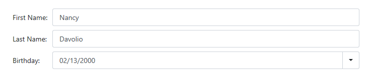
Customize Appearance
Set the Decoration property to FormLayoutGroupDecoration.None to disable the card decoration for groups:
<DxFormLayout>
    <DxFormLayoutGroup Caption="Personal Information" Decoration="FormLayoutGroupDecoration.None">
        <DxFormLayoutItem Caption="First Name:">
            <DxTextBox @bind-Text="@FirstName" />
        </DxFormLayoutItem>

        <DxFormLayoutItem Caption="Last Name:">
            <DxTextBox @bind-Text="@LastName" />
        </DxFormLayoutItem>

        <DxFormLayoutItem Caption="Birthday:">
            <DxDateEdit @bind-Date="@Birthday"></DxDateEdit>
        </DxFormLayoutItem>
    </DxFormLayoutGroup>
</DxFormLayout>

@code {
    string FirstName { get; set; } = "Nancy";
    string LastName { get; set; } = "Davolio";
    DateTime Birthday { get; set; } = DateTime.Now.AddYears(-20);
}
Use the CssClass property to apply a CSS class to a group:
<style>
    .my-class {
        color: blue;
    }
</style>

<DxFormLayout Data="forecast">
    <DxFormLayoutGroup Caption="Weather Forecast" CssClass="my-class">
        <DxFormLayoutItem Caption="Date" Field="@nameof(WeatherForecast.Date)" ReadOnly="true" />
        <DxFormLayoutItem Caption="Temperature" Field="@nameof(WeatherForecast.TemperatureC)" Enabled="false" />
    </DxFormLayoutGroup>
</DxFormLayout>

@code {
    public class WeatherForecast
    {
        public DateTime Date { get; set; }
        public int TemperatureC { get; set; }
    }

    WeatherForecast forecast = new WeatherForecast()
    {
        Date = new DateTime(2020, 05, 11),
        TemperatureC = 20,
    };
}
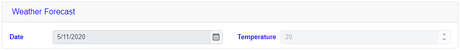
Refer to following topic for more information: CSS Classes.
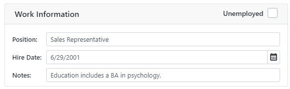
Use the HeaderTemplate and HeaderCssClass properties to customize only the group’s header. Add the HeaderTemplate component to the group’s markup and wrap the group’s items in the Items tag:
<DxFormLayout>
    <DxFormLayoutGroup ColSpanMd="6">
        <HeaderTemplate>
            <div class="float-left">
                Work Information
            </div>
            <div class="float-right">
                <DxCheckBox CheckedChanged="@((bool t) => UnemployedChanged(t))" LabelPosition="LabelPosition.Left" Checked="@Unemployed">Unemployed</DxCheckBox>
            </div>
        </HeaderTemplate>
        <Items>
            <DxFormLayoutItem Caption="Position:" ColSpanMd="12">
                <DxTextBox @bind-Text="@Position" Enabled="!Unemployed" />
            </DxFormLayoutItem>
            @* ... *@
        </Items>
    </DxFormLayoutGroup>
</DxFormLayout>

@code {
  bool Unemployed { get; set; }
  string? Position { get; set; } = "Sales Representative";
  // ...
  void UnemployedChanged(bool value)
  {
      // ...
      Position = value ? null : Position;
      Unemployed = value;
  }
}
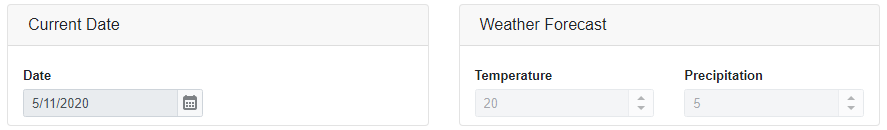
Enabled and Read-Only Modes
You can disable auto-generated editors within the the group or mark them as read-only.
<DxFormLayout Data="forecast">
    <DxFormLayoutGroup Caption="Current Date" ColSpanMd="6" ReadOnly="true">
        <DxFormLayoutItem Caption="Date" Field="@nameof(WeatherForecast.Date)" ReadOnly="true" />
    </DxFormLayoutGroup>
    <DxFormLayoutGroup Caption="Weather Forecast" ColSpanMd="6" Enabled="false">
        <DxFormLayoutItem Caption="Temperature" Field="@nameof(WeatherForecast.TemperatureC)" Enabled="false" />
        <DxFormLayoutItem Caption="Precipitation" Field="@nameof(WeatherForecast.Precipitation)" />
    </DxFormLayoutGroup>
</DxFormLayout>