DxMaskedInput<T> Class
A Masked Input component.
Namespace: DevExpress.Blazor
Assembly: DevExpress.Blazor.v22.1.dll
NuGet Package: DevExpress.Blazor
Declaration
public class DxMaskedInput<T> :
    DxInputDataEditorBase<T>
Type Parameters
| Name | Description |
|---|---|
| T | The value type. |
Remarks
The DevExpress Masked Input for Blazor (<DxMaskedInput>) is a text editor that supports masks.
Most of our data editors can work only with certain data types (DateTime, numeric objects, and so on), but you cannot use these editors (Date Time, Spin Edit, Time Edit) if you store the data source objects (dates or numbers) as strings. The Masked Input can work with such data. The component converts strings from the data source to the corresponding data type (DateTime, int, and so forth), and then treats the resulting value as a date or number. This allows you to use all the functionality of the appropriate mask type (Date-Time, Numeric), even for string objects.
Add a Masked Input to a Project
Follow the steps below to add the Masked Input component to an application:
- Use a DevExpress Project Template to create a new Blazor Server or Blazor WebAssembly application. If you use a Microsoft project template or already have a Blazor project, configure your project to incorporate DevExpress Blazor components.
- Add the
<DxMaskedInput>…</DxMaskedInput>markup to a.razorfile. - Configure the component: apply a mask, specify the editor’s value, handle value changes, and so on (see the sections below).
Apply a Mask
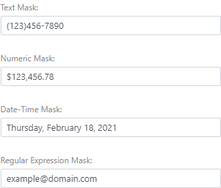
The Masked Input component supports four mask types:
Follow the steps below to set up a mask:
Assign a desired mask pattern to the Mask property. For information on patterns available for each mask type, follow the links above.
<DxMaskedInput @bind-Value="Value"
               Mask="(000) 000-0000" >
</DxMaskedInput>

@code{
    String Value { get; set; }
}
You should also set the MaskMode property to
MaskMode.RegExto enable a Regular Expression mask.<DxMaskedInput @bind-Value="Value" Mask="[A-Z]*" MaskMode="@MaskMode.RegEx" /> @code{ String Value { get; set; } }
If required, configure mask settings (the current culture, placeholder characters, and so on). For this purpose, add the component that corresponds to the mask type (DxDateTimeMaskProperties, DxNumericMaskProperties, DxTextMaskProperties, and DxRegExMaskProperties) to the Masked Input markup and specify the component’s properties.
The code below enables the French culture and changes the default mask placeholder (
_) to the custom character (#).@using System.Globalization <DxMaskedInput @bind-Value="Value" Mask="[A-Z]{3}-[0-9]{2}" MaskMode="@MaskMode.RegEx"> <DxRegExMaskProperties Culture="Culture" Placeholder="Placeholder" /> </DxMaskedInput> @code{ String Value { get; set; } char Placeholder = '#'; CultureInfo Culture = CultureInfo.GetCultureInfo("fr-FR"); }
Edit Value
Use the Value property to specify an editor value or to bind the displayed text to a data source object. You can use the @bind attribute to bind the Value property to a data field. Refer to the following topic for details: Two-Way Data Binding.
Also, the specified value should fit the Mask pattern. Otherwise, the value cannot be displayed.
<DxMaskedInput @bind-Value="Value" Mask="[A-Z]*" MaskMode="MaskMode.RegEx"/>

@code {
    string Value { get; set; } = "TEXT";
}
The Value property updates its value when the editor loses focus (OnLostFocus mode). You can set the BindValueMode property to OnInput to update the Value property when a user changes the input value.
Handle a Value Change
If you do not use two-way data binding, handle the ValueChanged event to respond to changes made in the editor. The code below enables the Update Text button once a user types in the Masked Input editor.
<DxMaskedInput Value="Value"
               ValueChanged="@((int newValue) => OnValueChanged(newValue))"
               Mask="@NumericMask.Currency">
</DxMaskedInput>
<DxButton Enabled="@IsEnabled">Update Value</DxButton>

@code {
    int Value = 0;
    bool IsEnabled = false;

    void OnValueChanged(int newValue)
    {
        Value = newValue;
        if (newValue != 0)
            IsEnabled = true;
        else IsEnabled = false;
    }
}
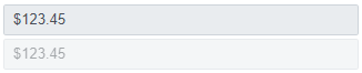
Disabled and ReadOnly Modes
Use the Enabled and ReadOnly properties to disable and mark the Masked Input component as read-only.
<DxMaskedInput @bind-Value="@Value"
               Mask="@NumericMask.Currency"
               ReadOnly="true">
</DxMaskedInput>

<DxMaskedInput @bind-Value="@Value"
               Mask="@NumericMask.Currency"
               Enabled="false">
</DxMaskedInput>

@code {
    double Value { get; set; } = 123.45;
}
Appearance Customization
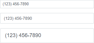
Use the SizeMode property to specify a Masked Input size. The code below applies different size modes to Masked Input components.
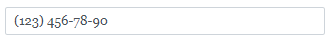
<DxMaskedInput SizeMode="SizeMode.Small" @bind-Value="@Value" Mask="(000) 000-0000" />

<DxMaskedInput SizeMode="SizeMode.Medium" @bind-Text="@Value" Mask="(000) 000-0000" />

<DxMaskedInput SizeMode="SizeMode.Large" @bind-Text="@Value" Mask="(000) 000-0000" />

@code {
    string Value { get; set; }
}
To apply custom CSS rules to Masked Input, use the InputCssClass property. The following code snippet changes the component font:
<style>
    .my-style {
        font-family: Georgia, 'Times New Roman', Times, serif;
    }
</style>

<DxMaskedInput @bind-Value="@Value"
                InputCssClass="my-style"
                Mask="(999) 000-00-00">
</DxMaskedInput>

@code {
    string Value { get; set; }
}
For more information, refer to the following help topics:
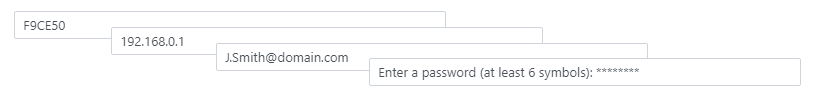
Clear Button and Placeholder
Set the ClearButtonDisplayMode property to Auto to display the Clear button in the Masked Input editor when it is not empty. Use the NullText property to display the prompt text (placeholder) in the editor when its value is null.
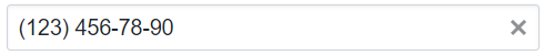
<DxMaskedInput @bind-Value="@Value"
               ClearButtonDisplayMode="DataEditorClearButtonDisplayMode.Auto"
               NullText="Specify a phone..."
               Mask="(000) 000-00-00">
</DxMaskedInput>

@code {
    string Value { get; set; }
}
Input Validation
You can add a standalone Masked Input or the Form Layout component to the Blazor’s standard EditForm. This form validates user input based on data annotation attributes defined in a model and indicates errors.
<EditForm Model="@starship" Context="EditFormContext">
    <DataAnnotationsValidator />
    <DxFormLayout >
        <DxFormLayoutItem Caption="Identifier:" ColSpanMd="6" >
            <Template >
                <DxMaskedInput @bind-Value="@starship.Identifier" Mask=".{,16}" MaskMode="@MaskMode.RegEx" />
            </Template >
        </DxFormLayoutItem >
        @*...*@
    </DxFormLayout>
</EditForm>

@code {
    private Starship starship=new Starship();
}
For more information, refer to the following help topic: Validate Input.
HTML Attributes and Events
You can use HTML attributes and events to configure the Masked Input.
<DxMaskedInput @bind-Value="@Value"
               Mask="(000) 000-0000"
               @onfocusout="MyFunction" />

@AlertText

@code {
    string Value { get; set; }

    void MyFunction()
    {
        AlertText = $"The Masked Input is out of focus!";
    }
}
Troubleshooting
If a Blazor application throws unexpected exceptions, refer to the following help topic: Troubleshooting.