DxButton Class
A Button component.
Namespace: DevExpress.Blazor
Assembly: DevExpress.Blazor.v22.1.dll
NuGet Package: DevExpress.Blazor
Declaration
public class DxButton :
    DxComponentBase<JSInteropProxyBase>,
    ISizeModeAccessor,
    IRequireSelfCascading
Remarks
The DevExpress Button for Blazor (<DxButton>) allows you to add a stylized button to your project and handle its click.
Add a Button to a Project
Follow the steps below to add the Button component to an application:
- Use a DevExpress Project Template to create a new Blazor Server or Blazor WebAssembly application. If you use a Microsoft project template or already have a Blazor project, configure your project to incorporate DevExpress Blazor components.
- Add the
<DxButton/>markup to a.razorfile. - Configure the component: specify the button’s content and appearance, handle button clicks, and so on (see the sections below).
Button Content and Appearance
Use the Text property to specify the button’s text.
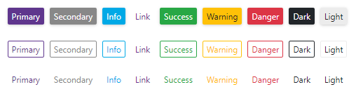
To configure button appearance, specify the RenderStyle and RenderStyleMode properties. All the Bootstrap styles are available.
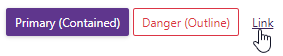
<DxButton RenderStyle="ButtonRenderStyle.Primary" RenderStyleMode="ButtonRenderStyleMode.Contained"
    Text="Primary (Contained)" />
<DxButton RenderStyle="ButtonRenderStyle.Danger" RenderStyleMode="ButtonRenderStyleMode.Outline"
    Text="Danger (Outline)" />
<DxButton RenderStyle="ButtonRenderStyle.Link" RenderStyleMode="ButtonRenderStyleMode.Contained"
    Text="Link" />
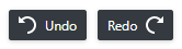
Assign the icon’s CSS class to the IconCssClass property to add an icon to your button. The IconPosition property specifies the icon position.
<DxButton RenderStyle="ButtonRenderStyle.Dark" Text="Undo" Title="Undo the last action."
    IconCssClass="undo" style="margin-right: 0.5em;"/>
<DxButton RenderStyle="ButtonRenderStyle.Dark" Text="Redo" Title="Restore the previously undone action."
    IconCssClass="redo" IconPosition="ButtonIconPosition.AfterText" />
To hide the button, set the Visible property to false.
Size Modes
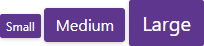
Use the SizeMode property to specify a button size. The code below applies different size modes to Button components.
<DxButton Text="Small" SizeMode="SizeMode.Small" />

<DxButton Text="Medium" SizeMode="SizeMode.Medium" />

<DxButton Text="Large" SizeMode="SizeMode.Large" />
For more information, refer to Size Modes.
Handle the Click Event
Handle the Click event to respond to the button’s click.
<DxButton ...
    Click="@Handler">

@code {
    // ...
    void Handler(MouseEventArgs args) {
        Console.WriteLine("I am clicked!");
    }
}
If you use the NavigateUrl property together with the Click event’s handler, the browser handles the event first and then navigates to the specified URL.
To submit a form with a button click, set the SubmitFormOnClick option to true.
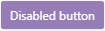
Set the Enabled property to false to disable the button.
<DxButton RenderStyle="ButtonRenderStyle.Primary" Text="Disabled button" Enabled="false" />
Custom Content
You can implement custom content for your button and customize the button’s appearance and behavior.

<DxButton RenderStyle="ButtonRenderStyle.Info" Click="@Like" IconCssClass="like" Text="Like">
    @context
    <span style="width: 0.8em; margin-left: 8px;">@(likes < 10 ? likes.ToString() : "9")</span>
</DxButton>

@code {
    int likes;
    protected override void OnInitialized() {
        likes = 1;
    }
    void Like(MouseEventArgs args) {
        likes++;
    }
}
Troubleshooting
If a Blazor application throws unexpected exceptions, refer to the following help topic: Troubleshooting.