DxContextMenu Class
A Context Menu component.
Namespace: DevExpress.Blazor
Assembly: DevExpress.Blazor.v22.1.dll
NuGet Package: DevExpress.Blazor
Declaration
public class DxContextMenu :
    DxComponentBase,
    IModelWrapper<IContextMenuModel>,
    IServiceProviderAccessor,
    IRequireSelfCascading
Remarks
<DxContextMenu> adds a context menu to your Blazor application.
Add a Context Menu to a Project
Follow the steps below to add the Context Menu component to an application:
- Use a DevExpress Project Template to create a new Blazor Server or Blazor WebAssembly application. If you use a Microsoft project template or already have a Blazor project, configure your project to incorporate DevExpress Blazor components.
- Add the
<DxContextMenu>…</DxContextMenu>markup to a.razorfile. Configure the component: add items, customize their appearance, handle clicks, and so on (see the sections below).
You can use two methods to populate the control:
Add code that invokes the context menu when users right-click an HTML element.
Unbound Mode
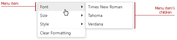
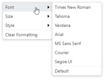
In this mode, you should add items to the Context Menu component markup. Use the DxContextMenuBase.Items property to specify a collection of root items. Each item is a DxContextMenuItem class instance that can have a collection of child items (the DxContextMenuItem.Items property).
<DxContextMenu>
    <Items>
        <DxContextMenuItem Text="Font">
            <Items>
                <DxContextMenuItem Text="Times New Roman"></DxContextMenuItem>
                <DxContextMenuItem Text="Tahoma"></DxContextMenuItem>
                <DxContextMenuItem Text="Verdana"></DxContextMenuItem>
            </Items>
        </DxContextMenuItem>
        <DxContextMenuItem Text="Size">
            <Items>
                <DxContextMenuItem Text="8pt"></DxContextMenuItem>
                <DxContextMenuItem Text="10pt"></DxContextMenuItem>
                <DxContextMenuItem Text="12pt"></DxContextMenuItem>
            </Items>
        </DxContextMenuItem>
        <DxContextMenuItem Text="Style">
            <Items>
                <DxContextMenuItem Text="Bold"></DxContextMenuItem>
                <DxContextMenuItem Text="Italic"></DxContextMenuItem>
                <DxContextMenuItem Text="Underline"></DxContextMenuItem>
            </Items>
        </DxContextMenuItem>
        <DxContextMenuItem Text="Clear Formatting" BeginGroup="true"></DxContextMenuItem>
    </Items>
</DxContextMenu>
Customize Items
To specify an item’s name, use the Name property.
The table below lists API members that allow you to customize item appearance.
| Member | Description |
|---|---|
| Text | Specifies a menu item’s text. |
| IconCssClass | Specifies the CSS class of a menu item’s icon. |
| IconUrl | Specifies the URL of a menu item’s icon. |
The following code demonstrates how to add items to a menu and specify their icons:
<DxContextMenu>
    <Items>
        <DxContextMenuItem Text="Home" IconCssClass="oi oi-home"></DxContextMenuItem>
        <DxContextMenuItem Text="Contacts" IconCssClass="oi oi-phone"></DxContextMenuItem>
        <DxContextMenuItem Text="Calendar" IconCssClass="oi-calendar"></DxContextMenuItem>
    </Items>
</DxContextMenu>
Item Templates
The Context Menu component allows you to use templates to customize the layout and appearance of menu items. You can specify a template for all items or an individual item. Individual templates override common templates.
| What to Customize | Common Templates | Individual Templates |
|---|---|---|
| A whole item | DxContextMenu.ItemTemplate | DxContextMenuItem.Template |
| An item’s text | DxContextMenu.ItemTextTemplate | DxContextMenuItem.TextTemplate |
| An item’s submenu | DxContextMenu.SubMenuTemplate | DxContextMenuItem.SubMenuTemplate |
The following example demonstrates how to define submenu templates for the Text color and Background color menu items:
<div class="dxbs-preventsel target-container"
@oncontextmenu="e => ContextMenu.ShowAsync(e)"
@oncontextmenu:preventDefault>
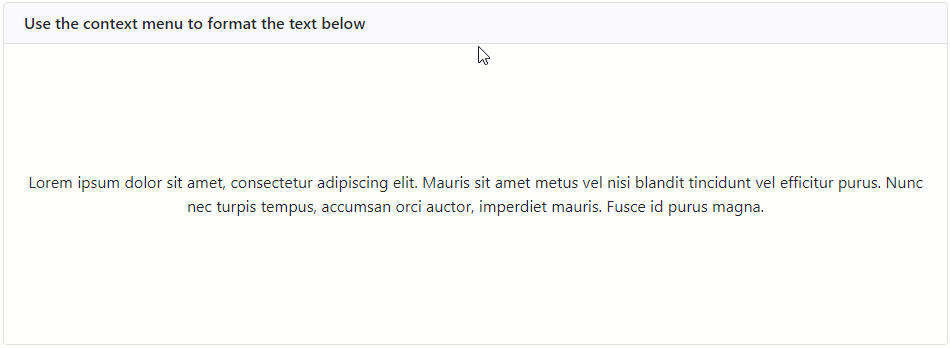
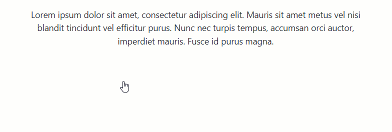
<p style="display: inline-block; text-align: center; margin: auto; color:@TextColor; background-color:@BackgroundColor">Lorem ipsum dolor sit amet, consectetur adipiscing elit. Mauris sit amet metus vel nisi blandit tincidunt vel efficitur purus. Nunc nec turpis tempus, accumsan orci auctor, imperdiet mauris. Fusce id purus magna.</p>
</div>
<DxContextMenu @ref="@ContextMenu">
<Items>
<DxContextMenuItem Text="Text color">
<SubMenuTemplate>
<ColorPicker HeaderText="Text color" SelectedColor="@TextColor" ColorChanged="ChangeTextColor"/>
</SubMenuTemplate>
</DxContextMenuItem>
<DxContextMenuItem Text="Background color">
<SubMenuTemplate>
<ColorPicker HeaderText="Background color" SelectedColor="@BackgroundColor" ColorChanged="@ChangeBackgroundColor"/>
</SubMenuTemplate>
</DxContextMenuItem>
<DxContextMenuItem Text="Reset colors" Click="@ResetColors" BeginGroup="true"
Enabled="@(BackgroundColor != UnsetValue || TextColor != UnsetValue)"/>
</Items>
</DxContextMenu>
@code {
const string UnsetValue = "unset";
DxContextMenu ContextMenu { get; set; }
private string TextColor { get; set; } = UnsetValue;
private string BackgroundColor { get; set; } = UnsetValue;
private void ChangeTextColor(string color) {
TextColor = color;
ContextMenu.HideAsync();
}
private void ChangeBackgroundColor(string color) {
BackgroundColor = color;
ContextMenu.HideAsync();
}
private void ResetColors() {
BackgroundColor = TextColor = UnsetValue;
InvokeAsync(StateHasChanged);
}
}
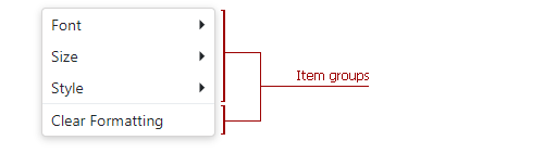
Group Items
You can split context menu items into groups. To specify the start of a new item group, use the BeginGroup property.
<DxContextMenu>
    <Items>
        <DxContextMenuItem Text="Font">
            <Items>
                @* ... *@
            </Items>
        </DxContextMenuItem>
        <DxContextMenuItem Text="Size">
            <Items>
                @* ... *@
            </Items>
        </DxContextMenuItem>
        <DxContextMenuItem Text="Style">
            <Items>
                @* ... *@
            </Items>
        </DxContextMenuItem>
        <DxContextMenuItem Text="Clear Formatting" BeginGroup="true"></DxContextMenuItem>
    </Items>
</DxContextMenu>
A horizontal line separates groups:
Disable User Interaction
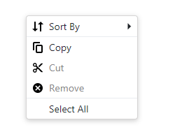
To disable a menu item, set its Enabled property to false. The code below disables the Cut and Remove menu items.
<DxContextMenu>
    <Items>
        <DxContextMenuItem Text="Sort By" IconUrl="images/Sort_by.svg">
            <Items>
                ...
            </Items>
        </DxContextMenuItem>
        <DxContextMenuItem Text="Copy" IconUrl="images/Copy.svg" BeginGroup="true"></DxContextMenuItem>
        <DxContextMenuItem Text="Cut" IconUrl="images/Cut.svg" Enabled="false"></DxContextMenuItem>
        <DxContextMenuItem Text="Remove" IconUrl="images/Clear.svg" Enabled="false"></DxContextMenuItem>
        <DxContextMenuItem Text="Select All" BeginGroup="true"></DxContextMenuItem>
    </Items>
</DxContextMenu>
Bound Mode
The Context Menu component supports binding to data. In bound mode, items from the data source automatically populate menu items.
Follow the steps below to bind Context Menu to data:
Use the Data property to specify a data source. You can use different data types:
- Flat data - a collection of items that are available at one level.
- Hierarchical data - a collection of nested items.
Add the DataMappings tag to the component’s markup.
Create the DxContextMenuDataMapping instance and map item properties (BeginGroup, Enabled, and so on) to data source fields. Mappings are used to link the Context Menu data model to the data source.
Flat data - the Key and ParentKey properties are required. If the Context Menu’s structure consists of only one level, you can omit these properties.
Hierarchical data - the Children property is required.
You can also create multiple
DxContextMenuDataMappinginstances to specify different mappings for different item levels. Use the Level property to specify the item level for which data mappings are applied.
The code below loads context menu items from the TextFormattingMenu class. Each menu item has child items. The code specifies the Children, Text, IconUrl, and BeginGroup mappings to adjust the context menu data model to the specified data source.
<div style="@Formatting.GetStyleString()" class="dxbs-preventsel target-container"
     @oncontextmenu="((e) => { ContextMenu.ShowAsync(e); } )"
     @oncontextmenu:preventDefault>
     @* ... *@
</div>
<DxContextMenu Data="@MenuItems" ItemClick="@ItemClick" @ref="@ContextMenu">
    <DataMappings>
        <DxContextMenuDataMapping Children="Children"
                                  Text="Text"
                                  IconUrl="IconUrl"
                                  BeginGroup="BeginGroup"
                                  Enabled="Enabled" />
    </DataMappings>
</DxContextMenu>

@code {
    List<TextFormattingMenuItem> menuItems;
    List<TextFormattingMenuItem> MenuItems => menuItems = menuItems ?? TextFormattingMenu.ContextMenuItems(Formatting);
    DxContextMenu ContextMenu { get; set; }
    TextFormatting Formatting { get; set; } = new TextFormatting();

    void ItemClick(ContextMenuItemClickEventArgs args) {
        ((TextFormattingMenuItem)args.ItemInfo.DataItem).Click();
    }
}
Note
If you bind the Context Menu component with a nonempty Items collection to a data source, unbound data is lost. Bound data overwrites all the items added to the Items collection.
You can also bind the Context Menu component to Grid elements. Refer to the following example for more information.
Customize Items
To specify an item’s name, use the Name property.
The table below lists API members that allow you to customize item appearance.
| Member | Description |
|---|---|
| Text | Specifies the text of a navigation component’s item. Map this property to a data source field. |
| IconCssClass | Specifies the name of a CSS class applied to the icon of the navigation component’s item. Map this property to a data source field. |
| IconUrl | Specifies the URL of a navigation component’s item icon. Map this property to a data source field. |
| Visible | Specifies visibility of the navigation component’s item. |
Group Items
You can split context menu items into groups. A horizontal line separates groups:
To specify the start of a new item group, use the BeginGroup property.
<div style="@Formatting.GetStyleString()" class="dxbs-preventsel target-container"
     @oncontextmenu="((e) => { ContextMenu.ShowAsync(e); } )"
     @oncontextmenu:preventDefault>
     @* ... *@
</div>
<DxContextMenu Data="@MenuItems" ItemClick="@ItemClick" @ref="@ContextMenu">
    <DataMappings>
        <DxContextMenuDataMapping Children="Children"
                                  Text="Text"
                                  IconUrl="IconUrl"
                                  BeginGroup="BeginGroup"
                                  Enabled="Enabled" />
    </DataMappings>
</DxContextMenu>

@code {
    List<TextFormattingMenuItem> menuItems;
    List<TextFormattingMenuItem> MenuItems => menuItems = menuItems ?? TextFormattingMenu.ContextMenuItems(Formatting);
    DxContextMenu ContextMenu { get; set; }
    TextFormatting Formatting { get; set; } = new TextFormatting();

    void ItemClick(ContextMenuItemClickEventArgs args) {
        ((TextFormattingMenuItem)args.ItemInfo.DataItem).Click();
    }
}
Handle Item Click
The following API members allow you to specify click handlers for context menu items:
| Member | Description |
|---|---|
| ItemClick | Specifies a common handler for all items. |
| Click | Specifies handlers for individual items. |
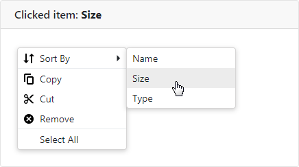
The code below demonstrates how to specify a common click handler for all menu items. When an item is clicked in the menu, the item’s text is displayed in the header.
<div class="card-header">
    @if (ClickedItem != null) {
        <span>Clicked item: <b>@ClickedItem</b></span>
    }
    else {
        <span>Clicked item: None</span>
    }
</div>

<DxContextMenu ItemClick="@OnItemClick">
    <Items>
        <DxContextMenuItem Text="Sort By" IconUrl="images/Sort_by.svg">
            <Items>
                <DxContextMenuItem Text="Name"></DxContextMenuItem>
                <DxContextMenuItem Text="Size"></DxContextMenuItem>
                <DxContextMenuItem Text="Type"></DxContextMenuItem>
            </Items>
        </DxContextMenuItem>
        @* ... *@
    </Items>
</DxContextMenu>

@code {
    string ClickedItem { get; set; }

    void OnItemClick(ContextMenuItemClickEventArgs args) {
        ClickedItem = args.ItemInfo.Text;
    }
}
Show/Hide Context Menu
To display a context menu, handle an event (for example, contextMenu) and call the ShowAsync method. Refer to ASP.NET Core Blazor Event Handling for more information.
<div style="height: 200px;"
     @oncontextmenu="((e) => ContextMenu.ShowAsync(e))"
     @oncontextmenu:preventDefault>
    <span style="font-weight: 600">RIGHT-CLICK TO SHOW THE CONTEXT MENU</span>
</div>

<DxContextMenu @ref="@ContextMenu">
    <Items>
        <DxContextMenuItem Text="Copy" />
        <DxContextMenuItem Text="Cut" />
        <DxContextMenuItem Text="Remove" />
    </Items>
</DxContextMenu>

@code {
    DxContextMenu ContextMenu { get; set; }
}
You can also use the ShowAsync(Double, Double) method to display a context menu at the specified coordinates on a browser window (x,y).
The context menu is closed when a user clicks outside it or clicks a menu item that does not have child items.
You can also use the HideAsync() method to close the menu. The code below demonstrates how to close the menu when the SortBy root item is clicked. The example uses a handler for the ItemClick event.
<DxContextMenu @ref="@ContextMenu" ItemClick="@OnItemClick">
    <Items>
        <DxContextMenuItem Name="SortBy" Text="Sort By">
            <Items>
                <DxContextMenuItem Text="Name"></DxContextMenuItem>
                <DxContextMenuItem Text="Size"></DxContextMenuItem>
                <DxContextMenuItem Text="Type"></DxContextMenuItem>
            </Items>
        </DxContextMenuItem>
    </Items>
</DxContextMenu>

@code {
    DxContextMenu ContextMenu { get; set; }

    void OnItemClick(ContextMenuItemClickEventArgs args) {
        if(args.ItemInfo.Name == "SortBy") {
            ContextMenu.HideAsync();
        }
    }
}
Troubleshooting
If a Blazor application throws unexpected exceptions, refer to the following help topic: Troubleshooting.