GridElementType Enum
Lists values that define a Grid element’s type.
Namespace: DevExpress.Blazor
Assembly: DevExpress.Blazor.v22.1.dll
NuGet Package: DevExpress.Blazor
Declaration
public enum GridElementTypeMembers
| Name | Description |
|---|---|
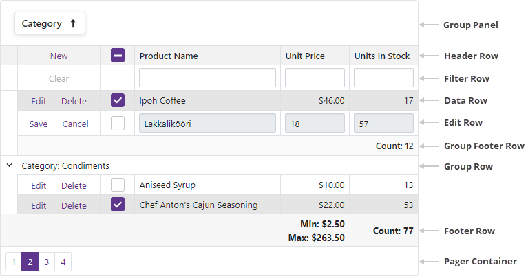
DataRow
|
A data row. |
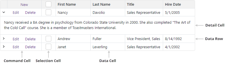
DataCell
|
A data column cell. |
CommandCell
|
A command column cell. |
SelectionCell
|
A selection column cell. |
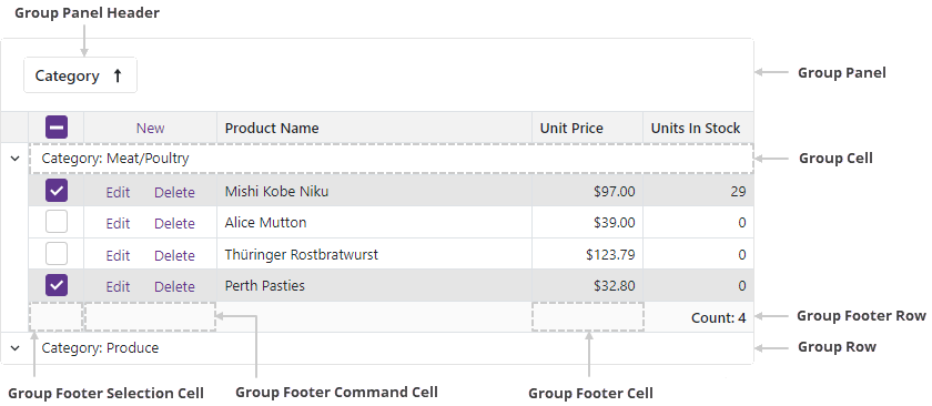
GroupRow
|
A group row. |
GroupCell
|
A group row cell. |
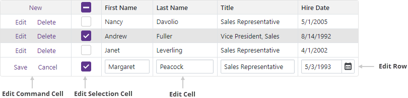
EditRow
|
An edit row. |
EditCell
|
An edit row cell. |
EditCommandCell
|
An edit row‘s command column cell. |
EditSelectionCell
|
An edit row‘s selection column cell. |
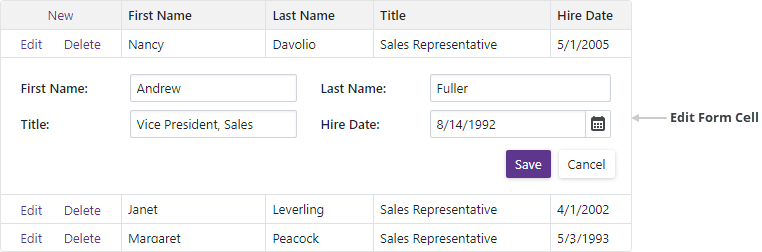
EditFormCell
|
An edit form cell. |
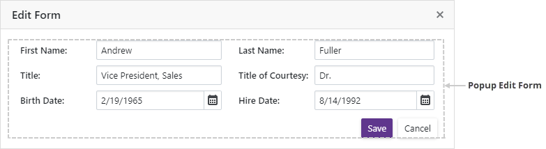
PopupEditForm
|
|
DetailCell
|
A detail row cell. |
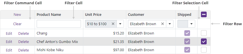
FilterRow
|
The filter row. |
FilterCell
|
A filter row‘s edit cell. |
FilterCommandCell
|
A filter row‘s command column cell. |
FilterSelectionCell
|
A filter row‘s selection column cell. |
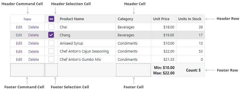
HeaderRow
|
The row that contains Grid column headers. |
HeaderCell
|
A data column header cell. |
HeaderCommandCell
|
A command column header cell. |
HeaderSelectionCell
|
A selection column header cell. |
GroupPanel
|
The group panel. |
GroupPanelHeader
|
A column header in the group panel. |
FooterRow
|
The footer. |
FooterCell
|
A footer cell. |
FooterCommandCell
|
The footer‘s command column cell. |
FooterSelectionCell
|
The footer‘s selection column cell. |
GroupFooterRow
|
A group footer. |
GroupFooterCell
|
A group footer cell. |
GroupFooterCommandCell
|
A group footer‘s command column cell. |
GroupFooterSelectionCell
|
A group footer‘s selection column cell. |
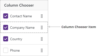
ColumnChooserItem
|
A column chooser item. |
PagerContainer
|
A container that stores the Grid pager. |
Related API Members
The following properties accept/return GridElementType values:
Remarks
Use this enumeration’s values to define an element type when you handle the CustomizeElement event.
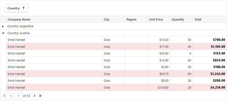
The code below customizes the appearance of grid elements that meet the following criteria:
- Data rows with Total > 1000 are highlighted.
- All Total values are bold.
- If the grid rows are grouped by Country, the group row’s tooltip displays group summary values.
@implements IDisposable
@inject NwindDataService NwindDataService

<style>
    .highlighted-item > td {
        background-color: rgba(245, 198, 203, 0.5);
    }
</style>

<DxGrid @ref="Grid"
        Data="@Data"
        ShowGroupPanel="true"
        UnboundColumnData="Grid_UnboundColumnData"
        CustomizeElement="Grid_CustomizeElement">
    <Columns>
        <DxGridDataColumn FieldName="CompanyName" MinWidth="100" />
        <DxGridDataColumn FieldName="City" Width="10%" />
        <DxGridDataColumn FieldName="Region" Width="10%" />
        <DxGridDataColumn FieldName="Country" Name="Country" Width="10%" GroupIndex="0" />
        <DxGridDataColumn FieldName="UnitPrice" DisplayFormat="c" Width="10%" />
        <DxGridDataColumn FieldName="Quantity" MinWidth="80" Width="10%" />
        <DxGridDataColumn FieldName="Total" Name="Total" UnboundType="GridUnboundColumnType.Decimal" DisplayFormat="c" MinWidth="100" Width="15%" />
    </Columns>
    <GroupSummary>
        <DxGridSummaryItem SummaryType="GridSummaryItemType.Count" FieldName="Country" Visible="false" />
        <DxGridSummaryItem SummaryType="GridSummaryItemType.Sum" FieldName="Total" Visible="false" />
    </GroupSummary>
</DxGrid>

@code {
    object Data { get; set; }
    IGrid Grid { get; set; }
    readonly TaskCompletionSource<bool> dataLoadedTcs = new(TaskCreationOptions.RunContinuationsAsynchronously);

    protected override async Task OnInitializedAsync() {
        var invoices = await NwindDataService.GetInvoicesAsync();
        var customers = await NwindDataService.GetCustomersAsync();
        Data = invoices.OrderBy(i => i.OrderDate).Join(customers, i => i.CustomerId, c => c.CustomerId, (i, c) => {
            return new {
                CompanyName = c.CompanyName,
                City = i.City,
                Region = i.Region,
                Country = i.Country,
                UnitPrice = i.UnitPrice,
                Quantity = i.Quantity
            };
        });
        dataLoadedTcs.TrySetResult(true);
    }
    protected override async Task OnAfterRenderAsync(bool firstRender) {
        if(firstRender) {
            await dataLoadedTcs.Task;
            Grid.ExpandGroupRow(1);
        }
    }

    void Grid_UnboundColumnData(GridUnboundColumnDataEventArgs e) {
        if(e.FieldName == "Total") {
            decimal price = (decimal)e.GetRowValue("UnitPrice");
            short quantity = (short)e.GetRowValue("Quantity");
            e.Value = price * quantity;
        }
    }
    void Grid_CustomizeElement(GridCustomizeElementEventArgs e) {
        if(e.ElementType == GridElementType.DataRow && (System.Decimal)e.Grid.GetRowValue(e.VisibleIndex, "Total") > 1000) {
            e.CssClass = "highlighted-item";
        }
        if(e.ElementType == GridElementType.DataCell && e.Column.Name == "Total") {
            e.Style = "font-weight: 800";
        }
        if(e.ElementType == GridElementType.GroupRow && e.Column.Name == "Country") {
            var summaryItems = e.Grid.GetGroupSummaryItems().Select(i => e.Grid.GetGroupSummaryDisplayText(i, e.VisibleIndex));
            e.Attributes["title"] = string.Join(", ", summaryItems);
        }
    }
    public void Dispose() {
        dataLoadedTcs.TrySetCanceled();
    }
}
Images
Grid Rows
Data Row
Edit Elements
Header and Footer
Group Elements
Filter Elements
Column Chooser