DxAccordion Class
An Accordion component.
Namespace: DevExpress.Blazor
Assembly: DevExpress.Blazor.v22.1.dll
NuGet Package: DevExpress.Blazor
Declaration
public class DxAccordion :
    DxNavigationComponentBase<IAccordionModel>
Remarks
The DevExpress Accordion component for Blazor (<DxAccordion>) displays hierarchical data structures within collapsible groups. Use this control to add layout management or navigation capabilities to your application.
Add an Accordion to a Project
Follow the steps below to add the Accordion component to an application:
- Use a DevExpress Project Template to create a new Blazor Server or Blazor WebAssembly application. If you use a Microsoft project template or already have a Blazor project, configure your project to incorporate DevExpress Blazor components.
- Add the
<DxAccordion>…</DxAccordion>markup to a.razorfile. - Configure the component: add items or bind the Accordion to data, handle expand/collapse events, customize items, and so on (see the sections below).
Unbound Mode (Items)
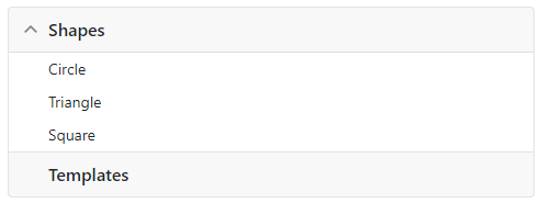
The <DxAccordion> component supports bound and unbound modes. In unbound mode, the developer should write markup that adds individual elements to the Accordion’s Items collection. Each item can have its own collection of child items (Items).
A DxAccordionItem class instance defines an item in code, and the Name property specifies its unique name. Use the Text property to specify the item’s text, the IconCssClass property to specify a CSS class for the item’s icon, and the NavigateUrl property to specify the URL to navigate to when a user clicks an item.
<DxAccordion>
    @* Root items *@
    <Items>
        <DxAccordionItem Text="Shapes" Expanded="true">
            @* Nested items *@
            <Items>
                <DxAccordionItem Text="Circle" />
                <DxAccordionItem Text="Triangle" />
                <DxAccordionItem Text="Square" />
            </Items>
        </DxAccordionItem>
        <DxAccordionItem Text="Templates" />
    </Items>
</DxAccordion>
Data Binding
The Accordion component supports binding to data. In bound mode, items from the data source automatically populate Accordion items.
Follow the steps below to bind Accordion to data:
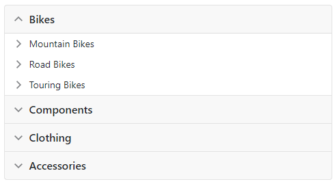
Use the Data property to specify a data source. You can use different data types:
- Flat data - a collection of items that are available at one level.
- Hierarchical data - a collection of nested items.
Add the DataMappings tag to the component’s markup.
Create the DxAccordionDataMapping instance and map item properties (HasChildren, NavigateUrl, and so on) to data source fields. Mappings are used to link the Accordion data model to the data source.
Flat data - the Key and ParentKey properties are required. If the Accordion’s structure consists of only one level, you can omit these properties.
Hierarchical data - the Children property is required.
You can also create multiple
DxAccordionDataMappinginstances to specify different mappings for different item levels. Use the Level property to specify the item level for which data mappings are applied.
Flat Data
The code below binds the Accordion to a flat collection of data items. It specifies mappings for the Text, Key, and ParentKey properties.
<DxAccordion Data="Data">
    <DataMappings>
        <DxAccordionDataMapping Text="Name"
                                Key="Id"
                                ParentKey="CategoryId" />
    </DataMappings>
</DxAccordion>

@code {
    List<FlatDataItem> Data { get; set; }

    protected override void OnInitialized() {
        IEnumerable<ProductFlat> products = ProductData.Products;
        IEnumerable<ProductCategory> productSubcategories = ProductData.Categories;

        Data = new List<FlatDataItem>(Enum.GetValues<ProductCategoryMain>().Select(i => new FlatDataItem() { Name = i.ToString(), Id = i }));
        Data.AddRange(products.Select(i => new FlatDataItem() { Name = i.ProductName, Id = i.Id, CategoryId = i.ProductCategoryId }));
        Data.AddRange(productSubcategories.Select(i => new FlatDataItem() { Name = i.Subcategory, Id = i.SubcategoryID, CategoryId = i.Category }));
    }
}
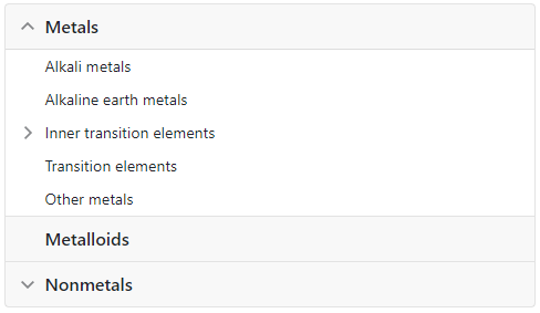
Hierarchical Data
The code below binds the Accordion to the collection of ChemicalElementGroup objects. Each object can have child objects. The code specifies the Children and Text mappings to adjust the Accordion’s data model to the specified data source.
<DxAccordion Data="@ChemicalElements.Groups">
    <DataMappings>
        <DxAccordionDataMapping Children="Groups"
                                Text="Name"/>
    </DataMappings>
</DxAccordion>
Expand and Collapse Items
Users can click the Accordion item’s header or expand/collapse button to change the expansion state. Use the ExpandCollapseAction property to choose the action that expands or collapses the item.
See the related API members below:
- ExpandCollapseAction
- Specifies the user action that expands or collapses the item.
- ExpandMode
- Specifies how many items can be expanded at a time.
- Expanded
- Specifies whether the item is expanded.
- RootItemExpandButtonIconCssClass
- Specifies the CSS class name for a root item’s Expand button icon.
- RootItemCollapseButtonIconCssClass
- Specifies the CSS class name for a root item’s Collapse button icon.
- RootItemExpandButtonDisplayMode
- Specifies where the Accordion component displays its expand button for root items.
- SubItemCollapseButtonIconCssClass
- Specifies the CSS class name for a subitem’s Collapse button icon.
- SubItemExpandButtonIconCssClass
- Specifies the CSS class name for a subitem’s Expand button icon.
- SubItemExpandButtonDisplayMode
- Specifies where the Accordion component displays expand and collapse buttons for nested items.
- CollapseAll()
- Collapses all items.
- ExpandAll()
- Expands all items.
- ExpandToItem(Func<IAccordionItemInfo, Boolean>)
- Expands items down to the specified item.
- GetItemExpanded(Func<IAccordionItemInfo, Boolean>)
- Returns whether the specified item is expanded.
- SetItemExpanded(Func<IAccordionItemInfo, Boolean>, Boolean)
- Expands or collapses the specified node.
The following events fire when an item’s state changes:
- AfterCollapse
- Fires after an item was collapsed.
- AfterExpand
- Fires after an item was expanded.
- BeforeCollapse
- Fires when an item is about to be collapsed and allows you to cancel the action.
- BeforeExpand
- Fires when an item is about to be expanded and allows you to cancel the action.
- ExpandedChanged
- Fires when an Accordion’s item expands or collapses.
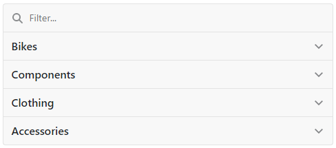
Filter Items
Enable the ShowFilterPanel option to activate the filter panel. If a user types in a search string, the component displays matching items and their parent and child items. Note that if you activate the filter option with the enabled LoadChildItemsOnDemand option, the component loads all its items into memory.
<DxAccordion ShowFilterPanel="true">
    @* ... *@
</DxAccordion>
You can also use the FilterString property to specify the filter criteria in code.
In addition to default filter logic, you can specify the CustomFilter property to enable heuristic algorithms.
Load Child Items On Demand
If you set the LoadChildItemsOnDemand property to true, the Accordion loads an item’s children when the item is expanded for the first time. This mode improves the Accordion’s performance if the bound data structure contains a large number of items.
You can load child items on demand in either bound or unbound modes. In bound mode, the HasChildren property is required. The component uses this property to determine how to render items before they are expanded for the first time (for example, whether expand buttons must appear).
<DxAccordion Data="@Data" LoadChildItemsOnDemand="true">
    <DataMappings>
        <DxAccordionDataMapping Text="Name"
                                Key="Id"
                                ParentKey="CategoryId"/>
    </DataMappings>
</DxAccordion>
Templates
Use the following templates to specify appearance of all items:
- ItemContentTemplate
- Specifies a content template for all Accordion items.
- ItemHeaderTextTemplate
- Specifies a header text template for all Accordion items.
- ItemTemplate
- Specifies the template used to display Accordion items.
In unbound mode, you can create templates for individual items. These templates have priority over common templates. Use the following <DxAccordionItem> properties:
- ContentTemplate
- Specifies a template for the Accordion item’s content.
- HeaderTextTemplate
- Specifies a template for the Accordion item’s header text.
- Template
- Specifies the template used to display the Accordion item.
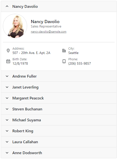
The following example shows how to apply the ItemTemplate:
<style>
    .my-class {
        margin-bottom: 5px;
    }
</style>
<div class="cw-480">
    <DxAccordion Data=@DataSource>
        <DataMappings>
            <DxAccordionDataMapping Key="LastName"
                                    Text="LastName" />
        </DataMappings>
        <ItemTemplate>
            @{
                var dataItem = (Employee)context.DataItem;
            }
            <div class="my-class">
                <EmployeeCard EmployeeInfo=dataItem />
            </div>
        </ItemTemplate>
    </DxAccordion>
</div>

Navigate URL for an Item
Use the NavigateUrl property to specify a URL where the client web browser navigates when an item is clicked. To specify where to display the URL (in the current window, new tab, and so on), use the Target property:
In the example below, the Grid item’s NavigateUrl is opened in a new tab:
<DxAccordion>
    <Items>
        <DxAccordionItem Text="Grid" NavigateUrl="https://demos.devexpress.com/blazor/Grid"
                         Target="_blank" />
        <DxAccordionItem Text="Navigation and Layout" />
        <DxAccordionItem Text="Data Editors" />
        <DxAccordionItem Text="Scheduler" />
    </Items>
</DxAccordion>
Troubleshooting
If a Blazor application throws unexpected exceptions, refer to the following help topic: Troubleshooting.