DxDropDown.HeaderTextTemplate Property
Specifies a template for the drop-down window’s header text area.
Namespace: DevExpress.Blazor
Assembly: DevExpress.Blazor.v22.1.dll
NuGet Package: DevExpress.Blazor
Declaration
[Parameter]
public RenderFragment<IPopupElementInfo> HeaderTextTemplate { get; set; }
Property Value
| Type | Description |
|---|---|
| RenderFragment<IPopupElementInfo> | The template content. |
Remarks
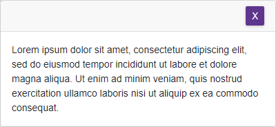
Use the HeaderTextTemplate property to display any UI fragment (for instance, formatted text, images, or another component) in the header’s text area. The template accepts an IPopupElementInfo object as the context parameter. You can use the parameter’s CloseCallback property to implement the Close button.
<DxButton Id="showDDbtton" Click="() => IsOpenWindow = true">Show Window</DxButton>
<DxDropDown BodyText="Lorem ipsum dolor sit amet, consectetur adipiscing elit, sed do eiusmod tempor
            incididunt ut labore et dolore magna aliqua. Ut enim ad minim veniam, quis nostrud
            exercitation ullamco laboris nisi ut aliquip ex ea commodo consequat."
            Width="400"
            @bind-IsOpen="@IsOpenWindow"
            PositionTarget="#showDDbtton"
            PositionMode="DropDownPositionMode.Bottom"
            HeaderVisible="true"
            HeaderCssClass="header-style">
    <HeaderTextTemplate>
        <DxButton Text="X" Click="@context.CloseCallback" />
    </HeaderTextTemplate>
</DxDropDown>

@code {
    bool IsOpenWindow { get; set; } = false;
}
.header-style {
    justify-content: flex-end;
}
See Also