DxDropDown.HeaderTemplate Property
Specifies a template for the drop-down window’s header.
Namespace: DevExpress.Blazor
Assembly: DevExpress.Blazor.v22.1.dll
NuGet Package: DevExpress.Blazor
Declaration
[Parameter]
public RenderFragment<IPopupElementInfo> HeaderTemplate { get; set; }
Property Value
| Type | Description |
|---|---|
| RenderFragment<IPopupElementInfo> | The template content. |
Remarks
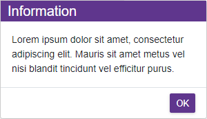
Use the HeaderTemplate property to display any UI fragment (for instance, formatted text, images, or another component) in the window header. The template accepts an IPopupElementInfo object as the context parameter. You can use the parameter’s CloseCallback property to implement the Close button.
<DxButton Id="showDDbtton" Click="() => IsOpen = true">Show a drop-down window</DxButton>
<DxDropDown HeaderVisible="true"
            FooterVisible="true"
            Width="max(25vw, 300px)"
            BodyText="Lorem ipsum dolor sit amet, consectetur adipiscing elit. Mauris sit amet metus vel
             nisi blandit tincidunt vel efficitur purus."
            @bind-IsOpen="@IsOpen"
            PositionTarget="#showDDbtton"
            PositionMode="DropDownPositionMode.Bottom">
    <HeaderTemplate>
        <div style="background-color:rgb(95,54,141); color:white; padding-left:10px; font-size:20px">
            Information
        </div>
    </HeaderTemplate>
    <FooterTextTemplate>
        <DxButton RenderStyle="ButtonRenderStyle.Primary" Text="OK" Click="@context.CloseCallback" />
    </FooterTextTemplate>
</DxDropDown>

@code {
    bool IsOpen { get; set; } = false;
}
The HeaderTemplate property takes priority over the HeaderText and HeaderTextTemplate properties.
See Also