DxCalendar<T> Class
A Calendar component.
Namespace: DevExpress.Blazor
Assembly: DevExpress.Blazor.v22.1.dll
NuGet Package: DevExpress.Blazor
Declaration
public class DxCalendar<T> :
    DxResizableEditorBase<T, CalendarJSInteropProxy>
Type Parameters
| Name | Description |
|---|---|
| T | The data type. Supported types: DateTime and Nullable DateTime. |
Remarks
The DevExpress Calendar for Blazor (<DxCalendar>) allows users to select dates and navigate through months, years, decades, and centuries.
Add a Calendar to a Project
Follow the steps below to add the Calendar component to an application:
- Use a DevExpress Project Template to create a new Blazor Server or Blazor WebAssembly application. If you use a Microsoft project template or already have a Blazor project, configure your project to incorporate DevExpress Blazor components.
- Add the
<DxCalendar>…</DxCalendar>markup to a.razorfile. - Configure the component: specify a selected date, set a date range, disable dates, and so on (see the sections below).
Select a Date
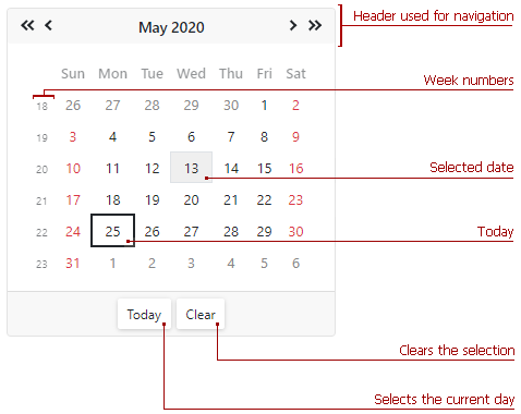
Users can click a date to select it. The calendar’s header allows users to navigate between dates.
Use the SelectedDate property to specify a date in code or to bind the selected date to a model’s field. The calendar supports DateTime and Nullable DateTime data types.
You can use the @bind attribute to bind the SelectedDate property to a data field. Refer to Two-Way Data Binding.
<DxCalendar @bind-SelectedDate="@SelectedDate" />

@code{
    DateTime SelectedDate { get; set; } = DateTime.Now;
}
The SelectedDateChanged event occurs each time the selection changes.
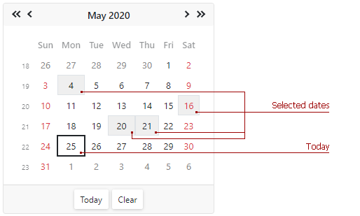
Select Multiple Dates
Set the EnableMultiSelect property to true to enable multiple date selection in the calendar. The SelectedDates collection stores all the selected dates. To handle selection changes, use the SelectedDatesChanged event.
You can use the @bind attribute to bind the SelectedDates property to a data field. Refer to Two-Way Data Binding.
<DxCalendar EnableMultiSelect="true"
            @bind-SelectedDates="SelectedDates" />

@code {
    IEnumerable<DateTime> SelectedDates = new List<DateTime>();

    IEnumerable<DateTime> GetSelectedDates()
    {
        DateTime baseDate = DateTime.Today;
        SelectedDates = new List<DateTime>() { baseDate.AddDays(-9), baseDate.AddDays(-5), baseDate.AddDays(-4),
                                    baseDate.AddDays(6), baseDate.AddDays(12), baseDate.AddDays(13),
                                    baseDate.AddDays(15) };
        return SelectedDates;
    }

    protected override void OnInitialized()
    {
        SelectedDates = GetSelectedDates();
    }
}
To select a range of dates, users should select the initial date, hold the left mouse button, and move the mouse to the final date. To add/remove dates to/from the selection, users should click a date with the Ctrl key pressed.
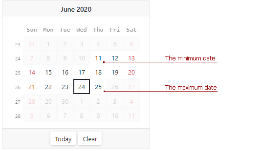
Set a Date Range
Use the MinDate and MaxDate properties to specify a range of available dates. The calendar disables dates that are out of the range and hides navigation arrows for them.
The default minimum and maximum values are System.DateTime.MinValue and System.DateTime.MaxValue.
Note
The maximum date should be greater than the minimum date. Otherwise, an exception occurs.
<DxCalendar T="DateTime" MinDate="@(new DateTime(2020, 06, 11))" MaxDate="@(new DateTime(2020, 06, 25))" />
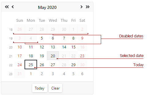
Disable Dates
Handle the CustomDisabledDate event to disable the selection of individual dates. This event is raised each time a day cell is rendered.
<DxCalendar T="DateTime" CustomDisabledDate="@OnCustomDisabledDate">
</DxCalendar>

@code {
    void OnCustomDisabledDate(CalendarCustomDisabledDateEventArgs args) {
        args.IsDisabled = args.Date < DateTime.Today.AddDays(-20) || GetDisabledDates().Exists(d => DaysEqual(d, args.Date));
    }
    bool DaysEqual(DateTime date1, DateTime date2) {
        return (date1.Year == date2.Year && date1.DayOfYear == date2.DayOfYear);
    }
    List<DateTime> GetDisabledDates() {
        DateTime baseDate = DateTime.Today;
        return new List<DateTime>() { baseDate.AddDays(-9), baseDate.AddDays(-4), baseDate.AddDays(-3), baseDate.AddDays(3), baseDate.AddDays(5), baseDate.AddDays(6), baseDate.AddDays(15) };
    }
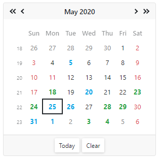
Customize Day Cells
Use the calendar’s DayCellTemplate property to customize day cells.
@using Data

<DxCalendar T="DateTime">
    <DayCellTemplate>
        <a class="@GetCssClassNames(context)">@context.Day.ToString()</a>
    </DayCellTemplate>
</DxCalendar>

@code {
    CalendarData data = new CalendarData();

    string GetCssClassNames(DateTime date) {
        string result = string.Empty;

        if (data.PersonalDays.Exists(d => DaysEqual(d, date)))
            result = "font-weight-bold text-success";
        if (data.Holidays.Exists(d => DaysEqual(d, date)))
            result = "text-danger";
        if (data.BirthDates.Exists(d => DaysEqual(d, date)))
            result += "font-weight-bold text-info";

        return result;
    }
    bool DaysEqual(DateTime date1, DateTime date2) {
        return (date1.Year == date2.Year && date1.DayOfYear == date2.DayOfYear);
    }

}
Appearance
A table below lists API members you can use to customize the Calendar’s appearance:
Member | Description |
|---|---|
Specifies the month and the year to display on the calendar. | |
Specifies the first day of a week in the calendar. | |
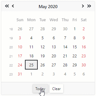
Specifies whether the Clear button is displayed in the calendar’s footer. | |
Specifies the first week of the year. | |
Specifies the name of the CSS class applied to the Calendar’s header. |
Size Modes
Use the SizeMode property to specify the Calendar’s size. The code below applies different size modes to Calendar components.
<DxCalendar SelectedDate="@SelectedDate" SizeMode="SizeMode.Small"></DxCalendar>

<DxCalendar SelectedDate="@SelectedDate" SizeMode="SizeMode.Medium"></DxCalendar>

<DxCalendar SelectedDate="@SelectedDate" SizeMode="SizeMode.Large"></DxCalendar>

@code {
    DateTime SelectedDate { get; set; } = DateTime.Now;
}
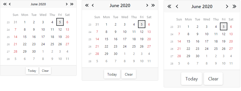
For more information, refer to Size Modes.
Input Validation
You can add a standalone Calendar or the Form Layout component to Blazor’s standard EditForm. This form validates user input based on data annotation attributes defined in a model and indicates errors.
<EditForm Model="@model" Context="EditFormContext">
    <DataAnnotationsValidator />
    <DxFormLayout >
        <DxFormLayoutItem Caption="Date:" ColSpanMd="6" >
            <Template >
                <DxCalendar @bind-SelectedDate="@model.Date" />
            </Template>
        </DxFormLayoutItem>
        @*...*@
    </DxFormLayout>
</EditForm>

@code {
    private Model model=new Model();
}
For more information, refer to the following help topic: Validate Input.
Read-Only State
<DxCalendar> supports a read-only state. Set the ReadOnly property to true to activate this option.
<DxCalendar T="DateTime" ReadOnly="true"/>
Troubleshooting
If a Blazor application throws unexpected exceptions, refer to the following help topic: Troubleshooting.