DxComboBox<TData, TValue> Class
A ComboBox component.
Namespace: DevExpress.Blazor
Assembly: DevExpress.Blazor.v22.1.dll
NuGet Package: DevExpress.Blazor
Declaration
public class DxComboBox<TData, TValue> :
    DxComboBoxBase<TData, TValue, ComboBoxJSInteropProxy>,
    IDataSourceSettings<TData>,
    IServiceProviderAccessor,
    IRequireSelfCascading,
    IEditorSettingsAccessor,
    ITextInputEditor<TData>,
    IInputBase,
    IFocusableEditor
Type Parameters
| Name | Description |
|---|---|
| TData | The data item type. |
| TValue | The value type. |
Remarks
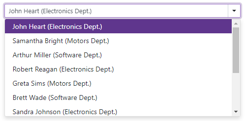
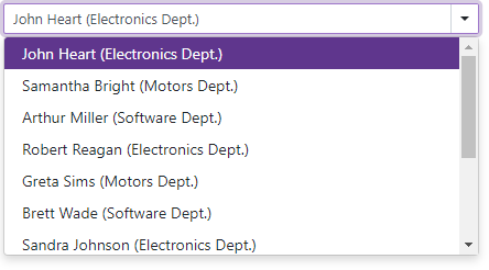
The DevExpress ComboBox for Blazor (<DxComboBox>) component displays a drop-down window with a list of items. Users can click an item in the drop-down list or use the Up arrow, Down arrow, and Enter keys to navigate between items and select them. When a user presses and holds an arrow key, the editor’s window continuously navigates between items.
Add a ComboBox to a Project
Follow the steps below to add the ComboBox component to an application:
- Use a DevExpress Project Template to create a new Blazor Server or Blazor WebAssembly application. If you use a Microsoft project template or already have a Blazor project, configure your project to incorporate DevExpress Blazor components.
- Add the
<DxComboBox>…</DxComboBox>markup to a.razorfile. - Bind the component to data.
- Configure the component: add a clear button and placeholder, customize appearance, specify the filter mode, and so on (see the sections below).
Bind to Data
Use the Data property to bind the ComboBox to a strongly typed collection or enumeration. Initialize this object in the OnInitialized lifecycle method or before this method is invoked. Use the DataAsync property instead of the Data property if a strongly typed collection is loaded asynchronously (for instance, from an HTTP request).
Use the Value property to specify the component’s selected value or item. You can use the @bind attribute to bind the Value property to a data field. For more information, refer to the following help topic: Two-Way Data Binding.
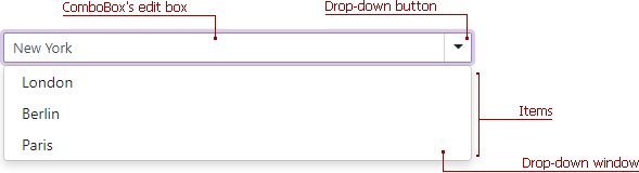
<DxComboBox Data="@Cities" @bind-Value="@Value" ></DxComboBox>

@code {
  IEnumerable<string> Cities = new List<string>() {
    "London",
    "Berlin",
    "Paris",
  };

  string Value { get; set; }
}
The ComboBox can detect IQueryable<T> collections and use benefits of the corresponding LINQ query providers (such as Entity Framework).
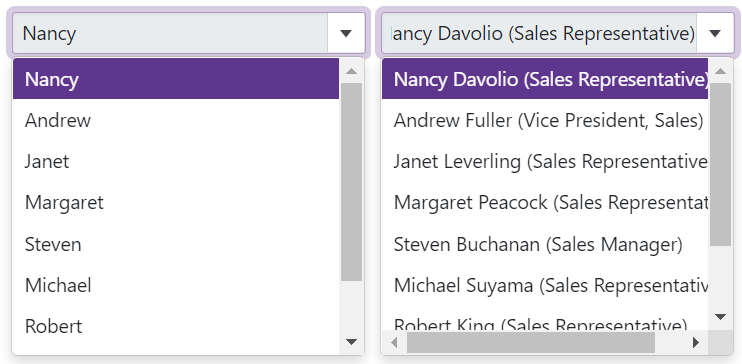
If you bind the ComboBox to a data collection that stores custom objects (IEnumerable<CustomType>), override the object’s Equals method and specify the TextFieldName property. This property specifies the custom object’s field name that returns string values to be shown within the ComboBox’s drop-down window.
@using BlazorApp.Data

<DxComboBox Data="@Staff.DataSource"
            TextFieldName="@nameof(Person.Text)"
            @bind-Value="@Value"
            AllowUserInput="true">
</DxComboBox>

@code {
  Person Value { get; set; } = Staff.DataSource[0];
}
Otherwise, the ComboBox items are populated with CustomType.ToString() values.
If your data is stored on a remote service and is loaded through a Web API, assign the data type to the component’s T parameter and use the CustomData property to implement data load logic.
Items
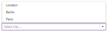
The <DxComboBox> drop-down window displays a list of predefined items. Set the AllowUserInput property to true to allow users to type values into the ComboBox’s edit box.
<DxComboBox Data="@Cities"
            AllowUserInput="true"
            NullText="Select City ..."
            @bind-Value="@Value"
            @bind-Text="@Text">
</DxComboBox>

@code {
  IEnumerable<string> Cities = new List<string>() {
    "London",
    "Berlin",
    "Paris",
  };

  string Text { get; set; } = "New York";
  string Value { get; set; }
}
Use the Text property to specify an editor value in code. To respond to an editor’s text change, handle the TextChanged event.
The table below lists API members related to the ComboBox item collection:
Member | Description |
|---|---|
Specifies the ComboBox’s selected value/item. | |
Fires when the ComboBox’s selected value changes. | |
Specifies the data source field that populates values for the ComboBox’s items. | |
Specifies a template used to display the ComboBox’s items. | |
Specifies the current state (displayed/hidden) of a drop-down window. | |
Displays an editor’s drop-down window. |
Clear Button and Placeholder
Set the ClearButtonDisplayMode property to Auto to show the Clear button when the editor has a non-null value. Users can click this button to clear the editor’s value (set it to null).
Use the NullText property to display the prompt text (placeholder) in the editor when its value is null.
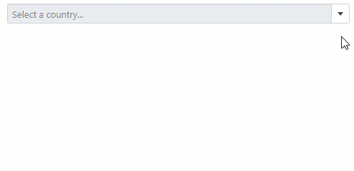
<DxComboBox NullText="Select a country..."
            Data="@CountryData.Countries"
            @bind-Value="@CurrentCountry"
            TextFieldName="@nameof(Country.CountryName)"
            ClearButtonDisplayMode="DataEditorClearButtonDisplayMode.Auto">
</DxComboBox>

@code {
    Country CurrentCountry { get; set; } = CountryData.Countries[1];
}
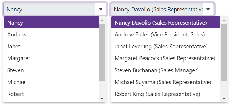
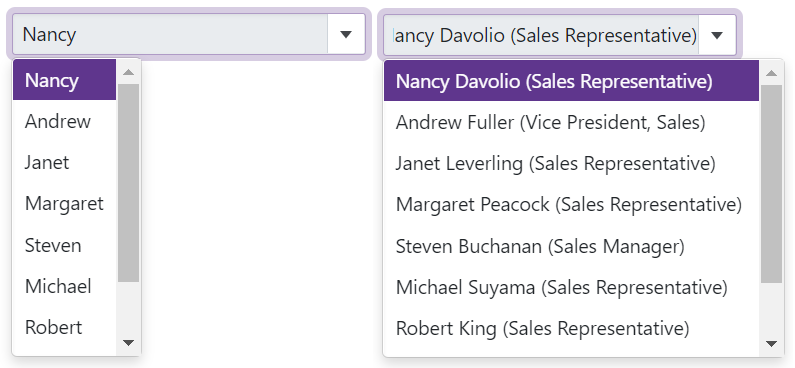
Cascading Comboboxes
The <DxComboBox> allows you to create cascade lists - populate one ComboBox with items based on the user selection from another ComboBox. Use the Value property to access the selected item. To respond to the selected item change, handle the ValueChanged event.
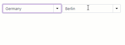
<DxComboBox Data="@Countries"
            TextFieldName="@nameof(Country.CountryName)"
            Value="@CurrentCountry"
            ValueChanged="@((Country country) => SelectedCountryChanged(country))"
            AllowUserInput="true">
</DxComboBox>

<DxComboBox Data="@CurrentCountryCities"
            TextFieldName="@nameof(City.CityName)"
            @bind-Value="@CurrentCity"
            AllowUserInput="true">
</DxComboBox>

@code {
    List<Country> Countries { get; set; } = CountryCity.Countries;
    List<City> CurrentCountryCities { get; set; } = new List<City>();
    Country CurrentCountry { get; set; } = CountryCity.Countries[1];
    City CurrentCity { get; set; } = CountryCity.Cities[4];

    void SelectedCountryChanged(Country country) {
        CurrentCountry = country;
        CurrentCountryCities = CountryCity.Cities.FindAll(city => city.CountryId == CurrentCountry.Id);
        CurrentCity = CurrentCountryCities[0];
    }

    protected override void OnInitialized() {
        base.OnInitialized();
        SelectedCountryChanged(CurrentCountry);
    }
}
Filter Data
<DxComboBox> allows you to dynamically filter list items based on the text typed into the editor. Use the FilteringMode property to enable filtering and specify the filter mode (Contains or StartsWith).
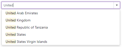
<DxComboBox FilteringMode="DataGridFilteringMode.Contains" Data="@Data" @bind-Value="@Value"></DxComboBox>

@code {
    IEnumerable<Country> Data;
    Country Value { get; set; }
}
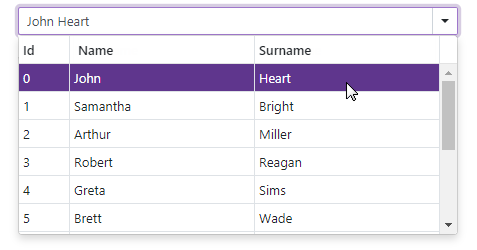
Multiple Columns
The ComboBox can display data across multiple columns. To create columns, use DxListEditorColumn objects that include the following options for column customization:
- FieldName - Specifies the data source field that populates column items.
- Caption - Specifies the column header.
- Visible - Specifies the column visibility.
- VisibleIndex - Specifies the column display order.
- Width - Specifies the column width.
To format an edit box’s value, use the EditFormat property.
<DxComboBox Data="@Staff.DataSource"
            @bind-Value="@SelectedPerson"
            EditFormat ="{1} {2}">
    <DxListEditorColumn FieldName="Id" Width="50px" />
    <DxListEditorColumn FieldName="FirstName" Caption="Name"/>
    <DxListEditorColumn FieldName="LastName" Caption="Surname"/>
</DxComboBox>

@code {
    Person SelectedPerson { get; set; } = Staff.DataSource[0];
}
Customization
The ComboBox component allows you to customize its appearance and the appearance of its items.
Appearance Customization
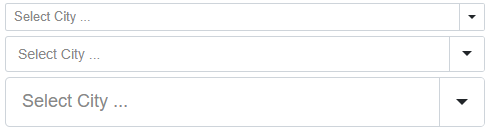
Use the SizeMode property to specify the size of a ComboBox. The code below applies different sizes to ComboBox components.
<DxComboBox Data="@Cities"
            NullText="Select City ..."
            @bind-Value="@Value"
            SizeMode="SizeMode.Small">
</DxComboBox>

<DxComboBox Data="@Cities"
            NullText="Select City ..."
            @bind-Value="@Value"
            SizeMode="SizeMode.Medium">
</DxComboBox>

<DxComboBox Data="@Cities"
            NullText="Select City ..."
            @bind-Value="@Value"
            SizeMode="SizeMode.Large">
</DxComboBox>

@code {
    IEnumerable<string> Cities = new List<string>() {
        "London",
        "Berlin",
        "Paris",
    };

    string Value { get; set; }
}
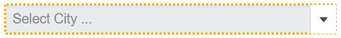
To customize ComboBox input, use the InputCssClass property. The following code snippet applies a custom style to input borders:
<style>
    .my-style {
        border: 2px dotted orange;
    }
</style>

<DxComboBox Data="@Cities"
            NullText="Select City ..."
            @bind-Value="@Value"
            InputCssClass="my-style">
</DxComboBox>

@code {
    IEnumerable<string> Cities = new List<string> () {
        "London",
        "Berlin",
        "Paris",
    };

    string Value { get; set; }
}
For more information, refer to the following help topics:
Items Customization
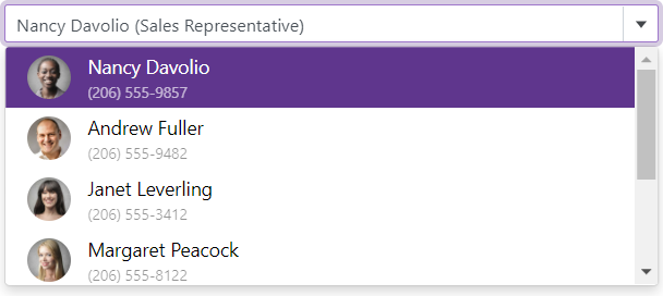
The ItemTemplate property allows you to customize the appearance of the ComboBox’s items. Use the template’s context parameter to access a data object and its fields (for instance, you can get the value of a data field).
The example below demonstrates how to display the ComboBox’s items in a card-like view. Each item shows an employee’s first name, last name, photo, and phone number.
@inject NwindDataService NwindDataService
<DxComboBox Data="@Data"
            @bind-Value="@Value"
            CssClass="cw-480">
    <ItemTemplate>
        <div class="combobox-item-template">
            <img src="@StaticAssetUtils.GetImagePath(GetImageFileName(context))" />
            <div class="combobox-item-template-text">
                <span>@context.FirstName @context.LastName</span>
                <span class="combobox-item-template-employee-phone">@context.HomePhone</span>
            </div>
        </div>
    </ItemTemplate>
</DxComboBox>

@code {
    IEnumerable<Employee> Data { get; set; }
    Employee Value { get; set; }

    protected override async Task OnInitializedAsync() {
        Data = await NwindDataService.GetEmployeesAsync();
        Value = Data.FirstOrDefault();
    }

    string GetImageFileName(Employee employee) {
        return $"Employees/item-template{employee.EmployeeId}.jpg";
    }
}
Virtual Scrolling
When virtual scrolling is activated (ListRenderMode is set to Virtual), the ComboBox renders data on demand when a user scrolls its items.
<DxComboBox ListRenderMode="ListRenderMode.Virtual"
            Data="@Strings"
            @bind-Value="@Value" >
</DxComboBox>
Input Validation
You can add a standalone ComboBox or Form Layout component to Blazor’s standard EditForm. This form validates user input based on data annotation attributes defined in a model and indicates errors. To specify which ComboBox property takes part in input validation (Text or Value), use the ValidateBy property. If you handle the ValueChanged event and cannot use two-way binding, specify the ValueExpression property to identify the value passed to the event handler.
<EditForm Model="@starship" Context="EditFormContext">
    <DataAnnotationsValidator />
    <DxFormLayout >
        <DxFormLayoutItem Caption="Primary Classification:" ColSpanMd="6" >
            <Template >
                <DxComboBox
                            NullText="Select classification ..."
                            ClearButtonDisplayMode="DataEditorClearButtonDisplayMode.Auto"
                            @bind-Value="@starship.Classification"
                            Data="@(new List<string>() { "Defense", "Exploration", "Diplomacy" })"
                            ValidateBy="ComboBoxValidateBy.Value"
                />
            </Template >
        </DxFormLayoutItem >
        @*...*@
    </DxFormLayout>
</EditForm>

@code {
    private Starship starship=new Starship();
}
For more information, refer to the following help topic: Validate Input.
Read-Only State
<DxComboBox> supports a read-only state. Set the ReadOnly property to true to activate this option.
<DxComboBox ReadOnly="true"
            Data="@Strings"
            @bind-Value="@Value" >
</DxComboBox>
Drop-Down Window Width
Use the DropDownWidthMode property to specify the width of the drop-down list. The following values are available:
ContentOrEditorWidth (Default) - The list displays item text completely. The minimum list width matches the editor.
ContentWidth - The list width is equal to the width of the longest list item.
EditorWidth - The list width matches the editor. List items are cut if they do not fit.
Note
When the ComboBox renders items on demand (ListRenderMode is set to Virtual), the list width can change while users scroll items.
The following code sets the width of the drop-down list to the editor width.
@using BlazorApp.Data

<DxComboBox Data="@Staff.DataSource"
            @bind-Value="@Value"
            TextFieldName="@nameof(Person.Text)"
            DropDownWidthMode="DropDownWidthMode.EditorWidth">
</DxComboBox>

@code {
  Person Value { get; set; } = Staff.DataSource[0];
}
Drop-Down Window Direction
Use the DropDownDirection property to specify the direction in which the ComboBox’s drop-down window is displayed relative to the input element. The default value is Down. The following code changes the direction to Up:
<DxComboBox Data="@Cities"
            @bind-Value="@Value"
            NullText="Select City ..."
            DropDownDirection="DropDownDirection.Up">
</DxComboBox>

@code {
    IEnumerable<string> Cities = new List<string>() {
        "London",
        "Berlin",
        "Paris",
    };

    string Value { get; set; }
}
Note
If the editor is close to a browser window’s edge and there is not enough space to display the drop-down window in the specified direction, the drop-down window is displayed in the opposite direction.
HTML Attributes and Events
You can use HTML attributes and events to configure the ComboBox.
<DxComboBox Data="@Strings"
            @bind-Value="@Value"
            maxlength="10"
            @onclick="MyFunction">
</DxComboBox>

@code {
    void MyFunction(){
        //...
    }
}
Troubleshooting
If a Blazor application throws unexpected exceptions, refer to the following help topic: Troubleshooting.