DxTabs Class
A Tabs component.
Namespace: DevExpress.Blazor
Assembly: DevExpress.Blazor.v22.1.dll
NuGet Package: DevExpress.Blazor
Declaration
public class DxTabs :
    DxComponentBase<TabsJSInteropProxy>,
    ITabCollectionOwner,
    IRequireSelfCascading,
    ITabsJSInteropProxyServer,
    IJSCallback
Remarks
The DevExpress Tabs component for Blazor (<DxTabs>) allows you to build tabbed interfaces in your web sites.
Add Tabs to a Project
Follow the steps below to add the Tabs component to an application:
- Use a DevExpress Project Template to create a new Blazor Server or Blazor WebAssembly application. If you use a Microsoft project template or already have a Blazor project, configure your project to incorporate DevExpress Blazor components.
- Add the
<DxTabs>…</DxTabs>markup to a.razorfile. - Configure the component: add tabs, specify an active tab, handle tab clicks, and so on (see the sections below).
Tabs
<DxTabs> is a navigation component that consists of multiple tabs. The DxTab class implements a tab without content. Use the Text property to specify a tab’s text.
<DxTabs>
    <DxTab Text="Home"></DxTab>
    <DxTab Text="Products"></DxTab>
    <DxTab Text="Support"></DxTab>
</DxTabs>
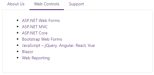
Active Tab
A user should click a tab to activate it. Only one tab can be active at a time. To activate a tab in code, assign its zero-based index in the tab collection to the ActiveTabIndex property. The ActiveTabIndexChanged event fires when the active tab changes.
The following example demonstrates how to update the content area when a user selects a tab.
<DxTabs @bind-ActiveTabIndex="@ActiveTabIndex">
    <DxTab Text="About Us"></DxTab>
    <DxTab Text="Web Controls"></DxTab>
    <DxTab Text="Support"></DxTab>
</DxTabs>
<div class="card dxbs-border-top-0 dxbs-border-radius-top-0">
    <div class="card-body">
        @switch (ActiveTabIndex)
        {
            case 0:
                <h4>From 1998 to the Present</h4>
                <p>We look forward to working with you and will do everything we can to make your experience with us a profitable one.</p>
                break;
            case 1:
                <ul>
                    <li><a href="https://www.devexpress.com/products/net/controls/asp/">ASP.NET Web Forms </a></li>
                    <li><a href="https://www.devexpress.com/products/net/controls/asp/mvc/">ASP.NET MVC</a></li>
                    <li><a href="https://www.devexpress.com/products/net/controls/asp/core.xml">ASP.NET Core</a></li>
                    <li><a href="https://www.devexpress.com/products/net/controls/asp/bootstrap-webforms.xml">Bootstrap Web Forms</a></li>
                    <li><a href="https://js.devexpress.com/">JavaScript – jQuery, Angular, React, Vue</a></li>
                    <li><a href="https://www.devexpress.com/blazor/">Blazor</a></li>
                    <li><a href="https://www.devexpress.com/subscriptions/reporting/">Web Reporting</a></li>
                </ul>
                break;
            case 2:
                <p>Submit your support inquiries via the <a href="https://supportcenter.devexpress.com/">DevExpress Support Center</a> for assistance.</p>
                break;

        }
    </div>
</div>
@code {
    int ActiveTabIndex { get; set; } = 1;
}
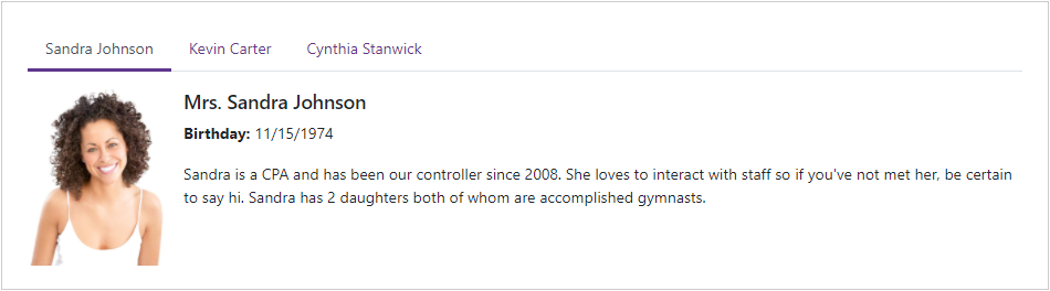
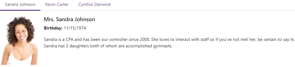
Tab Pages
Use the DxTabPage class to create a tab page (a tab with content) within the <DxTabs> component.
<DxTabs>
    @foreach (var employee in Employees)
    {
        <DxTabPage Text="@(employee.FirstName + ' ' +  employee.LastName)">
            <div class="media demo-tab-page-content">
                <img src="@(StaticAssetUtils.GetImagePath($"Employees/{employee.FileName}.png"))" width="125" />
                <div class="media-body pl-3">
                    <h5 class="mt-0">@employee.Title @employee.FirstName @employee.LastName</h5>
                    <p><b>Birthday:</b> @employee.BirthDate.ToShortDateString()</p>
                    <p>@employee.Notes</p>
                </div>
            </div>
        </DxTabPage>
    }
</DxTabs>
@code {
    IEnumerable<Employee> Employees;

    protected override async Task OnInitializedAsync()
    {
        Employees = (await EmployeeService.Load()).Skip(5).Take(3);
    }
}
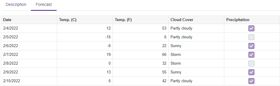
A tab page can include other DevExpress Blazor components. The following code creates a tab page with the DxGrid component.
<DxTabs style="width:950px">
    <DxTabPage Text="Description">
        <div class="p-3">
            <b>7-Day Weather Forecast</b>
        </div>
    </DxTabPage>
    <DxTabPage Text="Forecast">
        <div class="py-3">
            <DxGrid Data="@Data">
                <Columns>
                    <DxGridDataColumn FieldName=@nameof(WeatherForecast.Date) />
                    <DxGridDataColumn FieldName=@nameof(WeatherForecast.TemperatureC) Caption="Temp. (C)" />
                    <DxGridDataColumn FieldName=@nameof(WeatherForecast.TemperatureF) Caption="Temp. (F)" />
                    <DxGridDataColumn FieldName="@nameof(WeatherForecast.CloudCover)" />
                    <DxGridDataColumn FieldName="@nameof(WeatherForecast.Precipitation)">
                        <CellDisplayTemplate>
                            <DxCheckBox CssClass="d-inline-block" Enabled="false" Checked="(bool)context.Value" />
                        </CellDisplayTemplate>
                    </DxGridDataColumn>
                </Columns>
            </DxGrid>
        </div>
    </DxTabPage>
</DxTabs>

@code {
    public class WeatherForecast {
        public DateTime Date { get; set; }
        public int TemperatureC { get; set; }
        public int TemperatureF => 32 + (int)(TemperatureC / 0.5556);
        public string CloudCover { get; set; }
        public bool Precipitation { get; set; }
    }
    String[] CloudCover = { "Sunny", "Partly cloudy", "Cloudy", "Storm" };
    object Data;

    public Task<IEnumerable<WeatherForecast>> GetForecastAsync(CancellationToken ct = default) {
        var rng = new Random();
        DateTime startDate = DateTime.Now;
        return Task.FromResult(Enumerable.Range(1, 7).Select(index => new WeatherForecast {
            Date = startDate.AddDays(index),
            TemperatureC = rng.Next(-15, 20),
            CloudCover = CloudCover[rng.Next(0, CloudCover.Length)],
            Precipitation = Convert.ToBoolean(rng.Next(0, 2))
        }).AsEnumerable());
    }

    protected override async Task OnInitializedAsync() {
        Data = await GetForecastAsync();
    }
}
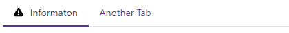
Tab Icons
Use the TabIconCssClass property to display an icon in the tab.
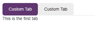
Tab Template
Use the TabTemplate property to customize a tab’s appearance.
<DxTabs>
    <DxTab>
        <TabTemplate>
            <div style="padding:10px 20px; text-align:center; border-radius:7px;
                 background-color:rgb(95,54,111); color:white">Custom Tab</div>
        </TabTemplate>
    </DxTab>
    @*...*@
</DxTabs>
Handle Tab Clicks
Use the DxTabs.TabClick and DxTabBase.Click events to handle tab clicks. The code below demonstrates how to specify a common click handler for all tabs.
<DxTabs TabClick="OnTabClick">
    <DxTab Text="Home"></DxTab>
    <DxTab Text="Products"></DxTab>
    <DxTab Text="Support"></DxTab>
</DxTabs>

@ClickedTab

@code  {
    public string ClickedTab { get; set; } = "";

    void OnTabClick(TabClickEventArgs e) {
        ClickedTab = $"Tab '{e.TabIndex}' has been clicked";
    }
}

Tab Render Mode
Use the RenderMode property to specify how the DxTabs component loads tab content.
<DxTabs RenderMode="TabsRenderMode.Default">
    ...
</DxTabs>
Render modes include:
- Default
- The DxTabs component initially only loads the content of an active tab. When a user selects another tab, its content replaces the content of the previously active tab in the DOM. Note the DxTabs component does not store the state of tabs.
- AllTabs
- DxTabs renders the content of all tabs in the DOM and maintains the tab’s state. This mode speeds up navigation between tabs but it can increase memory consumption.
- OnDemand
- The component initially loads content of an active tab and then loads the content of other tabs when a user selects them. In this case, the component retains the state of the tabs. Use this mode to improve application performance.
Tab Scroll Mode
Use the ScrollMode property to specify how users navigate between tabs when they do not fit the container’s width.
<DxTabs ScrollMode="TabsScrollMode.Auto">
    ...
</DxTabs>
Scroll modes include:
- Auto
This scroll mode automatically adapts to the device type. Mobile and tablet devices use Swipe mode. Desktop devices use NavButtons mode.
- NavButtons
The container displays tabs that fit the width. Users can navigate to other tabs in the following ways: use the navigation buttons; hover the cursor over a tab with the
Shiftkey pressed and scroll the mouse wheel; or swipe (mobile devices only).- Swipe
The container displays a few tabs that fit the width. To navigate to other tabs, users can swipe tabs, or hover the mouse pointer over the container, hold the
Shiftkey, and scroll the mouse wheel.- NoScroll (default value)
Users cannot scroll tabs. The tabs that do not fit the container’s width are moved to a new line.
Troubleshooting
If a Blazor application throws unexpected exceptions, refer to the following help topic: Troubleshooting.