DxDateEdit<T> Class
A Date Edit component.
Namespace: DevExpress.Blazor
Assembly: DevExpress.Blazor.v22.1.dll
NuGet Package: DevExpress.Blazor
Declaration
public class DxDateEdit<T> :
    DxDropDownBase<T, DropDownJSInteropProxy>,
    ITextInputEditor<T>,
    IRequireSelfCascading,
    IInputBase,
    IDateTimeMaskedEditor,
    INestedSettingsOwner,
    IFocusableEditor,
    IDropDownJSInteropProxyServer,
    IJSCallback
Type Parameters
| Name | Description |
|---|---|
| T | The data type. Supported types: DateTime, DateTimeOffset, and their nullable instances. |
Remarks
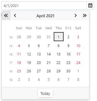
The DevExpress Date Edit for Blazor (<DxDateEdit>) displays a drop-down calendar that allows users to select dates. You can combine two Date Editors to implement a date range picker.
Additionally, you can add a time section to the component. This allows users to select date-time values or type them in the edit box.
Add a Date Edit to a Project
Follow the steps below to add the Date Edit component to an application:
- Use a DevExpress Project Template to create a new Blazor Server or Blazor WebAssembly application. If you use a Microsoft project template or already have a Blazor project, configure your project to incorporate DevExpress Blazor components.
- Add the
<DxDateEdit>…</DxDateEdit>markup to a.razorfile. - Configure the component: specify a selected date, set a date range, apply a mask, and so on (see the sections below).
Edit Value
Use the Date property to specify the date that is selected in <DxDateEdit>. The date range is limited by the MinValue and MaxValue properties. Refer to the following section for details: Set a Date Range.
You can use the @bind attribute to bind the Date property to a data field. Refer to the following topic for details:Two-Way Data Binding.
<DxDateEdit Date="DateTime.Today"></DxDateEdit>

<DxDateEdit @bind-Date="@DateTimeValue"></DxDateEdit>

@code {
    DateTime DateTimeValue { get; set; } = DateTime.Today;
}
If you do not use two-way data binding, handle the DateChanged event to respond to the editor’s date change. The code below enables the Update Date button once the Date Edit component’s value is changed.
<DxDateEdit Date="@Date" DateChanged="@((DateTime newValue) => OnDateChanged(newValue))"></DxDateEdit>
<button type="button" class="btn btn-primary" disabled="@IsDisabled">Update Date</button>

@code {
    DateTime Date = DateTime.Today;
    bool IsDisabled = true;

    void OnDateChanged(DateTime newValue) {
        Date = newValue;
        if (newValue != DateTime.Today)
            IsDisabled = false;
        else IsDisabled = true;
    }
}
Apply a Mask
The Date Edit component supports Date-Time masks.
Follow the steps below to set up a mask:
Assign a desired mask pattern to the Mask property.
<DxDateEdit @bind-Date="Value"
            Mask="yyyy-MM-dd" />

@code{
    DateTime Value { get; set; } = DateTime.Now;
}
If required, configure mask settings (the current culture, caret mode, and so on). For this purpose, add the DxDateTimeMaskProperties component to the Date Edit markup and specify the component’s properties. Use the MaskProperties template to define mask properties for the Date Edit with custom day cells.
The code below enables the
Advancingcaret mode.<DxDateEdit @bind-Date="Value" Mask="yyyy-MM-dd"> <DxDateTimeMaskProperties CaretMode="MaskCaretMode.Advancing" /> </DxDateEdit> @code{ DateTime Value { get; set; } = DateTime.Now; }
Nullable Date and Placeholder
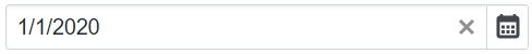
If the Date Edit component is bound to a nullable object, users can delete the editor’s value (set it to null).
You can also set the ClearButtonDisplayMode property to Auto to show the Clear button when the editor has a non-null value. Use the NullText property to specify the prompt text (placeholder) when the editor’s value is null.
<DxDateEdit @bind-Date="@DateTimeValue"
            ClearButtonDisplayMode="DataEditorClearButtonDisplayMode.Auto"
            NullText="Select a date..."></DxDateEdit>

@code {
    DateTime? DateTimeValue { get; set; } = new DateTime(2020, 01, 01);
}
You can also specify a custom null value for the Date Edit component. This value can be used with nullable and regular DateTime types. For more information, refer to NullValue.
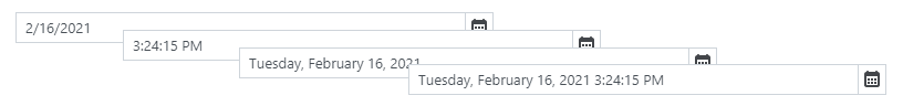
Date Format
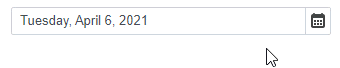
Use the Format property to format the Date Edit’s value in edit mode when the editor is focused, and use the DisplayFormat property to format the editor’s display value when the editor is not focused. If you do not set the DisplayFormat property, the Format is applied in display and edit modes.
The following example demonstrates how to apply the long date format in display mode and the short date format in edit mode:
<DxDateEdit @bind-Date="@DateTimeValue" DisplayFormat="D" Format="d"></DxDateEdit>

@code {
    DateTime DateTimeValue { get; set; } = DateTime.Now;
}
Refer to the following Microsoft help topics for more information about supported formats: Standard Date and Time Format Strings and Custom Date and Time Format Strings.
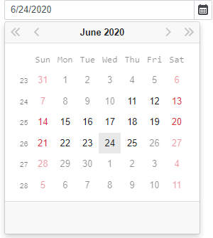
Set a Date Range
Use the MinDate and MaxDate properties to specify a range of available dates. The Date Edit’s calendar disables dates that are out of the range and hides navigation arrows for them. If a user types a date that is out of the range, the Date Edit keeps the previously selected date.
The default minimum and maximum values are System.DateTime.MinValue and System.DateTime.MaxValue.
Note
The maximum date should be greater than the minimum date. Otherwise, an exception occurs.
<DxDateEdit Date="DateTime.Today"
            MinDate="@(new DateTime(2020, 06, 11))"
            MaxDate="@(new DateTime(2020, 06, 25))" />
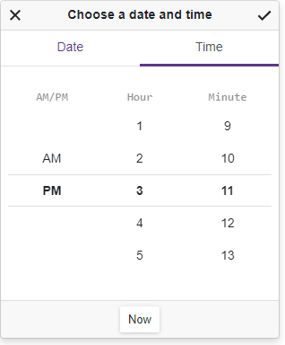
Time Section
Date Edit can display a time section that contains a scroll picker. Users can edit time value in the picker or enter the value in the edit box.
Set the TimeSectionVisible property to true to display the time section in the component. The TimeSectionScrollPickerFormat property allows you to specify the format of the time value in the picker. If the TimeSectionScrollPickerFormat property is not specified, the section’s appearance depends on the current culture.
<DxDateEdit @bind-Date="@DateTimeValue"
            TimeSectionVisible="true"
            TimeSectionScrollPickerFormat="tt h m">
</DxDateEdit>

@code {
    DateTime DateTimeValue { get; set; } = DateTime.Now;
}
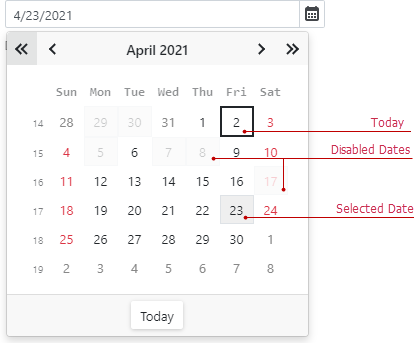
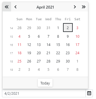
Disable Dates
Handle the CustomDisabledDate event to disable individual dates. This event is raised each time a day cell is rendered.
<DxDateEdit @bind-Date="@DateTimeValue" CustomDisabledDate="@OnCustomDisabledDate"></DxDateEdit>

@code {
    DateTime dateTimeValue = DateTime.Now;
    DateTime DateTimeValue { get => dateTimeValue; set { dateTimeValue = value; InvokeAsync(StateHasChanged); } }

    void OnCustomDisabledDate(CalendarCustomDisabledDateEventArgs args) {
        args.IsDisabled = args.Date < DateTime.Today.AddDays(-20) || GetDisabledDates().Exists(d => DaysEqual(d, args.Date));
    }
    bool DaysEqual(DateTime date1, DateTime date2) {
        return (date1.Year == date2.Year && date1.DayOfYear == date2.DayOfYear);
    }
    List<DateTime> GetDisabledDates() {
        DateTime baseDate = DateTime.Today;
        return new List<DateTime>() { baseDate.AddDays(-9), baseDate.AddDays(-4), baseDate.AddDays(-3), baseDate.AddDays(3), baseDate.AddDays(5), baseDate.AddDays(6), baseDate.AddDays(15) };
    }
}
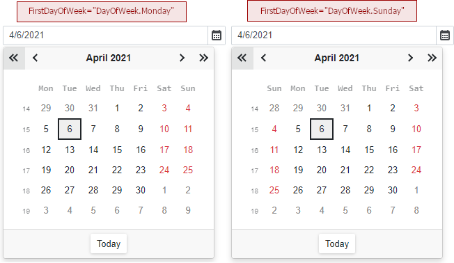
Set the First Day of the Week
The first day of a week in the Date Edit’s drop-down calendar depends on the current culture settings. Use the FirstDayOfWeek property to specify a different day.
<DxDateEdit Date="DateTime.Today" FirstDayOfWeek="DayOfWeek.Monday"></DxDateEdit>
To specify a rule that determines the first week of the year, use the WeekNumberRule property.
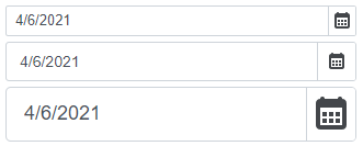
Appearance Customization
Use the SizeMode property to specify a Date Edit size. The code below applies different size modes to Date Edit components.
<DxDateEdit @bind-Date="@DateTimeValue" SizeMode="SizeMode.Small"></DxDateEdit>

<DxDateEdit @bind-Date="@DateTimeValue" SizeMode="SizeMode.Medium"></DxDateEdit>

<DxDateEdit @bind-Date="@DateTimeValue" SizeMode="SizeMode.Large"></DxDateEdit>

@code {
    DateTime DateTimeValue { get; set; } = DateTime.Now;
}
To customize Date Edit input, use the InputCssClass property. The following code snippet applies the custom style to the text within the input:
<style>
    .my-style {
        font-weight: 800;
    }
</style>

<DxDateEdit @bind-Date="@DateTimeValue" InputCssClass="my-style"></DxDateEdit>

@code {
    DateTime DateTimeValue { get; set; } = DateTime.Now;
}

For more information, refer to the following help topics:
You can also place custom content and define CSS styles in the calendar type datepicker. Use the DayCellTemplate property to access the current date-time object and its settings.
<DxDateEdit @bind-Date="@DateTimeValue">
    <DayCellTemplate>
        <span class="text-info">@context.Day.ToString()</span>
    </DayCellTemplate>
</DxDateEdit>

@code{
    DateTime DateTimeValue { get; set; } = DateTime.Today;
}
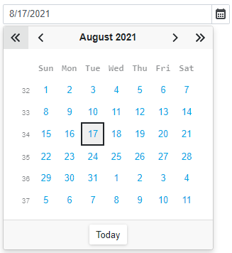
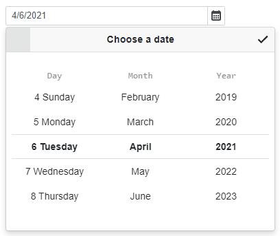
Datepicker Modes
<DxDateEdit> adapts a datepicker to the device type.
Mobile and tablet devices display a datepicker as a scroll picker.
Note
Mobile devices show a datepicker in a modal window.
Other device types display a datepicker as a calendar.
Set the PickerDisplayMode property to Calendar or ScrollPicker to show the same datepicker type on all devices. For the scroll picker, you can also use the ScrollPickerFormat property to define the date format for each part (day, month, and year).
<DxDateEdit @bind-Date="@DateTimeValue" PickerDisplayMode="DatePickerDisplayMode.ScrollPicker"
            ScrollPickerFormat="dddd MMMM yyyy"></DxDateEdit>

@code {
    DateTime DateTimeValue { get; set; } = DateTime.Now;
}
Input Validation
You can add a standalone Date Edit or the Form Layout component to Blazor’s standard EditForm. This form validates user input based on data annotation attributes defined in a model and indicates errors.
<EditForm Model="@starship" Context="EditFormContext">
    <DataAnnotationsValidator />
    <DxFormLayout >
        <DxFormLayoutItem Caption="Production Date:" ColSpanMd="6" >
            <Template >
                <DxDateEdit @bind-Date="@starship.ProductionDate" />
            </Template>
        </DxFormLayoutItem>
        @*...*@
    </DxFormLayout>
</EditForm>

@code {
    private Starship starship=new Starship();
}
For more information, refer to the following help topic: Validate Input.
Read-Only State
<DxDateEdit> supports a read-only state. Set the ReadOnly property to true to activate this option.
<DxDateEdit ReadOnly="true"> </DxDateEdit>
Drop-Down Window Direction
Use the DropDownDirection property to specify the direction in which the drop-down calendar is displayed relative to the input element. The default value is Down. The following code changes the direction to Up:
<DxDateEdit Date="DateTime.Today" DropDownDirection="DropDownDirection.Up" />
Note
If the editor is close to a browser window’s edge and there is not enough space to display the drop-down window in the specified direction, the drop-down window is displayed in the opposite direction.
HTML Attributes and Events
You can use HTML attributes and events to configure the Date Edit.
<DxDateEdit Date="DateTime.Today"
            id="date"
            name="date"
            autocomplete="on"
            @oninput="MyFunction">
</DxDateEdit>

@code {
    void MyFunction(){
        //...
    }
}
Troubleshooting
If a Blazor application throws unexpected exceptions, refer to the following help topic: Troubleshooting.