LabelWrapMode Enum
Lists values that specify how the CheckBox label is wrapped.
Namespace: DevExpress.Blazor
Assembly: DevExpress.Blazor.v22.1.dll
NuGet Package: DevExpress.Blazor
Declaration
public enum LabelWrapModeMembers
| Name | Description |
|---|---|
WordWrap
|
The label is divided into multiple lines to keep text within the target area. |
NoWrap
|
The label is displayed in full. |
Ellipsis
|
The label is cropped to fit into a container and has an end ellipsis. |
Related API Members
The following properties accept/return LabelWrapMode values:
Remarks
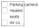
The CheckBox component consists of the check mark and label. If the label is too long to fit the parent component, you can wrap or crop the label. To do this, use the LabelWrapMode property.
The following example demonstrates how CheckBoxes with different LabelWrapMode property values behave in a fixed-width container:
<div style="width: 80px; border: 1px dashed black;">
    <DxCheckBox @bind-Checked="@Value" LabelWrapMode="LabelWrapMode.NoWrap">Parking camera</DxCheckBox>
    <DxCheckBox @bind-Checked="@Value" LabelWrapMode="LabelWrapMode.WordWrap">Heated seats</DxCheckBox>
    <DxCheckBox @bind-Checked="@Value" LabelWrapMode="LabelWrapMode.Ellipsis">Air conditioning</DxCheckBox>
</div>
In the example above, the CheckBox label with LabelWrapMode.NoWrap exceeds the container’s borders. To crop this label, you can apply the table-layout: fixed or overflow: hidden CSS rule to the container and specify its width:
<div style="width: 80px; border: 1px dashed black; overflow: hidden;">
      <DxCheckBox @bind-Checked="@Value" LabelWrapMode="LabelWrapMode.NoWrap">Parking camera</DxCheckBox>
      <DxCheckBox @bind-Checked="@Value" LabelWrapMode="LabelWrapMode.WordWrap">Heated seats</DxCheckBox>
      <DxCheckBox @bind-Checked="@Value" LabelWrapMode="LabelWrapMode.Ellipsis">Air conditioning</DxCheckBox>
</div>
