Size Modes
- 3 minutes to read
You can apply different size modes to DevExpress Blazor components and their elements.
Components That Support Size Modes
Component | Resizable part(s) | Related API |
|---|---|---|
Entire component | ||
Navigation buttons displayed in the component’s header. | ||
Entire component | ||
Input box and drop-down button | ||
Input box and drop-down button | ||
Data Grid | Compatible data editors in the Edit Form. | |
Resizable components (for example, data editors or buttons) in Form Layout’s items | ||
Entire component | ||
Entire component | ||
Entire component | ||
Entire component | ||
The Today button, view navigator, and view visible interval. | ||
Entire component | ||
Input box and drop-down button | ||
Entire component | ||
Input box and drop-down button | ||
Toolbar items |
Apply a Size Mode
You can set up size modes at the following levels:
- Individual components (for example, ComboBox, Spin Edit, Pager).
- All compatible components in a container (for example, Data Grid, Form Layout).
- All compatible components in an application.
Individual Components
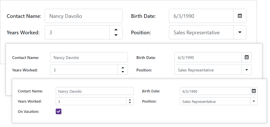
To specify a control’s size, use the SizeMode property (DxButton.SizeMode, DxComboBox.SizeMode, and so on). If you do not modify this property, the component uses the SizeMode global option (the default is Small).
Note
For the complete list of components that support size modes and related API members, refer to the section above.
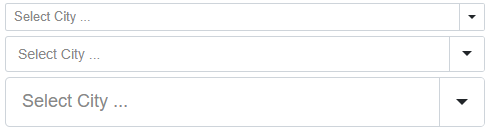
The code below applies different size modes to ComboBox components.
<DxComboBox Data="@Cities"
            NullText="Select City ..."
            @bind-Value="@Value"
            SizeMode="SizeMode.Small">
</DxComboBox>

<DxComboBox Data="@Cities"
            NullText="Select City ..."
            @bind-Value="@Value"
            SizeMode="SizeMode.Normal">
</DxComboBox>

<DxComboBox Data="@Cities"
            NullText="Select City ..."
            @bind-Value="@Value"
            SizeMode="SizeMode.Large">
</DxComboBox>

@code {
    IEnumerable<string> Cities = new List<string>() {
        "London",
        "Berlin",
        "Paris",
    };

    string Value = null;
    string Value { get => Value; set { Value = value; InvokeAsync(StateHasChanged); } }
}
Container Components
To specify the size of all resizable components in a container component, use the InnerComponentSizeMode property (for Data Grid, and Scheduler) or ItemSizeMode (for Form Layout and Toolbar). If you do not modify these properties, the components in the container use the SizeMode global option (the default is Small).
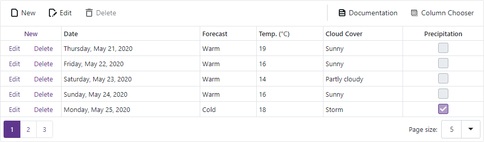
The code below applies the Medium size mode to all the resizable components located in the Data Grid.
<DxDataGrid DataAsync="@ForecastService.GetForecastAsync"
            PageSize="5"
            PagerPageSizeSelectorVisible="true"
            InnerComponentSizeMode="SizeMode.Medium">
    <HeaderTemplate>
        <DxToolbar ItemRenderStyleMode="ToolbarRenderStyleMode.Plain">
            <DxToolbarItem Text="New" BeginGroup="true" IconCssClass="grid-toolbar-new" />
            <DxToolbarItem Text="Edit" IconCssClass="grid-toolbar-edit" Enabled="true" />
            <DxToolbarItem Text="Delete" IconCssClass="grid-toolbar-delete" Enabled="false" />
            <DxToolbarItem Text="Documentation"
                           NavigateUrl="https://docs.devexpress.com/Blazor/401086/data-grid"
                           BeginGroup="true"
                           Alignment="ToolbarItemAlignment.Right"
                           IconCssClass="grid-toolbar-document"
                           target="_blank" />
            <DxDataGridColumnChooserToolbarItem Alignment="ToolbarItemAlignment.Right" />
        </DxToolbar>
    </HeaderTemplate>
    <Columns>
        ...
    </Columns>
</DxDataGrid>
Entire Application
Use the SizeMode application-wide option to specify the size mode for all resizable Blazor components. Individual component settings override this option.