CalendarControlBase.ContextButtons Property
Provides access to the collection of context buttons displayed in each calendar cell.
Namespace: DevExpress.XtraEditors.Controls
Assembly: DevExpress.XtraEditors.v25.2.dll
NuGet Package: DevExpress.Win.Navigation
Declaration
Property Value
| Type | Description |
|---|---|
| ContextItemCollection | The collection of context buttons. |
Remarks
In each calendar cell, you can display one or more context buttons, which can be added with the ContextButtons property. Typically, you need to enlarge the cell size using the CalendarControlBase.CellSize property to accommodate the created buttons.
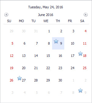
The following image shows the Calendar Control with four cells containing context buttons. Although the context buttons use the same image in the example, you can also display different images and accompany images with text and tooltips. Context buttons can always be visible or visible only on cell hovering.

The following list shows available context button types:
- ContextButton - A regular context button that can be clicked.
- CheckContextButton - A context button displaying a check box that can be checked by an end-user.
- RatingContextButton - A context item that allows an end-user to rate the content using the grading scale.
- TrackBarContextButton - A scrollable context item.
At design time, you can manage the context button collection for the Calendar Control and specify button properties using the Context Buttons designer. To invoke this designer, click the ellipsis button of the ContextButtons property in the Properties window.
By default, all context buttons from the ContextButtons collection are displayed in each calendar cell. If you need to hide context buttons for certain cells or dynamically customize button properties, handle the CalendarControlBase.ContextButtonCustomize event.
To respond to clicks on context buttons in a centralized way, handle the CalendarControlBase.ContextButtonClick event.
The CalendarControlBase.ContextButtonOptions property provides access to the settings applied to the context buttons and the panels that contain them. For instance, you can specify the indent between the buttons, the background color of each panel, the animation used to show and hide the panels, and the padding around the buttons.