Cells
- 14 minutes to read
Display Text and Cell Value
A cell value is the value stored in a data source. Display text of a cell is the string displayed in the cell.
Customize Display Text of Cells
Handle the CustomColumnDisplayText event to customize display text of cells based on a specific condition. The following example displays “User name not specified” in cells in the “UserName” column that have blank values:
gridView1.CustomColumnDisplayText += (sender, e) => {
    if (e.Column.FieldName == "UserName")
        if (e.Value == null || (string)e.Value == string.Empty)
            e.DisplayText = "User name not specified";
};
Sort and Filter by Display Text
When the Data Grid sorts or filters data, it processes cell values (and not display text). To sort and filter grid rows by display text, use GridColumn.SortMode and GridColumn.FilterMode properties.
Obtain Cell Values in Code
| API Member | Description |
|---|---|
| ColumnView.GetRowCellDisplayText | Returns the display text of the specified cell. |
| ColumnView.GetRowCellValue | Returns the value of the specified cell. |
| ColumnView.GetFocusedRowCellDisplayText | Returns the display text of the specified cell in the focused row. |
| ColumnView.GetFocusedRowCellValue | Returns the value of the specified cell in the focused row. |
| CellValueChanging | Occurs before the user changes a cell value and allows you to cancel the action. |
| CellValueChanged | Occurs after the user has changed the value of a cell. |
| FocusedRowHandle, FocusedColumn | Use these properties to focus a cell. |
Read the following topics for additional information and examples:
Content Alignment
Data Grid cells that display numeric values align their content to the right. Cells that display data of other types align their content to the left.
Use the column’s AppearanceCell.TextOptions.HAlignment property to change the alignment of cell values. The following example changes the alignment of cell values in “Text” and “Date” columns:

using DevExpress.Utils;
using System.Collections.Generic;
using System;

namespace DXApplication {
    public partial class Form1 : DevExpress.XtraEditors.XtraForm {
        List<DataItem> datasource;
        public Form1() {
            InitializeComponent();
            datasource = new List<DataItem>() {
                new DataItem(){ Text = "AAA", Number = 10, Date = DateTime.Now },
                new DataItem(){ Text = "BBB", Number = 20, Date = new DateTime(2024, 5, 5) },
                new DataItem(){ Text = "CCC", Number = -30, Date = new DateTime(2024, 10, 10) },
                new DataItem(){ Text = "DDD", Number = -40, Date = new DateTime(2024, 4, 4) },
            };
            gridControl1.DataSource = datasource;
            gridControl1.ForceInitialize();
            AlignCellValues();
        }
        void AlignCellValues(){
            gridView1.Columns["Text"].AppearanceCell.TextOptions.HAlignment = HorzAlignment.Center;
            gridView1.Columns["Date"].AppearanceCell.TextOptions.HAlignment = HorzAlignment.Far;
        }
    }

    public class DataItem {
        public string Text { get; set; }
        public int Number { get; set; }
        public DateTime Date { get; set; }
    }
}
To change alignment of individual cells based on a specific condition, handle the ColumnView.RowCellDefaultAlignment event:
using DevExpress.Utils;

gridView.RowCellDefaultAlignment += (s, e) => {
    HorzAlignment alignment = HorzAlignment.Default;
    switch(e.RowHandle % 3) {
        case 0:
            alignment = HorzAlignment.Center;
            break;
        case 1:
            alignment = HorzAlignment.Far;
            break;
        case 2:
            alignment = HorzAlignment.Near;
            break;
    }
    e.HorzAlignment = alignment;
};
Cell Selection
To enable multiple cell selection, do the following:
- Enable the View’s OptionsSelection.MultiSelect option.
- Set the View’s OptionsSelection.MultiSelectMode property to
GridMultiSelectMode.CellSelectto allow users to select individual cells usingCtrlandShiftkeys:
// Enable multiple selection.
gridView1.OptionsSelection.MultiSelect = true;
// Enable multiple cell selection.
gridView1.OptionsSelection.MultiSelectMode = DevExpress.XtraGrid.Views.Grid.GridMultiSelectMode.CellSelect;
Cell Selection API
| API Member | Description |
|---|---|
| GridView.SelectCell | Selects the specified cell. |
| GridView.SelectCells | Selects a range of cells. |
| GridView.GetSelectedCells | Returns selected cells. |
| GridView.GetSelectedCells(System.Int32) | Returns grid columns that contain selected cells in the specified row. |
How to Display an Image in a Cell
Depending on your task, you can use different techniques to display images (glyphs, icons, pictures) in grid cells.
Editor Context Images
Use RepositoryItemTextEdit.ContextImageOptions to display the same raster or vector (SVG) image in all cells of a column (in display and edit modes).
The following example displays a vector (SVG) image in cells of the “Date” column:

// Create and initialize a DateEdit repository item.
RepositoryItemDateEdit riDateEdit = new RepositoryItemDateEdit() {
    Name = "repositoryItemDateEdit1"
};

/* Display an image (SVG) in the cell editor.
    * The SVG image is obtained from the SvgImageCollection.
    * The SVG image was added to the SvgImageCollection in Visual Studio at design time.
    */

riDateEdit.ContextImageOptions.SvgImage = svgImageCollection1["adateoccuring"];
riDateEdit.ContextImageOptions.SvgImageSize = new System.Drawing.Size(16, 16);
riDateEdit.ContextImageOptions.Alignment = DevExpress.XtraEditors.ContextImageAlignment.Far;

// Add the repository item (cell editor) to the grid control's RepositoryItems collection.
gridControl1.RepositoryItems.Add(riDateEdit);

// Assign the repository item to the 'Date' column.
gridView1.Columns["Date"].ColumnEdit = riDateEdit;
Display Images in Individual Cells
- Create a
RepositoryItemTextEditand specify its ContextImageOptions. - Add the
RepositoryItemTextEditto the grid’s RepositoryItems collection. - Handle the GridView.CustomRowCellEdit event to assign the
RepositoryItemTextEditto specific cells based on a condition.
The following example assigns the repositoryItemTextEdit2 to “ShipCountry” column cells for orders that ship to Denmark:
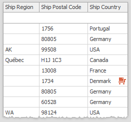
private void GridView1_CustomRowCellEdit1(object sender, CustomRowCellEditEventArgs e) {
    if (e.RowHandle != GridControl.NewItemRowHandle && e.Column.FieldName == "ShipCountry"
        && e.CellValue.ToString() == "Denmark") {
            e.RepositoryItem = repositoryItemTextEdit2;
    }
}
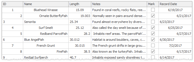
Check Edit with Images
Follow the steps below to replace Boolean cell values with icons:
- Create a RepositoryItemCheckEdit and add it to the grid’s RepositoryItems collection.
- Set the
RepositoryItemCheckEdit‘s CheckBoxOptions.Style property toCheckBoxStyle.Custom. - Specify RepositoryItemCheckEdit.ImageOptions. Set images and image size for “Checked”, “Unchecked”, and “Grayed” states.
- Assign
RepositoryItemCheckEditto the column’s ColumnEdit property.

using DevExpress.XtraEditors.Repository;


// Create and initialize a CheckEdit repository item.
RepositoryItemCheckEdit riCheckEdit = new RepositoryItemCheckEdit()
{
    Name = "repositoryItemCheckEdit1",
    AllowGrayed = true
};
riCheckEdit.CheckBoxOptions.Style = DevExpress.XtraEditors.Controls.CheckBoxStyle.Custom;
/* Associate SVG images to check states.
    * SVG images are obtained from the SvgImageCollection.
    * SVG images were added to the SvgImageCollection in Visual Studio at design time.
    */
riCheckEdit.ImageOptions.SvgImageChecked = svgImageCollection1["weather_sunny"];
riCheckEdit.ImageOptions.SvgImageUnchecked = svgImageCollection1["weather_rainheavy"];
riCheckEdit.ImageOptions.SvgImageGrayed = svgImageCollection1["weather_cloudy"];
riCheckEdit.ImageOptions.SvgImageSize = new System.Drawing.Size (16, 16);

// Add the repository item (cell editor) to the grid control's RepositoryItems collection.
gridControl1.RepositoryItems.Add(riCheckEdit);

// Assign the repository item to the Boolean 'Check' column.
gridView1.Columns["Check"].ColumnEdit = riCheckEdit;
Image Combo Box
If your cells display enumeration values that you wish to replace with images, use the ImageComboBoxEdit editor linked to an ImageList or a DevExpress image collection.
RepositoryItemImageComboBox imageCombo =
    gridControl1.RepositoryItems.Add("ImageComboBoxEdit") as RepositoryItemImageComboBox;
DevExpress.Utils.ImageCollection images = new DevExpress.Utils.ImageCollection();
images.AddImage(Image.FromFile("..\\..\\Minor.png"));
images.AddImage(Image.FromFile("..\\..\\Moderate.png"));
images.AddImage(Image.FromFile("..\\..\\Severe.png"));
imageCombo.SmallImages = images;
    // The first argument is the item description, visible to end users
    // The second argument is the cell (data source) value
    // The third argument is the index of an image inside the "SmallImages" collection
imageCombo.Items.Add(new ImageComboBoxItem("Minor", (short)1, 0));
imageCombo.Items.Add(new ImageComboBoxItem("Moderate", (short)2, 1));
imageCombo.Items.Add(new ImageComboBoxItem("Severe", (short)3, 2));
imageCombo.GlyphAlignment = DevExpress.Utils.HorzAlignment.Center;
gridView1.Columns["Severity"].ColumnEdit = imageCombo;
gridControl1.RepositoryItems.Add(imageCombo);
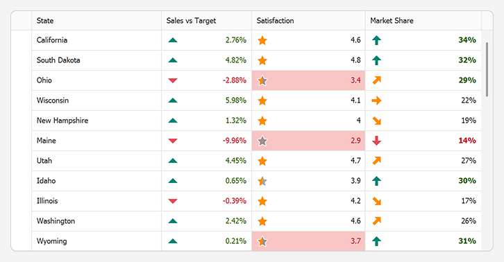
Conditional Formatting
This technique is recommended when you have a static icon set to visualize different values or value ranges. In this scenario, icons are displayed next to cell values. Read the following topic for additional information: Appearance and Conditional Formatting.
Fill Cells with Images
Use the PictureEdit editor to fill an entire Grid cell with an image:

RepositoryItemPictureEdit pictureEdit =
    gridControl1.RepositoryItems.Add("PictureEdit") as RepositoryItemPictureEdit;
pictureEdit.SizeMode = PictureSizeMode.Zoom;
pictureEdit.NullText = " ";
gridView1.Columns["Picture"].ColumnEdit = pictureEdit;
gridControl1.RepositoryItems.Add(pictureEdit);
Custom Draw
The GridView.CustomDrawCell event allows you to paint images inside Grid cells.
private void GridView1_CustomDrawCell(object sender, RowCellCustomDrawEventArgs e) {
    if (e.RowHandle != GridControl.NewItemRowHandle && e.Column.FieldName == "ShipCountry"
        && e.CellValue.ToString() == "Denmark") {
            e.DefaultDraw();
            //TODO: specify required offsets
            e.Cache.DrawImage(img, e.Bounds.X + offsetX, e.Bounds.Y + offsetY);
    }
}
HTML Formatting
Use the Image tag to embed images into cells. Note that this technique makes cells non-editable.
gridView1.HtmlImages = imageCollection1;
gridView1.RowHeight = 60;
// Create an unbound column
GridColumn unbound = new GridColumn();
unbound.UnboundDataType = typeof(string);
unbound.FieldName = "unboundImageColumn";
unbound.Visible = true;
unbound.Caption = "Icon";
gridView1.Columns.Add(unbound);
// Assign a RepositoryItemHypertextLabel as the unbound column editor
RepositoryItemHypertextLabel htLabel = new RepositoryItemHypertextLabel();
htLabel.HtmlImages = imageCollection1;
gridControl1.RepositoryItems.Add(htLabel);
unbound.ColumnEdit = htLabel;
// Set custom cell text
gridView1.CustomUnboundColumnData += GridView1_CustomUnboundColumnData;

private void GridView1_CustomUnboundColumnData(object sender, CustomColumnDataEventArgs e)
{
    if (e.Column.Caption == "Icon")
    {
        // Image from HtmlImages collection
        e.Value = "<image=add_32x32.png>";
        // Image from resources
        //e.Value = "<image=#_589812_200>";
    }
}
Unbound Columns
If you need a column with images that is not associated with specific data source values, create an unbound column with a RepositoryItemPictureEdit object as an in-place editor. Handle the ColumnView.CustomUnboundColumnData event to supply this column with images.
using System.IO;
using System.Drawing;
using System.Collections.Generic;
using DevExpress.XtraGrid.Views.Base;
using DevExpress.XtraGrid.Views.Card;

Dictionary<string, Image> imageCache = new Dictionary<string, Image>();
private void CardView1_CustomUnboundColumnData(object sender, CustomColumnDataEventArgs e) {
    if (e.IsSetData)
        return;
    CardView view = sender as CardView;
    var path = (string)view.GetListSourceRowCellValue(e.ListSourceRowIndex, "Path");
    if (string.IsNullOrEmpty(path))
        return;
    try {
        e.Value = LoadImage(path);
    }
    catch { }
}

Image LoadImage(string path) {
    Image img;
    if(!imageCache.TryGetValue(path, out img)) {
        if(File.Exists(path))
            img = Image.FromFile(path);
        imageCache.Add(path, img);
    }
    return img;
}
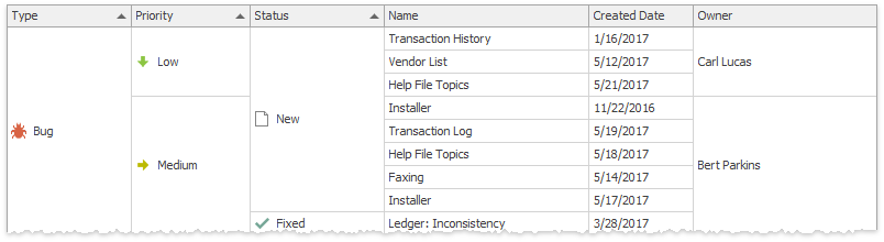
Cell Merging
GridView and BandedGridView can merge cells with the same values (note that merging relies on cell values, not cell display text). Read the following topic for additional information and examples: Tutorial: Cell Merging.
Related API
| API Member | Description |
|---|---|
| GridOptionsView.AllowCellMerge | Enables automatic cell merge for all columns in the View. |
| GridColumn.OptionsColumn.AllowMerge | Enables automatic cell merge for a column only. This property has priority over the global GridOptionsView.AllowCellMerge setting. |
| GridOptionsView.MergedCellEditMode | Specifies how users can edit merged cells. |
| GridView.CellMerge | Allows you to manually merge cells. |
In this example, the Data Grid contains a “Created By” column that displays e-mail addresses. The ColumnView.CustomColumnDisplayText event is handled to trim these addresses to their domain names. Since this event changes only cell display text, cell values remain intact and no merging occurs. To fix that, the GridView.CellMerge event is handled.

// Trim e-mail addresses
private void gridView1_CustomColumnDisplayText(object sender, DevExpress.XtraGrid.Views.Base.CustomColumnDisplayTextEventArgs e) {
    if (e.Column == colCreatorID) {
        string email = e.DisplayText;
        string domain = email.Substring(email.IndexOf('@') + 1);
        e.DisplayText = domain;
    }
}

// Custom cell merge
private void gridView1_CellMerge(object sender, DevExpress.XtraGrid.Views.Grid.CellMergeEventArgs e) {
    GridView view = sender as GridView;
    if(view == null) return;
    if (e.Column == colCreatorID) {
        string text1 = view.GetRowCellDisplayText(e.RowHandle1, colCreatorID);
        string text2 = view.GetRowCellDisplayText(e.RowHandle2, colCreatorID);
        e.Merge = (text1 == text2);
        e.Handled = true;
    }
}
Limitations
Merged cells impose the following limitations:
- Row multi-selection is disabled.
- Merged rows cannot display preview sections. If the GridOptionsView.ShowPreview option is set to true, neighboring cells with identical values cannot be merged, regardless of the GridOptionsView.AllowCellMerge property value.
- Appearance settings for focused rows and cells are ignored (the GridViewAppearances.FocusedRow and GridViewAppearances.FocusedCell properties).
- Appearance settings used to paint even and odd rows are ignored (the GridViewAppearances.EvenRow and GridViewAppearances.OddRow properties).
Related Examples
Display Icons in Grid Cells
This example uses various techniques to display images/icons within data cells.
Display Images from a Data Field with Image Paths
This example creates an unbound column and handles the CustomUnboundColumnData event to display images within grid cells when a data source contains file names of images stored on a local disk (the Images folder). The event handler loads images, caches them in a hash table, and displays them within appropriate cells.
Handle a Double Click on a Data Row or Cell
The Data Grid does not fire the DoubleClick event when a user double-clicks within an active cell editor. This example intercepts double mouse clicks within cell editors (enabled or disabled) to respond to double clicks within the active cell editor, rows, and cells.