Banded Grid Views
- 5 minutes to read
Banded Grid View (BandedGridView) displays data in a tabular form and organizes columns into bands.
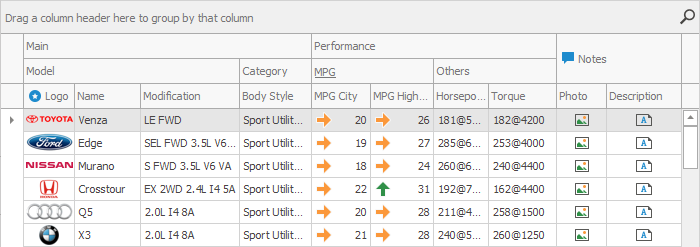
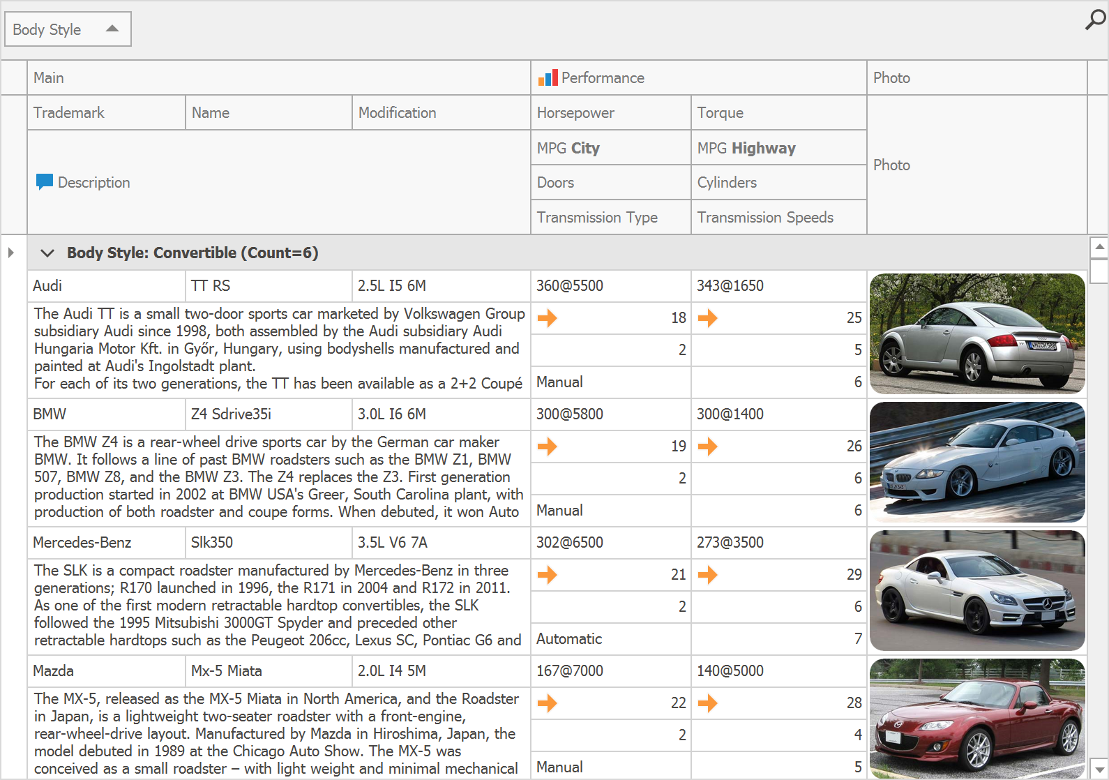
Advanced Banded View (AdvBandedGridView) does the same and additionally supports complex layouts of data cells.
Online Video
Demos
Bands and Columns
BandedGridView and AdvBandedGridView Views feature bands — stripes that organize grid columns into categories.

Columns in banded Views are instances of the BandedGridColumn class and inherit most of their settings from the parent GridColumn class.
Add, Remove, Reorder and Modify Bands
Run the Grid Designer and switch to the “Bands” tab. This tab has buttons to add and remove bands, and a property grid to modify band settings. You can also drag bands to rearrange them.
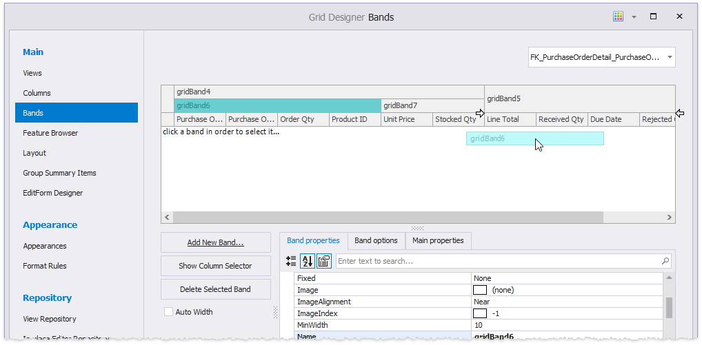
In code, create GridBand objects and place them into the BandedGridView.Bands collection.
Related API
BandedGridView.Bands - Provides access to the root band collection.
GridBandCollection.MoveTo - Moves a band to a new position among other bands.
Add Columns to Bands
At design time, drag a column and drop it below a band.

In code, either access the band’s GridBand.Columns collection and call its “Add”, “AddRange”, and “Insert” methods, or specify the BandedGridColumn.OwnerBand property for a column.
Related API
GridBand.Columns - Gets columns owned by the band.
GridBandColumnCollection.MoveTo - Moves a column to a new position within the current band.
BandedGridColumn.OwnerBand - Gets or sets a column’s parent band.
Multi-Level Bands
It is possible to stack bands below bands, forming a multi-level band hierarchy.

Drag and drop bands in the Grid Designer’s “Bands” tab to do this at design time. In code, place child bands into the GridBand.Children collections of the parent bands. To retrieve a parent band, use the GridBand.ParentBand property.
// Organize bands 2 and 3 under the first one
gridBand2.ParentBand.Children.Add(gridBand3);
// or
Band Headers
Use the following API to modify band headers.
-
Specifies the band text.
-
Specifies the band icon.
BandedGridView.MinBandPanelRowCount | BandedGridView.BandPanelRowHeight | GridBand.RowCount | GridBand.AutoFillDown
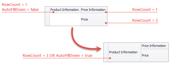
These properties specify band heights. Use the MinBandPanelRowCount and BandPanelRowHeight properties to set the initial number of band rows and the heights of these rows. Then, you can stretch a band vertically across multiple rows by setting its RowCount property. If the AutoFillDown setting is enabled, a band automatically stretches vertically to consume any available space below.
BandedViewAppearances.BandPanel | GridBand.AppearanceHeader
Provide access to common and individual appearance settings, applied to band headers.
Fixed Bands
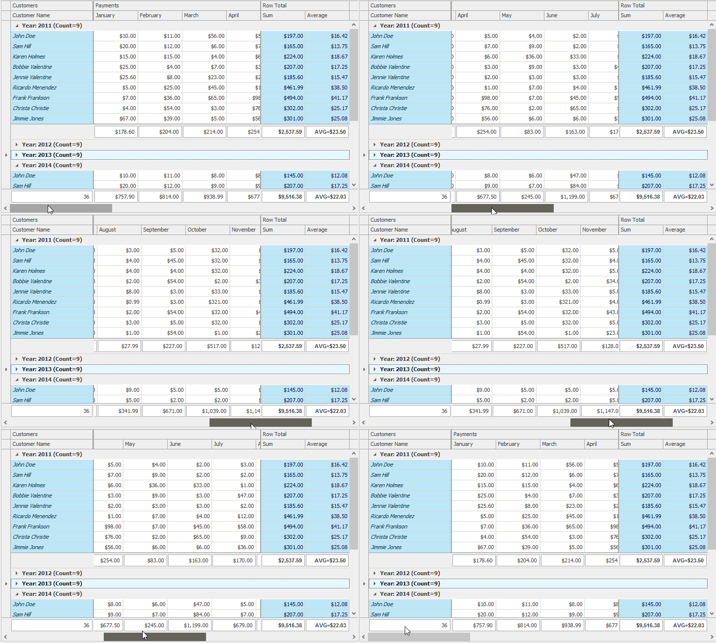
Similar to columns, you can anchor bands to the left and right sides of a View. Such bands are called fixed bands, and they remain in place as users scroll through the View.
Related API
GridBand.Fixed — Anchors a band to either side of a View.
GridView.FixedLineWidth — Specifies the width of a line that delimits fixed bands from regular ones.
Column Layout in Advanced Banded Views
In an Advanced Banded View, a single row can display vertically stacked cells that belong to different columns. The figure below is a screenshot of the Banded Views demo with eight columns stacked into four rows with the “Performance” band above them.
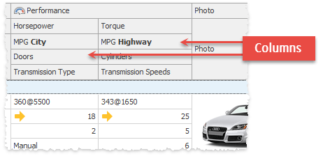
At design time, you can arrange columns by dragging them directly onto the form surface.
Related API
BandedGridColumn.RowIndex — Places a column into a specific row.
BandedGridColumn.RowCount — Specifies a row span, allowing a column to stretch across multiple rows.
BandedGridColumn.OwnerBand — Gets or sets a column’s parent band.
AdvBandedGridView.SetColumnPosition - Moves a column to the specified position among visible columns belonging to the same band.
BandedGridColumn.AutoFillDown — Allows a column to fill the available space below automatically.
BandedGridColumn.ColIndex — A read-only property that returns the position of this column within a parent band row.
using DevExpress.XtraGrid.Views.BandedGrid;

// Assign columns to bands
colHP.OwnerBand = bandPerfomancel;
colCyl.OwnerBand = bandPerfomancel;
colCapacity.OwnerBand = bandPerfomancel;
colGear.OwnerBand = bandPerfomancel;
colImage.OwnerBand = bandPicture;
// Change the column layout within bands
AdvBandedGridView View = colHP.View
view.SetColumnPosition(colHP, 0, 0);
view.SetColumnPosition(colCyl, 0, 1);
view.SetColumnPosition(colCapacity, 1, 0);
view.SetColumnPosition(colGear, 1, 1);
view.SetColumnPosition(colImage, 0, 0);
// Force the Image column to stretch its header if needed
colImage.AutoFillDown = true;

End-User Customization
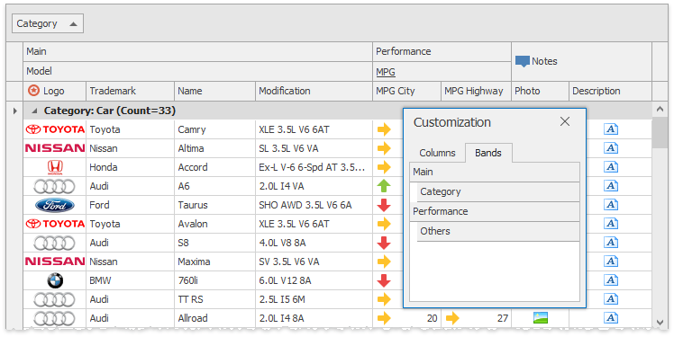
At runtime, users can drag and drop columns and bands to customize the layout as their needs dictate. Users can also hide and restore bands in the “Customization” dialog.
Related API
OptionsBand.AllowSize, BandedGridOptionsCustomization.AllowBandResizing — prevent users from resizing a specific band or all bands owned by the View.
OptionsBand.AllowMove, BandedGridOptionsCustomization.AllowBandMoving — prevent users from rearranging bands.
GridOptionsCustomization.AllowQuickHideColumns — gets or sets whether users can hide a column or a band by dragging it away from the column header panel.
BandedGridOptionsCustomization.AllowChangeBandParent, BandedGridOptionsCustomization.AllowChangeColumnParent — specify whether or not bands and columns can be moved outside their parent bands.
OptionsBand.ShowInCustomizationForm, BandedGridOptionsCustomization.ShowBandsInCustomizationForm — allow you to hide specific bands (or all bands) from the Customization dialog.