ColumnBase.SortIndicatorStyle Property
Gets or sets the style applied to the sort indicator within an individual column header. This is a dependency property.
Namespace: DevExpress.Xpf.Grid
Assembly: DevExpress.Xpf.Grid.v26.1.Core.dll
NuGet Package: DevExpress.Wpf.Grid.Core
Declaration
Property Value
| Type | Description |
|---|---|
| Style | A Style applied to the sort indicator within an individual column header. |
Remarks
Enable the ColumnBase.AllowSorting or DataViewBase.AllowSorting property to allow users to sort a column by clicking its header. The column header displays the sort indicator only if the ColumnBase.ShowSortIndicator or DataViewBase.ShowSortIndicator property is enabled, and the column is currently sorted.
Assign a Style to the ColumnBase.SortIndicatorStyle property to display a custom sort glyph within an individual column header. The target element for this style is the SortIndicatorControl class.
Example: Display a Custom Sort Icon for a Specific Column
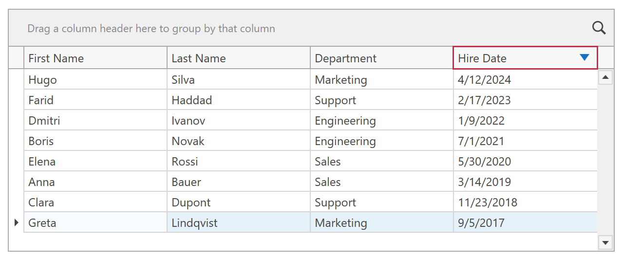
The following example displays custom sort icons within the Hire Date column header in the TableView:
<dx:ThemedWindow xmlns="http://schemas.microsoft.com/winfx/2006/xaml/presentation"
                 xmlns:x="http://schemas.microsoft.com/winfx/2006/xaml"
                 xmlns:dx="http://schemas.devexpress.com/winfx/2008/xaml/core"
                 xmlns:dxg="http://schemas.devexpress.com/winfx/2008/xaml/grid">
    <dx:ThemedWindow.Resources>
        <Style x:Key="CustomSortIndicatorStyle" TargetType="{x:Type dxg:SortIndicatorControl}">
            <Setter Property="Width" Value="14" />
            <Setter Property="Height" Value="14" />
            <Setter Property="Template">
                <Setter.Value>
                    <ControlTemplate TargetType="{x:Type dxg:SortIndicatorControl}">
                        <Grid Background="Transparent">
                            <Path x:Name="Arrow"
                                  Fill="#D9480F"
                                  HorizontalAlignment="Center"
                                  VerticalAlignment="Center"
                                  Data="M 0,7 L 10,7 L 5,0 Z" />
                        </Grid>
                        <ControlTemplate.Triggers>
                            <Trigger Property="SortOrder" Value="Descending">
                                <Setter TargetName="Arrow" Property="Data" Value="M 0,0 L 10,0 L 5,7 Z" />
                                <Setter TargetName="Arrow" Property="Fill" Value="#1971C2" />
                            </Trigger>
                        </ControlTemplate.Triggers>
                    </ControlTemplate>
                </Setter.Value>
            </Setter>
        </Style>
    </dx:ThemedWindow.Resources>
    <dxg:GridControl ItemsSource="{Binding}">
        <dxg:GridControl.View>
            <dxg:TableView ShowSortIndicator="True" />
        </dxg:GridControl.View>
        <dxg:GridControl.Columns>
            <dxg:GridColumn FieldName="FirstName" />
            <dxg:GridColumn FieldName="LastName" />
            <dxg:GridColumn FieldName="Department" />
            <dxg:GridColumn FieldName="HireDate"
                            SortIndicatorStyle="{StaticResource CustomSortIndicatorStyle}" />
        </dxg:GridControl.Columns>
    </dxg:GridControl>
</dx:ThemedWindow>