ColumnBase.FilterPopupMode Property
Gets or sets the display mode of the column’s Drop-Down Filter. This is a dependency property.
Namespace: DevExpress.Xpf.Grid
Assembly: DevExpress.Xpf.Grid.v25.2.Core.dll
NuGet Package: DevExpress.Wpf.Grid.Core
Declaration
Property Value
| Type | Description |
|---|---|
| FilterPopupMode | A FilterPopupMode enumeration value that specifies the display mode of the column’s drop-down filter. |
Available values:
| Name | Description |
|---|---|
| Default | ExcelSmart starting with v19.2. In previous versions, DateSmart for date-time columns, and List for other columns. |
| List | A regular list of items (one item at a time can be selected). |
| CheckedList | A checked list. Multiple items can be selected/checked simultaneously. |
| Custom | A drop-down filter is represented by a custom template assigned to the ColumnBase.CustomColumnFilterPopupTemplate property. |
| Date | This mode is equivalent to DateSmart regarding the appearance of the drop-down filter. The drop-down filter displays all the available check boxes, even if there is no data that falls into a corresponding date range. |
| DateAlt | This mode is equivalent to DateSmart, but with a different set of filters: Today, This week, This month, Next month, etc.
|
| DateSmart | A built-in calendar plus check boxes to select common non-intersecting date intervals. The available date ranges for the DateSmart and Date modes:
If there is no underlying data that would fall into a specific date range, the corresponding check box is hidden. If all values in the date-time column are set to null, all check boxes are visible. |
| DateCompact | A date-time drop-down filter without predefined values. |
| Excel | An Excel-style Drop-down Filter (previous). |
| ExcelSmart | An Excel-style Drop-down Filter (new; works starting with v18.2). |
| Disabled | Hides the Show Drop-down Filter button
|
Remarks
v19.2 and later use the Excel-style Drop-down Filter by default.
To use the previous drop-down filter:
- For a specific GridControl, specify the ColumnBase.FilterPopupMode / DataViewBase.ColumnFilterPopupMode property.
- For all GridControls, set the CompatibilitySettings.UseLegacyColumnFilterPopup property to true.
Drop-Down Filter Display Mode | FilterPopupMode Value |
|---|---|
an Excel style drop-down filter | FilterPopupMode.Excel (previous) FilterPopupMode.ExcelSmart (new; works starting with v18.2) |
a regular list of items (one item at a time can be selected) | |
a checked list (multiple items can be selected/checked simultaneously) | |
a calendar (for date-time columns) |
Examples
To create a custom drop-down filter:
- Set the
ColumnBase.FilterPopupModeproperty to FilterPopupMode.Custom / FilterPopupMode.ExcelSmart. Create a template that represents the drop-down filter and assign it to the ColumnBase.CustomColumnFilterPopupTemplate property (see Example 1).
You can define a filter element with the PART_FilterElement name as a custom data template (see Example 2).
Example 1
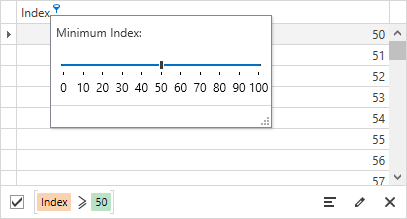
The following code sample demonstrates how to create a custom drop-down filter for the Index column:

<Window.Resources>
    <local:IntToCriteriaOperatorConverter x:Key="IntToCriteriaConverter"/>
</Window.Resources>
<dxg:GridControl x:Name="grid">
    <dxg:GridColumn FieldName="Index" FilterPopupMode="Custom">
        <dxg:GridColumn.CustomColumnFilterPopupTemplate>
            <DataTemplate>
                <StackPanel>
                    <Label Content="Minimum Index:" Margin="5"/>
                    <dxe:TrackBarEdit Minimum="0" Maximum="100"
                                      Width="200" Margin="10"
                                      TickFrequency="10" TickItemDisplayMode="TickAndText" TickPlacement="BottomRight"
                                      EditValue="{Binding Path=CustomColumnFilter, RelativeSource={RelativeSource TemplatedParent}, Converter={StaticResource IntToCriteriaConverter}}"/>
                </StackPanel>
            </DataTemplate>
        </dxg:GridColumn.CustomColumnFilterPopupTemplate>
    </dxg:GridColumn>
    <dxg:GridControl.View>
        <dxg:TableView AutoWidth="True"/>
    </dxg:GridControl.View>
</dxg:GridControl>
public class IntToCriteriaOperatorConverter : IValueConverter {
    object IValueConverter.Convert(object value, Type targetType,
            object parameter, System.Globalization.CultureInfo culture) {
        BinaryOperator binaryOperator = value as BinaryOperator;
        if (ReferenceEquals(binaryOperator, null))
            return null;
        OperandValue operandValue = binaryOperator.RightOperand as OperandValue;
        return operandValue.Value;
    }
    object IValueConverter.ConvertBack(object value, Type targetType,
            object parameter, System.Globalization.CultureInfo culture) {
        return new BinaryOperator("Index", Convert.ToInt32(value), BinaryOperatorType.GreaterOrEqual);
    }
}
Example 2
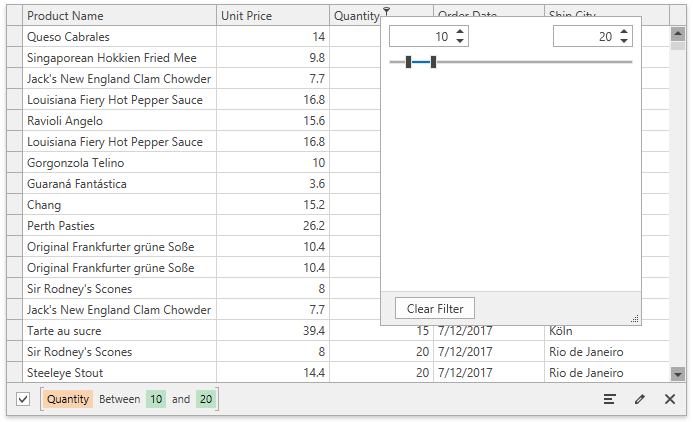
The following code sample uses the RangeFilterElement as a custom data template:

<dxg:GridControl x:Name="grid" ItemsSource="...">
    <dxg:GridControl.Columns>
        <!-- -->
        <dxg:GridColumn FieldName="Quantity">
            <dxg:GridColumn.CustomColumnFilterPopupTemplate>
                <DataTemplate>
                    <dxfui:RangeFilterElement x:Name="PART_FilterElement"/>
                </DataTemplate>
            </dxg:GridColumn.CustomColumnFilterPopupTemplate>
        </dxg:GridColumn>
        <!-- -->
    </dxg:GridControl.Columns>
    <dxg:GridControl.View>
        <dxg:TableView ColumnFilterPopupMode="ExcelSmart" />
    </dxg:GridControl.View>
</dxg:GridControl>
Related GitHub Examples
The following code snippets (auto-collected from DevExpress Examples) contain references to the FilterPopupMode property.
Note
The algorithm used to collect these code examples remains a work in progress. Accordingly, the links and snippets below may produce inaccurate results. If you encounter an issue with code examples below, please use the feedback form on this page to report the issue.
 .
.