ColumnBase.FilterPopupGlyphTemplate Property
Gets or sets the template used to display a filter popup glyph in an individual column header. This is a dependency property.
Namespace: DevExpress.Xpf.Grid
Assembly: DevExpress.Xpf.Grid.v26.1.Core.dll
Declaration
Property Value
| Type | Description |
|---|---|
| ControlTemplate | A ControlTemplate that displays the filter popup glyph in an individual column header. |
Remarks
Assign a ControlTemplate to the FilterPopupGlyphTemplate property to replace the predefined icon displayed in an individual column header when a filter popup is hidden. To override the template for all column headers, specify the FilterPopupGlyphTemplate. The column-level template has priority over the view-level FilterPopupGlyphTemplate.
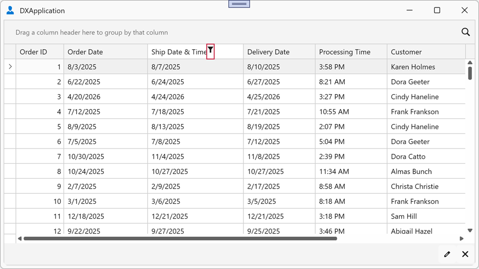
Example: Set a Custom Filter Popup Glyph for a Specific Column
The following example assigns a custom icon as the filter popup glyph for the Ship Date & Time column header in the TableView:
<dx:ThemedWindow xmlns="http://schemas.microsoft.com/winfx/2006/xaml/presentation"
                 xmlns:x="http://schemas.microsoft.com/winfx/2006/xaml"
                 xmlns:dx="http://schemas.devexpress.com/winfx/2008/xaml/core"
                 xmlns:dxg="http://schemas.devexpress.com/winfx/2008/xaml/grid">
    <dx:ThemedWindow.Resources>
        <ControlTemplate x:Key="CustomFilterGlyph">
            <Path Data="M 0,0 L 8,0 L 5,4 L 5,8 L 3,8 L 3,4 Z"
                  Fill="{Binding Path=(TextBlock.Foreground),
                                 RelativeSource={RelativeSource AncestorType=ContentPresenter}}"
                  HorizontalAlignment="Center"
                  VerticalAlignment="Center"
                  Stretch="Uniform"
                  Width="10" Height="10"/>
        </ControlTemplate>
    </dx:ThemedWindow.Resources>
    <dxg:GridControl ItemsSource="{Binding Orders}">
        <dxg:GridControl.View>
            <dxg:TableView/>
        </dxg:GridControl.View>
        <dxg:GridControl.Columns>
            <dxg:GridColumn FieldName="ShipDateTime" Header="Ship Date & Time"
                            FilterPopupGlyphTemplate="{StaticResource CustomFilterGlyph}"/>
            <dxg:GridColumn FieldName="CustomerName" Header="Customer"/>
        </dxg:GridControl.Columns>
    </dxg:GridControl>
</dx:ThemedWindow>