TdxSplashForm Class
A Splash Form designed to indicate application startup progress.
Declaration
TdxSplashForm = class(
    TdxSplashFormBase
)
Remarks
A Splash Form is a dedicated form type displayed during the app initialization phase. You can also add and display custom splash forms for different purposes (“About” screens, context help, etc.).
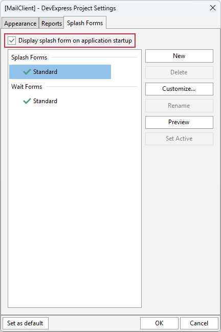
Splash Form Management
Use the design-time Project Settings dialog to manage Splash Forms in your project (the Splash Forms tab). A DevExpress project always has at least one (predefined) Splash Form accessible using the TdxSplashFormManager.SplashForm class function.
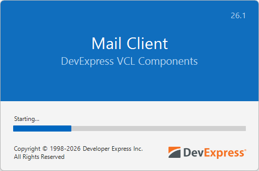
Enable a Splash Form at Startup
Check the Display splash form on application startup option in the Project Settings dialog to display the active/default Splash Form at startup:
Tip
You can also call Preview, Show, and Hide procedures to manually manage Splash Form visibility in your application. For example, you can design and display a Splash Form as a custom information form.
Hide a Splash Form
The active/default Splash Form is hidden automatically once the app initialization phase is complete when the following conditions are met:
- The main application form is derived from the TdxForm class (for example, when using the VCL Template Kit).
- DevExpress skins are enabled at the application level (using the Project Settings dialog or a TdxSkinController component).
Otherwise, you need to call the Hide procedure manually to hide the active splash form when required.
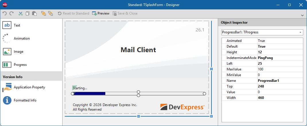
Splash Form Designer
The Splash Form Designer dialog allows you to configure the layout of a predefined or custom Splash Form. Select a Splash Form in the Project Settings dialog and click Customize… to display the Splash Form Designer dialog.
Main API Members
The list below outlines key members of the TdxSplashForm class. You can use these members to hide/display a Splash Form and access/customize existing UI elements.
Size & Position
- BoundsRect | SetBounds
- Specify the form’s bounding rectangle.
- Left | Top
- Specify the form position (in relation to the target control/form).
- Position
- Allows you to switch between predefined and custom Splash Form positions.
- Width | Height
- Specify Splash Form dimensions.
Visibility Management
- FadeIn | FadeOut
- Specify if fade in/out effects are enabled while the Splash Form is being displayed or hidden.
- Hide
- Hides the Splash Form if it is visible.
- Preview
- Displays the Splash Form for the target control or form in Preview mode. A user can click the target control/form to close the displayed Splash Form.
- Show
- Displays the Splash Form for the target control or form. Users cannot close the Splash Form in this mode. You need to call the Hide procedure explicitly to hide the displayed form.
- Visible
- Indicates if the form is visible.
UI Elements/Controls
All API members in this section allow you to access and modify existing UI elements/controls placed on the Splash Form. If the target predefined or custom UI element is not found, an exception occurs.
Tip
Use the Splash Form Designer dialog to add new or remove existing UI elements.
- Animation
- Provides access to an Animation/Activity Indicator element (TdxSplashFormBase.TAnimation) on the form.
- GetItem
- Provides access to any UI element/control on the form (by type and name).
- Image
- Provides access to an Image element (TdxSplashFormBase.TImage) on the form.
- Progress
- Provides access to a Progress Bar element (TdxSplashFormBase.TProgress) on the form.
- Text
- Provides access to a Text/Label element (TdxSplashFormBase.TText) on the form.
General-Purpose API Members
- BeginUpdate | EndUpdate
- Allow you to avoid excessive redraw operations during batch appearance setting changes.
- Color
- Specifies the form background color.
- Default
- Specifies if the Splash Form is used as default in the application.
- Name
- Specifies the Splash Form’s name (used in the Splash Form Manager and Project Settings).
Direct TdxSplashForm Class Reference
The TdxSplashFormManager.SplashForm class function returns a TdxSplashForm object.