High DPI and Graphics
- 7 minutes to read
This topic contains general recommendations on building DPI-aware VCL applications that target multi-monitor environments. Such applications can automatically render their UI elements according to the target monitor’s DPI to avoid blurry text or images.
Use the DevExpress VCL Template Kit
The VCL Template Kit is designed to quickly create common application types and frequently used UI forms. The VCL Template Kit addresses typical business app usage scenarios (such as data-centric forms, master-detail layouts, and common navigation patterns).

Tip
All application projects and individual forms created using the VCL Template Kit follow all recommendations and encapsulate best practices described in this topic.
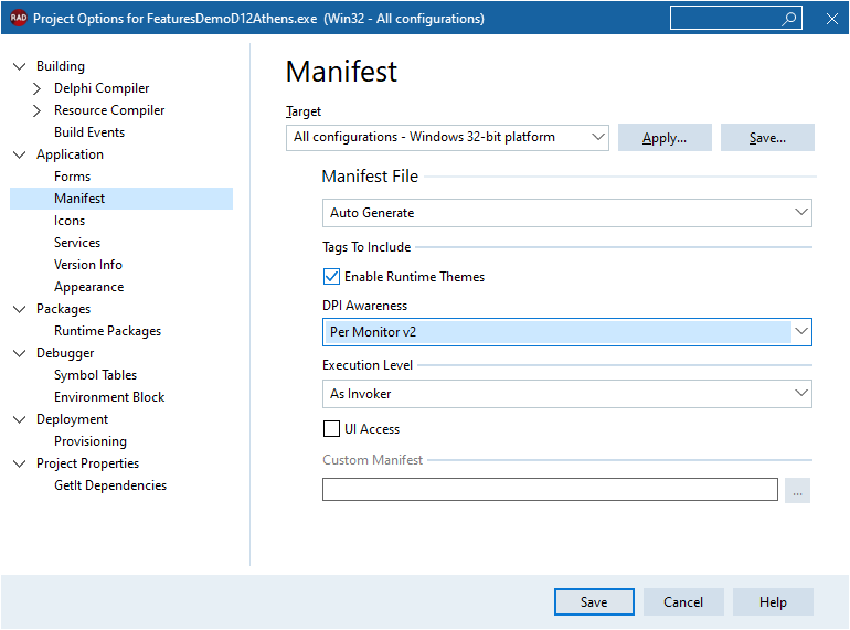
Enable DPI Awareness in Project Options
Make sure that the Per-Monitor DPI Awareness v2 mode is enabled in project settings in your RAD Studio IDE. Open the Project Options dialog for your project and select the Manifest option in the Application node. Select Per Monitor v2 in the DPI Awareness combo box and click Save to apply the change.
Important
We do not recommend the GDI Scaled DPI awareness mode for any project that includes DevExpress components because this mode conflicts with our scaling implementation.
Use DevExpress Form Classes
Different supported Embarcadero RAD Studio® IDE versions have different DPI awareness implementations at the level of standard forms and controls. To ensure the best experience with DevExpress components in multi-monitor mixed-DPI environments regardless of the RAD Studio version, we recommend that you derive all forms in your application project from DevExpress form classes.
Note
Form classes of all built-in dialogs in DevExpress components are derived from the TdxForm class.
Use Form/User Control Wizard
The DevExpress VCL Template Kit includes the dedicated Form/User Control Wizard designed to add DevExpress forms to an existing project. To create a new DevExpress form (a TdxForm descendant), click File | New → DevExpress VCL v26.1 Form/User Control - Delphi in the main menu of your RAD Studio IDE.
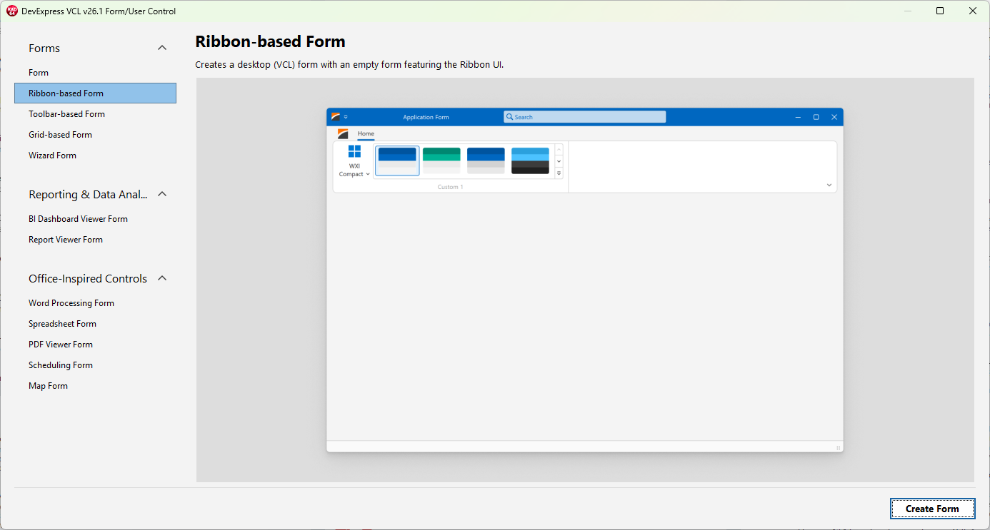
The Form/User Control Wizard lists multiple form templates designed for frequently-used scenarios – a blank form, forms with a pre-configured Ribbon/Toolbar UI and/or other DevExpress UI controls. Refer to the following help topic for details: VCL Template Kit.
Note
Alternatively, follow the instructions in the following sections to add DevExpress forms to your application:
Simple Form Classes
This section lists universal DevExpress form classes suitable for generic scenarios.
- TdxForm
The base form class designed to substitute TForm as the direct form ancestor in DPI-aware applications. We recommend that you use TdxForm as the base form class if you need to create a simple form or dialog with an arbitrary layout:
- TdxSkinForm
The base class for simple DPI-aware forms that can override global form corner and shadow settings. You can use TdxSkinForm instead of TdxForm as the base form class if you need to create a simple form that differs from all other forms in your application.
Tip
This form class can be useful if you need to display a splash screen during application startup or time-consuming operations.
Form Classes Designed for Specific UI Types
This section lists dedicated DevExpress form classes designed for specific UI paradigms and types. To add one of these dedicated forms to an existing application, you can use the [Form/User Control Wizard] shipped as part of the VCL Template Kit (recommended) or derive a new form from the corresponding class as demonstrated in the following section: Simple Form Classes.
Form Classes
- TdxFluentDesignForm
- The base form class for Fluent Design applications.
- TdxRibbonForm
The base form class for Ribbon UI applications. The Ribbon Form is designed to integrate a TdxRibbon control with its title bar as the main application UI and display additional title bar buttons.
Note
If you use a Ribbon UI in MDI applications, make sure that MDI child forms are also derived from the TdxRibbonForm class.
Use SVG Icons as UI Glyphs
The DPI-adaptive UI requires that controls automatically scale their icons in response to DPI changes. Icons should use all available pixels to avoid blurriness. We recommend that you use only SVG images as UI element glyphs because an SVG image ensures crisp render at any target resolution.
Refer to the following topic for general information on image support in DevExpress components: Glyphs and Images.
DevExpress Icon Library
DevExpress controls ship with an extensive library of SVG icons created by our design team. You can access the icon library from our design-time tools for image and glyph management.

Refer to the following topic for detailed information: Icon Library.
Third-Party SVG Icons
You can add third-party icon collections to the Icon Library and use these icons in the same manner as all icons created by DevExpress.
Tip
You may need to adapt third-party icons for proper interaction with DevExpress skins. Refer to the following topic for details: Third-Party SVG Icon Adaptation for DevExpress Skins and Palettes.
Use Vector Skins
DevExpress components ship with 8 skins that allow you to draw all UI elements of DevExpress forms and controls as vector primitives (skin elements). Like SVG UI glyphs, these skin elements ensure crisp render at any target DPI and can dynamically switch between color schemes (palettes). Every vector skin ships with a set of color palettes.
To apply a skin and its palette to your application, you can use the TdxSkinController component. DevExpress application templates automatically add a TdxSkinController component to the created minimum application.
DevExpress Skins and Standard VCL Components
The TdxSkinController component can also apply skins to the following standard VCL controls:
If you use both standard and DevExpress controls in one application and you need to leave standard controls unskinned, handle the TdxSkinController.OnSkinControl event.
Tip
While the TdxSkinController component supports these standard VCL controls, we recommend that you use their DevExpress counterparts to ensure the best user experience.
Skin Interaction with VCL Styles
The DevExpress Skin Engine and the VCL Styles technology are not compatible because they rely on different UI element rendering mechanisms.
Important
We do not recommend that you use Embarcadero RAD Studio® VCL Styles in any application project that uses DevExpress controls.
We strongly recommend that you use only DevExpress skins to ensure the best possible appearance of DevExpress-powered VCL applications.
Recommendations on Form Layout Design
We recommend that you use the TdxLayoutControl component as the main container for all other UI controls on a form. This component allows you to arrange UI controls into groups and create data entry forms of any complexity.
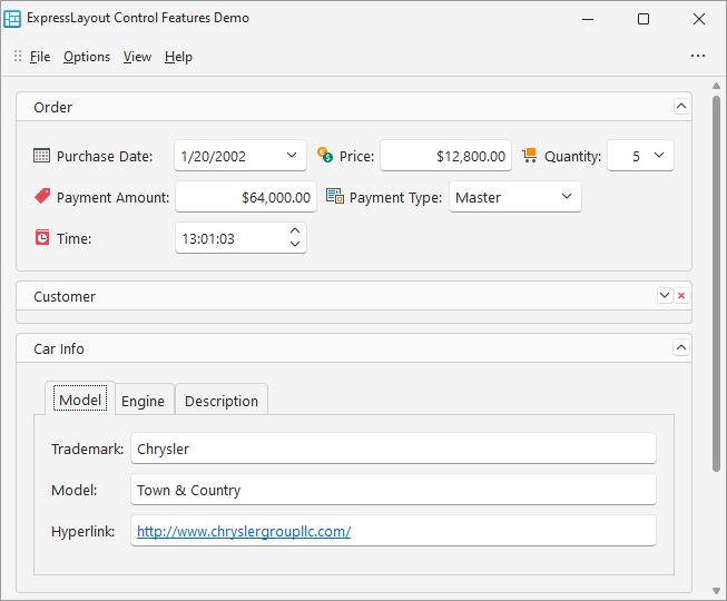
Layout groups and elements resize automatically according to monitor DPI changes and maintain relative dimensions and positions of all UI elements on the form. In addition, layout groups and elements automatically maintain relative sizes and positions of all controls when your application switches between skins because controls may have different dimensions when different skins are active.