VCL Data Grid
- 5 minutes to read
The VCL Data Grid (TcxGrid) control allows you to display data as a table and in a variety of other formats. The control’s built-in capabilities allow users to search, filter, group, sort, edit data, as well as calculate aggregates, highlight important records, and so much more.
The Data Grid control uses Views to display data in the following formats:
- Tabular format (Table View)
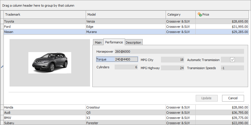
- Displays data as a table where columns and rows correspond to fields and records in a bound dataset. The Table View supports customizable data row layouts and allows you to embed DevExpress editors into column cells for user-friendly data input and presentation.
- Banded tabular format (Banded Table View)
- Extends the Table View functionality with the ability to join columns into bands.
- Data card format (Card View)
- Displays each data record as a contact card.
- Data card format with a custom layout (Layout View)
- Renders records as cards with a custom layout. You can arrange cards into columns, rows, or a carousel (Carousel display mode).
- Graphs and Charts (Chart View)
- Display data as one of the following charts: bar, column, line, area, and pie.
- Display format inspired by Windows Explorer (WinExplorer View)
- Displays records as images with captions. Supports various display modes found in Microsoft Windows Explorer: Small, Medium, Large, Extra-large, List, Tiles, and Content.
Get Started
The following tutorials help you get acquainted with the TcxGrid control and its Views:
Bind to Data
Views support different data controllers designed to work in different data access modes:
- Bound
- A grid View loads data on the client from a bound dataset. The TDataSource component connects the data controller to a dataset.
- Unbound
- A grid View is not bound to a dataset and manages data preloaded into the data controller.
- Provider
- A grid View loads data from a custom data source on demand.
- Server
- A grid View loads data from a supported database on demand. The current server mode implementation supports Microsoft SQL Server, Microsoft Access, MySQL, Firebird, InterBase (except for query-based server mode data sources), Oracle, Advantage, PostgreSQL, and SQLite databases.
Refer to the following topics for additional information on how to bind a grid View to data:
Edit Data
The Data Grid control allows you to embed DevExpress editors into column cells for user-friendly data display and input. Alternatively, you can use in-place and modal Edit Forms with a customizable layout.
Refer to the following topics for information on how to integrate data editors and edit forms into grid Views:
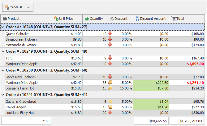
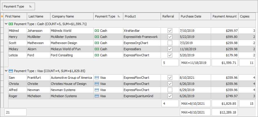
Group Data
Table and Banded Table Views allow users to drag column headers to a dedicated Group by box to group data. You can group data against any number of columns in code or at design time.

Refer to the following topics for details:
Search and Filter Data
The Data Grid has multiple options for data search and filtering.

Refer to the following topics for details:
Sort Data
Table, Banded Table, Layout, and Card Views allow users to sort data in ascending or descending order. You can sort data against any number of columns in code or at design time. Refer to the following topics for details on data sort operations:
Master-Detail
The Data Grid supports hierarchical View structures so you can display data from multiple datasets that form a one-to-many (master-detail) relationship. Table and Banded Table Views can display master tables while all available Views can display detail tables.

Refer to the following topic for details: Master-Detail.
Summaries
Summaries allow you to calculate totals against all records or a group of records.
Refer to the following topics for information on how to work with summaries:
In addition, you can Sort Data by Group Summaries.
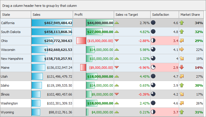
Conditional Formatting
The Data Grid control supports Excel-style conditional formatting.
Data Export
You can export the Data Grid’s content to a file in the following formats:
- Office Open XML (XLSX and XLTX)
- Comma-separated values (CSV)
- Plain text (TXT)
- HyperText Markup Language (HTML)
- Extensible Markup Language (XML)
- Microsoft Excel® Binary Spreadsheet Format (XLS and XLT)
Refer to the following topic for general information on data export: VCL Data Grid: Data Export.
Related GitHub-Hosted Example Project
Related Compiled Demo
To see the TcxGrid control in action, run the Grid and Data Editors demo in the VCL Demo Center installed with compiled DevExpress VCL demos. Click different items in the sidebar on the left to switch between individual demos on corresponding features.
Tip
You can find full source code for the installed compiled VCL Data Grid demo in the following folder:
%PUBLIC%\Documents\DevExpress VCL Demos\MegaDemos\Product Demos\ExpressQuantumGrid